
Create a simple player HUD using the Unity UI module.
In this tutorial we’ll create a Combatant type HUD to display the player’s name and Consumable type status values (HP, MP) and applied status effects. How you name your status values (or how many you have) doesn’t really matter for this setup.
Your project’s UI system should already be set to use the Unity UI module. If not, check the initial setup tutorial for the Unity UI module.
You can download the completed HUD setup here:
This contains the player HUD, status value UI and status effect UI prefabs as well as the used images and font. You still need to use those prefabs for the Status Value UI, Status Effect UI and HUD setup in the Makinom editor.
Status Value UI #
First, we’ll set up the Status Value UI for our HP and MP status values. The Unity UI module uses a prefab for this – the HUD will use the prefab to create the individual status values.
We’ll create a UI that shows the status value’s name on the left side, it’s current value at the right side and a value bar. The value bar uses a sprite and fills it according to the status value’s filled state.
You can download a simple, white sprite below in case you don’t have any sprite at hand. Using a white color allows us to color the sprite however we want using the Image component’s Color setting.
Create the HUD element #
Creating our status value prefabs is pretty straight forward. We create a ready to use setup using the scene hierarchy’s context menu: ORK Framework > HUD > Status Value > Status Value – Name+Value+Bar (for prefabs)
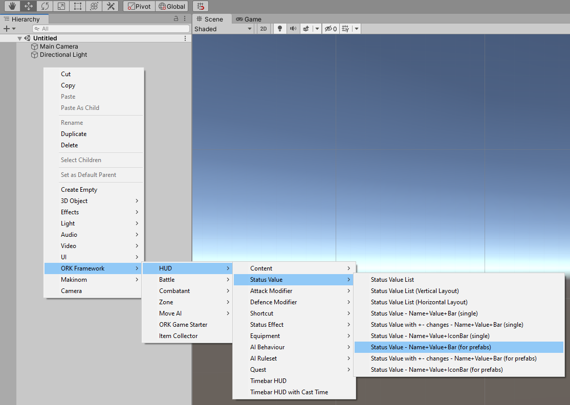
This will create a Canvas to style our UI in – the canvas is set up as Makinom’s default canvas would be. The ready to use status value game object is also set up for us and we can now style it to our liking.
We don’t really see much, as it’s currently white text on a white image.
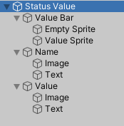
The structure of the created game object is as follows:
Value Bar Images #
We need to set the sprite the value bar will use. Change the Image components on the Empty Sprite and Value Sprite game objects (child objects of Canvas > Status Value > Value Bar).
- Source Image
Select the sprite you want to use.
E.g. the White_16x16 sprite you can download above.
Set the Value Sprite to use a Filled image type.
- Image Type
Select Filled.
This will let the value bar display only part of the image depending on the filled state of the value bar. - Fill Method
Select Horizontal. - Fill Origin
Select Left.
You can check how a partially filled status value will look like by changing the Fill Amount setting.
Styling #
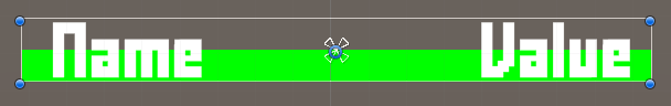
You can change the color of the value bar using the Color setting of the value sprite’s Image component. I leave the Color you use to your imagination. I’ll use a Green color for the HP and a Blue color for the MP. You can also change the color of the Empty Sprite if you want.
The text for name and value is defined in the ORK HUD Status Text Content components on the Name and Value child objects. E.g. if you also want to also display the maximum value, change the Value child object’s text to <value>/<valuemax>.
I’m using the following text for the Name:
- Default Content (Text)
Set to: <shortname>
The <shortname> text code will use the status value’s short name – and if no short name is used, it’ll use the name.
And the following text for the Value:
- Default Content (Text)
Set to: <value>/<valuemax>
Displaying the text of name and value is handled by the TextMeshPro – Text (UI) components on the Name > Text and Value > Text child objects. This is where you can change the font, font size, font color, etc.
I’m using a smaller font size.
- Font Size
Set to 14.
You can also further style the setup as you like, e.g. I’ll let the value bar go from center to bottom instead of the whole size.
Layout Element #
We add a Layout Element component to the the Status Value game object.
- Preferred Height
Enable this setting and set the value to 20.
This ensures the status value will have a height of at least 20 when it’s added to layout groups (which we’ll use).
Create Prefabs #
We’ll create 2 prefabs out of our status value game object (i.e. Status Value, not the Canvas). You can either create 2 individual prefabs or a prefab and a prefab variant.
One prefab for the HP (green color in my setup) and one prefab for the MP (blue color in my setup). The color is the only difference in my setup, but you can style them however you like, e.g. use different sprites.
You can remove the game object from the scene after creating the prefab.
Status Value Setup #
Next, we’ll set up the Status Value UI in the HP and MP status values with our prefabs.
Open the Makinom editor, navigate to Status > Status Values.
(HP) UI Settings > Custom Status Value UI #
Select our HP/health status value (Consumable type).
- Own Status Value UI
Enable this setting. - UI Prefab
Select the HP prefab you just created.
(MP) UI Settings > Custom Status Value UI #
Select your MP/mana status value (Consumable type).
- Own Status Value UI
Enable this setting. - UI Prefab
Select the MP prefab you just created.
Alternatively, you can also define a Key Status Value UI instead of setting the default UI. In this case, make sure to later also use the same UI key in the HUD Status Value List component setup.
Save Settings #
Don’t forget to save the changes you did in the Makinom editor via the Save Settings button at the bottom.
Status Effect UI #
Next, we’ll set up the Status Effect UI for status effects. The Unity UI module uses a prefab for this – the HUD will use the prefab to create the individual status effects.
We’ll create a UI that shows the status effect’s name at the bottom, it’s duration at the top and the icon in the background. Additionally, we’ll use the icon as a radial value bar for the duration.
Create the HUD element #
Create a ready to use setup using the scene hierarchy’s context menu: ORK Framework > HUD > Status Effect > Status Effect Content+Duration (for prefabs)
Like with the status value UI, this’ll create a ready-to-use setup for us that we’ll now adjust to our needs.
Rect Transform #
First, we adjust the size of the overall HUD element – this is handled on the Status Effect Content game object.
- Width
Set to 50. - Height
Set to 50.
While this size can be controlled by the HUD displaying it, we’ll design it with this size in mind.
Duration Text #
Next, let’s adjust the duration text – this is handled on the Status Effect Content > Duration Text child object.
The ORK HUD Status Text Content component handles the content that’ll be displayed. It already is set up as we need it, using the Status Effect type and the <duration> text code to display the duration of the effect.
The TextMeshPro – Text (UI) component handles how the text is displayed. Adjust the following settings.
- Font Size
Set to a smaller size, e.g. I’m using 10. - Vertex Color
Change the text’s color to a color you like – e.g. I’m using a red color. - Alignment
Set to Center and Top. - Wrapping
Select Disabled.
Name Text #
Now, we’ll adjust the duration text – this is handled on the Status Effect Content > Content > Text child object.
The TextMeshPro – Text (UI) component handles how the text is displayed. Adjust the following settings.
- Font Size
Set to an even smaller size, e.g. I’m using 8. - Vertex Color
Change the text’s color to a color you like – e.g. I’m using a red color. - Alignment
Set to Center and Bottom. - Wrapping
Select Disabled.
Icon Value Bar #
We want to use the icon as a value bar to show the duration.
First, we’ll add an empty game object to the Status Effect Content > Content child object, which will manage the bar. We’ll use an empty game object for this, as the bar’s game object can be disabled if the bar isn’t used, hiding all content, e.g. by a status effect without a duration.
Add a HUD Value Bar (Sprite) component to the empty game object and change the following settings.
- Value Image
Select the Image component on the Status Effect Content > Content > Image child object. - Change Fill Amount
Enable this setting.
Next, add an ORK HUD Value Bar Content component to the empty game object and change the following settings.
- Value Type
Select Status Effect Duration. - Unused Filling
Select Full.
Since we use the effect’s icon as the value bar, we need to make sure it’s filled if an effect doesn’t have a duration.
Otherwise the icon might not be fully visible.
This wouldn’t be needed for regular value bars, as they’ll get disabled (as part of the game object the component is on).
The value bar content automatically select’s the root’s HUD content provider and the sprite value bar we just added.
Now, we just need to set up the Image component displaying the icon to allow radial filling. Select the Status Effect Content > Content > Image child object.
To be able to change the settings we need, we’ll first need to select any sprite in the Source Image. So, just select whatever sprite you want, we’ll afterwards remove it again. Change the following settings
- Image Type
Select Filled. - Fill Method
Select Radial 360.
Remove the Source Image by selecting None.
The finished setup looks something like this:
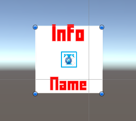
Create Prefab #
Create a prefab out of our status effect game object (i.e. Status Effect Content, not the Canvas). E.g. name the prefab Status Effect Radial Duration.
You can remove the game object from the scene after creating the prefab.
Status Effect UI Setup #
Next, we’ll set up the Status Effect UI in for all status effects with our prefab.
Open the Makinom editor, navigate to UI > UI Settings.
ORK UI Settings > HUD Settings > Default Status Effect UI #
These settings handle the default status effect UI for all effects.
- UI Prefab
Select the prefab you just created.
Alternatively, you can also define a Key Status Effect UI instead of setting the default UI. In this case, make sure to later also use the same UI key in the HUD Status Effect List component setup.
Save Settings #
Don’t forget to save the changes you did in the Makinom editor via the Save Settings button at the bottom.
HUD Prefab Setup #
Next, we’ll set up the actual HUD, starting with the prefab. The Unity UI module uses prefabs to create HUDs, i.e. your HUD’s setup is done in the scene view via game objects and components.
Creating the HUD #
We use the scene hierarchy’s context menu to create our base HUD: Makinom > HUD > HUD (Vertical Layout)
This creates an empty HUD with a vertical layout. We use a Vertical Layout Group to arrange the HUD’s content in a vertical list.
Rect Transform #
We adjust the width of the HUD.
- Width
Set to 300.
Content Size Fitter #
We’ll add a Content Size Fitter to the HUD to make it adjust it’s size to the displayed content.
- Vertical Fit
Select Preferred Size.
Image (Optional) #
We’ll add an Image component to display a background image in the HUD.
- Source Image
Select the Sprite you want to use, e.g. the BoxBlue from the UI assets (see the initial setup tutorial). - Color
Select a color you want to use (optional).
E.g. for the BoxBlue sprite, a white color with full alpha.
Adding HUD elements #
Now that we’ve got our basic HUD, it’s time to add some content to it.
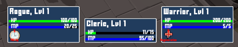
Combatant Information #
We’ll add an ORK HUD Status Text Content to display the combatant’s name and level. See this documentation for details.
Right-click on the base HUD game object in the scene hierarchy and add it using the context menu: ORK Framework > HUD > Content > Status Text+Icon Content (TextMesh Pro) or Status Text Content (TextMesh Pro) (text only)
This adds the text content as a child object of the HUD. Change the text of the ORK HUD Status Text Content component:
- Text
Set to: <name>, Lvl <level>
Like we did for the status value UI prefabs, you can change the style of the text in the TextMeshPro – Text (UI) component on the Status Text Content > Text child object. E.g. I’ll use:
- Font Style
Select Bold. - Font Size
Set to 20. - Vertex Color
Select a white color with full alpha.
Remove the Status Text Content > Image child object, we’ll not display the combatant’s icon in the HUD.
Status Values #
We’ll add a HUD Status Value List to list the status values using their Status Value UI we just set up.
Again, right-click on the base HUD game object in the scene hierarchy and use the context menu: ORK Framework > HUD > Status Value > Status Value List (Vertical Layout)
This adds the status value list as a child object of the HUD. It contains another vertical layout, since it’ll add the individual status values to this game object. This way adding the status value during the game will not interfere with any additional HUD elements we’ll add after the status values.
The default setup is already correct for what we want to do (show Consumable status values with the default UI). To make sure, let’s check it:
- List Status Values
Select Status Value Type. - Status Value Type
Select Consumable. - UI Key
Nothing defined here (empty text).
Status Effects #
We’ll add a HUD Status Effect List to list the status effects using their Status Effect UI we just set up.
Again, right-click on the base HUD game object in the scene hierarchy and use the context menu: ORK Framework > HUD > Status Effect > Status Effect List (Grid Layout)
This adds the status effect list as a child object of the HUD. It contains a grid layout, since it’ll add the individual status effects to this game object. Let’s adjust the grid layout:
- Cell Size
Set to X=50, Y=50. - Spacing
Set to X=10, Y=10.
As for the HUD Status Effect List component, the default setup is already correct for us, but you can also adjust it to your liking, e.g. limiting the number of displayed effects, combine stacked effects, etc.
Create Prefab #
You might be wondering about the placement of the HUD. We’ll use a UI Layout to handle this, but you can also use the actual HUD game object’s position if you want. In that case, place the HUD on the canvas where you want it to display.
That’s already everything we need to do. Create a prefab out of the HUD, e.g. save it as Player HUD.
You can now remove the canvas (and HUD) from the scene.
HUD Setup #
As a last step, we’ll set up the HUD in the Makinom editor.
UI Layout #
First, we create a UI Layout that’ll handle placing the HUD for the player and other player group members. We want the player HUDs to display at the lower right corner, adding additional combatants to the left. You can learn more about UI layouts in the Makinom documentation.
Open the Makinom editor, navigate to UI > UI Layouts and either change the Default layout (if you haven’t used it yet) or create a new UI layout.
UI Layout Settings #
- Name
Set to Player HUDs. - Layout Type
Select List.
List Layout Settings #
- Anchor
Select Lower Right. - Padding
Set to X=0, Y=0, Z=20, W=20. - Spacing
Set to 20. - List Fill
Select Horizontal. - Fill Anchor
Select Lower Right. - Invert
Enable this setting.
This will start with the first HUD (the player) in the corner, adding others to the left.
HUD #
Next, we’ll set up the HUD. Navigate to UI > HUDs, add a new HUD and change the following settings.
HUD Settings #
- Name
Set to Player. - HUD Type
Select Combatant. - Auto Display
Enable this setting.
This will automatically show the HUD. If you use a HUD only as a template, make sure to disable this setting.
Combatant Settings #
- Player
Enable this setting. - Player Group Scope
Select Battle.
This will show the battle group members of the player group. - Multi-Box Layout
Select UI Layout. - UI Layout
Select Player HUDs (the UI layout we just created).
Display Conditions #
You can use these settings to only show the HUD based on conditions. E.g. only during battles, etc.
We’ll ignore this for now.
Unity UI #
- UI Layer
Select HUDs (or any other UI layer you want the HUD to display on).
UI layers are used to organize your UI, learn more in the Makinom documentation. - HUD Prefab
Select the HUD prefab you just created.
Schematics #
You can optionally use schematics to animate opening and closing the HUD, e.g. fading it in/out. You can also set up default schematics for all HUDs.
See this tutorial for details.
Save Settings #
Once again, don’t forget to save the changes you did in the Makinom editor via the Save Settings button at the bottom.
Testing #
Hit play and test your HUD! Naturally, you need a combatant in your player group for this to work.
If you’re not satisfied with the look, open up the prefabs for the HUD and/or status values and adjust them to your liking.
Alternative Setup #
You can also create an alternative setup without using Status Value UI prefabs and the HUD Status Value List.
Use HUD Status Value components to define a single status value in the HUD instead of the HUD Status Value List component. Similar to the status value prefabs we created, you can use the scene hierarchy context menu: ORK Framework > HUD > Status Value > Status Value – Name+Value+Bar (single)
The styling process is the same like the prefabs. All you need to do is define the displayed status value in the HUD Status Value component.
This setup avoids creating prefabs in-game and can improve the performance of your UI (creation).


