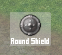
Create a dragging notification to show content being dragged and dropped.
Dragging something from a UI (e.g. a menu screen, battle menu or shortcut HUD) can display the dragged content using a dragging notification. The dragging notification is set up in UI > UI Settings in the Drag/Drop Settings, each UI box can optionally use a custom dragging notification (as well as shortcut slot HUD elements).
In this tutorial we’ll create a UI box for our dragging notification, which will also have some HUD components attached to have more control over the displayed content. You don’t need to use HUD components (or a template HUD) in a dragging notification, as it can also display information it it’s regular message, but using HUDs allows to create more complex UI (though we’ll keep it simple in this tutorial).
Your project’s UI system should already be set to use the Unity UI module. If not, check the initial setup tutorial for the Unity UI module.
You can download the completed HUD setup here:
This contains the dragging notification UI box prefab. You still need to use the prefab for the UI box and dragging notification setup in the Makinom editor.
UI Box Prefab #
The UI box should adjust it’s size to the displayed content, and as said above, we’ll also add HUD components to display information about the displayed content.
Additionally, the UI box should be displayed at the position of the cursor and follow it.
Base UI Box #
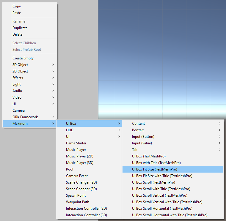
We’ll start with creating the UI box itself using the scene hierarchy’s context menu: Makinom > UI Box > UI Box Fit Size
Rect Transform #
The newly created UI Box game object should be selected. We’ll change the Rect Transform to have the upper left corner of the box be placed at the cursor position.
For this, we’ll change the pivot of the game object.
- Pivot
Set to X=0, Y=1.
UI Box #
The UI Box component handles all settings of the UI box. We only need to set up to display it at the cursor position, the rest of the settings are usually handled automatically for us when using the context menu to set it up.
- Limit to Screen
Enable this setting.
This’ll make the UI box stick to the edges of the screen in case the dragging will move it outside the screen. - At Cursor Position
Enable this setting.
This displays the UI box at the position of the cursor when it’s opened. - Follow Cursor
Enable this setting.
This’ll keep the UI box positioned at the cursor when it moves.
UI Receive Cursor Events #
This component is automatically added when creating a UI box using the context menu. It handles detecting if the UI box was clicked or if the cursor is over it.
Since our dragging notification will follow the cursor, it’s best to remove it to not interfere with the other UI boxes.
Remove the component via context-click on it’s name and selecting Remove Component.
Content Size Fitter #
The default setup for this UI box will only adjust the vertical size (height) to the displayed content. Let’s change it to also adjust the horizontal size (width).
- Horizontal Fit
Select Preferred Size.
HUD Content Provider #
Next, we’ll add start with the HUD component setup of the UI box.
HUD components need a content provider that handles the content they display. In regular HUDs, their root HUD component is usually their content provider.
When UI boxes directly display HUD components (e.g. instead of using a HUD template), they need to add a content provider component to be able to display content in HUD components.
Add a HUD Content Provider component to the UI Box game object to handle this for us.
UI Content #
In order to get the displayed content to the content provider we added, we need to select it in the UI box’s UI Content component (which handles displaying the UI box’s main content).
- HUD Content Provider
Select the HUD Content Provider component we just added.
E.g. by dragging it on the field (or selecting the UI Box game object). - Text Disable If Empty
Enable this setting.
This’ll disable the game object that displays the regular content text (the Text child object of the UI box in this setup) in case no text is displayed. This’ll prevent an empty text from having an impact on the layout.
HUD Icon Content #
Now, we’ll add actual HUD content to the UI box.
The UI box is set up to list content vertically – we’ll add an icon as our first HUD content. Just like creating HUDs, we use the scene hierarchy context menu to add HUD content to the UI box.
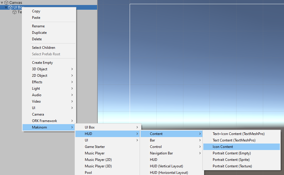
Context-click on the UI Box game object and add an icon content: Makinom > HUD > Content > Icon Content
HUD Text Content #
This component defines the content that will be displayed. The default setup that was created is already what we need, not displaying any text, but using the content icon.
UI Content #
We want to disable the icon’s game object in case some displayed content doesn’t have any icon.
The icon is displayed with a sprite, so we need to disable it if no sprite is available.
- Sprite Disable If Empty
Enable this setting.
Layout Element #
Additionally, we want to display the icon with a fixed size of 100×100.
Add a Layout Element to the Icon Content game object.
- Preferred Width
Enable this setting.
Set the width to 100. - Preferred Height
Enable this setting.
Set the width to 100.
HUD Text Content #
And as the last content added to the UI box, we’ll add a HUD text content to display the name of the dragged content.
Context-click on the UI Box game object and add a text content: Makinom > HUD > Content > Text Content
HUD Text Content #
The default setup that was created is already what we need, displaying the name using the <name> text code.
UI Content #
Same as the icon, we want to disable the text in case something doesn’t have a name.
- Text Disable If Empty
Enable this setting.
TextMeshPro – Text (UI) #
This component handles displaying the actual text.
In case you want to change the font, size, color, etc. – this is where you can do it.
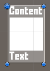
And that’s it for the UI box prefab – the finished UI box will look something like this:
Create Prefab #
Create a prefab out of the UI Box game object, e.g. naming it Drag Box.
If you’ve done the setup in one of your game’s scenes, don’t forget to remove the canvas (with the UI Box game object) again.
UI Box Setup #
With our prefab created, we can now set up the UI box that’s used by the dragging notification (and uses the UI box prefab).
Open the Makinom editor, navigate to UI > UI Boxes and create a new UI box.
Base Settings #
- Name
Set to Drag. - UI Layer
Select a UI layer that’s at least at the same layer as the UI that will display content that can be dragged.
It’s best to have it at a layer above the other UI. - Cursor Over
Disable this setting.
Unity UI #
- UI Box Prefab
Select the prefab you just created.
Drag Setup #
Navigate to UI > UI Settings.
Drag/Drop Settings #
These settings handle dragging and dropping content.
The Raycast Settings are used when something is dropped into the world, e.g. dragging an item on a combatant uses a raycast to find what it was dropped on. Make sure the Layer Mask is set up correctly for your layer setup.
We’ll set up some basic settings first.
- Drag Set Selection
Enable this setting.
This’ll set an input (e.g. button) as the selected input when starting a drag from it. - Drop Set Selection
Enable this setting.
This’ll set an input (e.g. button) as the selected input when dropping a drag on it. - Block Tooltips
Enable this setting.
Tooltips will be blocked while dragging something.
Dragging Notification #
Finally, we set up the dragging notification.
- Show Drag
Enable this setting. - Drag Box
Select the Drag box we just set up.
Message Content #
- Add HUD
Enable this setting.
This’ll add HUD content information to the displayed content and allows the HUD Content Provider we added to the UI box to use it. - HUD
Select the None HUD (default selection).
Not selecting a HUD here will still add the HUD content for the content provider, but not use a HUD as template.
If you select a HUD, the HUD’s prefab will be used to create an instance of the HUD as a child object of the UI box. - Text
Set it to an empty text, since we handle displaying the content using the HUD components.
Save Changes #
And that’s it – click on Save Settings to save the changes.
Testing #
To test the dragging notification, you need to enable dragging in one of your menus – e.g. the battle menu (UI > Battle Menus) or a menu screen (UI > Menu Screens). Menu screen parts that support drag/drop will have their separate Drag and Drop settings, e.g. the Inventory menu part.
Tip: Using HUD Templates #
Instead of adding the HUD components directly to the UI box as described in this tutorial, you can also use an existing HUD as a template. Tooltip type HUDs are probably the best fit, but you can use any HUD you want.
Using a HUD template is a good idea if you’ve already set up a HUD that looks like you want your drag notifications to look, or want to reuse the drag look in other parts of the UI.
To use a HUD template, simply select a HUD in the dragging notification’s settings instead of using the None HUD. And don’t add HUD components to the UI box, or they’ll both be used.
