Create a simple tooltip HUD using the Unity UI module.
In this tutorial we’ll create a Tooltip type HUD to display the name and description of the current tooltip.
Your project’s UI system should already be set to use the Unity UI module. If not, check the initial setup tutorial for the Unity UI module.
You can download the completed HUD setup here:
This contains the tooltip HUD prefab. You still need to use the prefab for the HUD setup in the Makinom editor.
HUD Prefab Setup #
The Unity UI module uses prefabs to create HUDs, i.e. your HUD’s setup is done in the scene view via game objects and components.
We use the scene hierarchy’s context menu to create our base HUD: Makinom > HUD > HUD (Vertical Layout)
This creates an empty HUD with a vertical layout. We use a Vertical Layout Group to arrange the HUD’s content in a vertical list.
Rect Transform #
We adjust the pivot and width of the HUD.
We change the pivot to be on the upper left corner of the HUD – we’ll make the HUD follow the mouse cursor position, and we want that corner to be placed at the cursor.
- Pivot
Set to X=0, Y=1. - Width
Set to 300.
HUD #
The HUD component is the base of the HUD, this is where we’ll set up following the cursor.
Position Settings #
- Limit to Screen
Enable this setting.
This’ll prevent the HUD from going over the edge of the screen – since we display it at the cursor position it’d otherwise not be able to properly display it’s information near the edge of the screen.
You can optionally set up a screen padding. - At Cursor
Enable this setting.
The HUD will be displayed at the cursor’s position when opened. - Follow Cursor
Enable this setting.
The HUD will also follow the cursor while it’s open. - Follow At Close
Enable this setting.
The HUD will also follow the cursor while closing (e.g. when fading out via UI animation schematics). - Cursor Offset
Set to X=20, Y=-20.
We add a bit of offset to the cursor, so that the HUD’s corner isn’t below the mouse cursor.
Vertical Layout Group #
Optionally change the padding and spacing of the layout group. I’ll change all to 10.
- Padding
Set all to 10. - Spacing
Set to 10.
Content Size Fitter #
We’ll add a Content Size Fitter to the HUD to make it adjust it’s size to the displayed content.
- Vertical Fit
Select Preferred Size.
Image (Optional) #
We’ll add an Image component to display a background image in the HUD.
- Source Image
Select the Sprite you want to use, e.g. the BoxBeige from the UI assets (see the initial setup tutorial). - Color
Select a color you want to use (optional).
E.g. for the BoxBeige sprite, a while color with full alpha.
Name #
We’ll start with adding the tooltip content’s name to the HUD.
Use the scene hierarchy’s context menu on the HUD game object to add a text content: Makinom > HUD > Content > Text Content (TextMeshPro)
This adds a ready to use child object to the HUD (which will be positioned and sized by the Vertical Layout Group) that manages and displays text.
Change the created game object’s name to Name.
HUD Text Content #
The HUD Text Content component is used to define general text information. There are also other variants of this component available, e.g. the ORK HUD Status Text Content to display specific information for items, combatants or other ORK content.
We use the general HUD Text Content since we only display the name here (and the description in the 2nd content we add), which is universal for all content.
The default setup of the component already displays the name.
- Default Content
Set to: <name>
TextMeshPro – Text (UI) #
This component displays the text, this is where we can adjust things like font size, style and alignment.
I’m using this setup.
- Font Style
Select Bold. - Font Size
Set to 20. - Vertex Color
Select a red color. - Alignment
Select Center.
Description #
Next, we add the tooltip content’s description to the HUD.
Like for the name, use the scene hierarchy’s context menu on the HUD game object to add a text content: Makinom > HUD > Content > Text Content (TextMeshPro)
Change the created game object’s name to Description.
HUD Text Content #
We change the displayed content to show the description.
- Default Content
Set to: <description>
TextMeshPro – Text (UI) #
This component displays the text, this is where we can adjust things like font size, style and alignment.
I’m using this setup.
- Font Size
Set to 15. - Vertex Color
Select a white color. - Alignment
Select Justified.
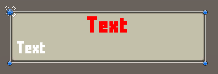
The finished HUD will look like this.
Create Prefab #
That’s already everything we need to do. Create a prefab out of the HUD, e.g. save it as Tooltip HUD.
You can now remove the canvas (and HUD) from the scene.
HUD Setup #
As a last step, we’ll set up the HUD in the Makinom editor.
Open the editor and navigate to UI > HUDs, add a new HUD and change the following settings.
HUD Settings #
- Name
Set to Tooltip. - HUD Type
Select Tooltip. - Auto Display
Enable this setting.
This will automatically show the HUD. If you use a HUD only as a template, make sure to disable this setting.
Tooltip Settings #
You can optionally limit for which tooltip content the HUD will be displayed.
For this, click on the Add Tooltip Check button and select which Tooltip Type is allowed. You can e.g. limit it do only be displayed for items, equipment or currencies – you can add as many types as you want.
We’ll ignore this for now.
Display Conditions #
You can use these settings to only show the HUD based on conditions. E.g. only during battles, etc.
We’ll ignore this for now.
Unity UI #
- UI Layer
Select HUDs (or any other UI layer you want the HUD to display on).
UI layers are used to organize your UI, learn more in the Makinom documentation. - HUD Prefab
Select the HUD prefab you just created.
Schematics #
You can optionally use schematics to animate opening and closing the HUD, e.g. fading it in/out. You can also set up default schematics for all HUDs.
See this tutorial for details.
Save Settings #
Don’t forget to save the changes you did in the Makinom editor via the Save Settings button at the bottom.
Displaying Tooltips #
Your tooltip HUD is ready to display content – however, tooltips are not automatically available everywhere.
E.g. in your menu screens or battle menus need to Enable Tooltip display, or the tooltip content information is not available in them.
As an example, let’s look at enabling tooltips for items (and equipment, etc.) that’s shown in an Inventory menu part of a menu screen (UI > Menu Screens).
Inventory (Part) > Item Box Settings > Drag and Drop #
- Enable Tooltip
Enable this setting.
That’s all that’s needed. Please note that each part (and usually also each individual UI box of that part) has their own tooltip setup. E.g. the Inventory part has separate tooltip options for item types and the listed items.
Testing #
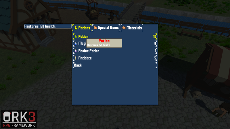
Hit play and test your HUD! E.g. via menu screens in the 3D RPG Playground tutorial project.
If you’re not satisfied with the look, open up the prefab of the HUD and and adjust them to your liking.
Tip: Specialized Content #
Adding specialized content via ORK HUD Status Text Content components will only display their content if the tooltip’s content matches the displayed type.
E.g. using the Item status type will only display the content if the tooltip is for an item, or using Ability status type will only display if the tooltip is an ability, etc.
You can add a ready-to-use setup via the scene hierarchy context menu: ORK Framework > HUD > Content > Status Text+Icon Content (TextMesh Pro) or Status Text Content (TextMesh Pro) (text only)
Tip: HUD Condition Component #
The HUD Condition component can be added to game objects on your HUD to enable/disable them based on defined conditions.
E.g. using Variable conditions also allows you to check variables of the displayed content – items, abilities and equipment can have their own variables. Use the Local variable origin to check the tooltip content’s variables.
With this, you can e.g. set up a custom item rarity system via item variables and display different background images based on which rarity an item has.


