
Set up the initial settings when using the Unity UI module.
In this tutorial we’ll go through the initial setup you should do when using the Unity UI module.
You can download an UI assets pack with some basic UI prefabs here:
This package contains:
- 2 background sprites for boxes
- 1 background sprite for buttons
- 1 white sprite (e.g. for value bars)
- 1 font with TextMesh Pro setup
- 2 UI box prefabs
- input prefabs (buttons, toggle, sliders, etc.)
Change the UI System #
First, you need to change the used UI system of your Makinom/ORK project.
Open the Makinom editor, navigate to UI > UI System and change the following settings.
- UI System Type
Select Unity UI. - Default Screen Size
Set up the screen size you want to use, or rather, you design your UI for.
This is e.g. used when creating a canvas for setting up UI prefabs or in-game (when the UI layers don’t use their own custom canvas prefabs).
The default is X=1920, Y=1080.
Changing the UI system will prompt a confirmation dialogue:
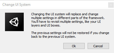
In rare cases it can happen that showing this confirmation dialogue causes an error – if that’s the case, disable the Show Confirmation Dialog option above the UI System Type setting. This’ll immediately change the UI system instead of showing the confirmation dialogue.
Save the changes using the Save Settings button at the bottom of the editor.
TextMesh Pro Setup #
If you haven’t done so, import the TMP Essential Assets into your Unity project.
You can impor them via the Unity menu: Window > TextMeshPro > Import TMP Essential Resources
Depending on your Unity/TMP version this might also be located somewhere else.
Learn more about setting up TextMesh Pro in this UI tutorial.
UI Enviroment Scene #
When editing UI prefabs, Unity will use a canvas that is most likely not matching the canvas used in your game. This can lead to your prefab’s position and size not matching the in-game’s position and size.
To solve this issue, set up a UI Environment scene with a correctly set up canvas matching your Default Screen Size.
Creating the scene #
After setting your Default Screen Size (or after changing it), create a new scene using the Unity menu: File > New Scene
Use the scene hierarchy’s context menu to create a canvas with the correct setup: Makinom > UI > Canvas
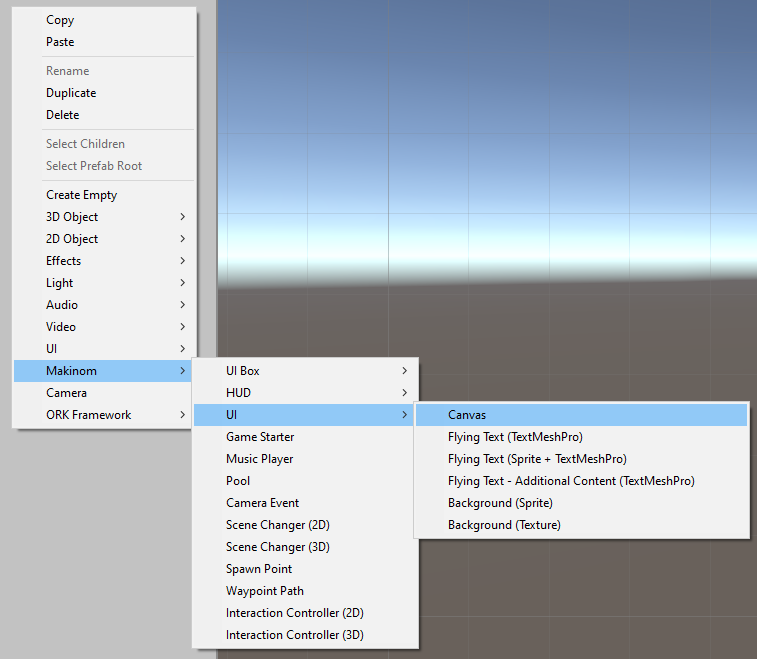
This’ll create a Canvas with the same set up as it’d be in the running game (when not using a canvas prefab), i.e. it’ll use a Canvas Scaler to scale content to different resolutions and aspect ratios.
Creating Makinom/ORK UI via the context menu will make sure it’s placed on a canvas that fits the UI setup of your project, using the same canvas setup as you just created.
Save the scene somewhere in your project, e.g. as UI Environment Scene.
Setting up the UI Environment scene #
Use the Unity menu to open the project settings: Edit > Project Settings…
Select the Editor tab and change the following setting.
- UI Environment
Select the UI Environment Scene you just saved.
Close the project settings.
Now, when editing a UI prefab, e.g. a UI box or an input prefab, they’ll use this scene and it’s canvas, making sure that their placement and size remains correct.
First UI Box #
It’s time to set up a first UI box.
Create a prefab #
When using the Unity UI module, the look, placement and size of the UI box is set up as a prefab.
Create a ready-to-use UI box setup using the scene hierarchy’s context menu: Makinom > UI Box > UI Box (different variants available)
The UI box is ready to go, so just make a prefab out of it.
For more details, check this tutorial about setting up a UI box prefab.
Using the prefab #
Navigate to UI > UI Boxes in the editor, select the Default UI box and change the following setting.
Unity UI #
- UI Box Prefab
Select the UI box prefab you want to use.
Save the changes using the Save Settings button at the bottom of the editor.
Default UI Prefabs #
One last thing remains to be done – creating UI prefabs for inputs (e.g. buttons, sliders, toggles or text fields) and using them as the Default UI Prefabs.
The default UI prefabs are used as fallbacks, in case no other UI prefab is defined for an input (e.g. by a UI box or the content definition of a dialogue or menu). When inputs are displayed in a UI box, they’re created from prefabs to define how they look or interact – the content is coming from whatever is displaying the UI box.
Creating the prefabs #
All of the inputs can easily be created using the scene hierarchy’s context menu.
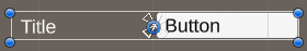
Button Prefab #
The button prefab is used for buttons, e.g. choices in a dialogue, items listed in an inventory menu, etc.
Create a button using the scene hierarchy’s context menu: Makinom > UI Box > Input (Button) > Choice Button
There are different variants available:
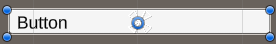
- Empty Button
An empty button, without any image or text. - Choice Button
A button with icon and text.
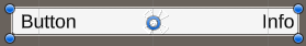
- Choice Info Button
A button with icon, text and an additional content using the content ID info.
The info content is displayed within the button, on it’s right side.
E.g. use a button like this for displaying items or abilities, which can show their quantity or use cost in the info content.
- Choice Title Button
A button with icon, text and an additional content using the content ID title.
The title content is displayed on the left side of the button.
E.g. use a button like this for displaying equipment slots, the title
- Choice Title Button fixed Width
Same as the Choice Title Button, but set up with the Title having a fixed width.
Use this variant to have multiple title buttons show the same title/button sizes.
The size of the title is managed by the Layout Element component’s Preferred Width setting of the Title Content child object.
Create a prefab out of the button. It’s recommended to make a prefab for a choice button, choice info button and choice title button to have them all available as needed.
Tab Button Prefab #
The tab button prefab is used for tabs, e.g. when a menu screen displays types as tabs instead of in a separate UI box.
Create a tab button using the scene hierarchy’s context menu: Makinom > UI Box > Tab > Tab Button
Create a prefab out of the tab button.
Bool Input Prefab #
The bool input prefab is used for bool value inputs, e.g. mute options in option menus or for custom options using a bool variable.
Create a bool input using the scene hierarchy’s context menu: Makinom > UI Box > Input (Value) > Toggle
Create a prefab out of the bool input.
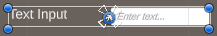
String Input Prefab #
The string input prefab is used for text/string value inputs, e.g. for custom options using a string variable.
Create a string input using the scene hierarchy’s context menu: Makinom > UI Box > Input (Value) > Text Input
Create a prefab out of the string input.
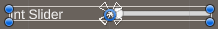
Int Input Prefab #
The int input prefab is used for int value inputs, e.g. quantity selections, volume options (when used as int) or custom options using an int variable.
Create an int input using the scene hierarchy’s context menu: Makinom > UI Box > Input (Value) > Int Slider or Int Button
There are different variants available:
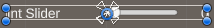
- Int Slider
An int slider input.
- Int Slider with Value
An int slider input with additional content using content ID value.
E.g. use the value content to display the slider’s value (via content setup in the option menu or value input dialogue using it).
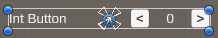
- Int Button Horizontal
An int input with 2 buttons to increase and decrease the value, arranged horizontally with an additional content between the buttons (content ID value).
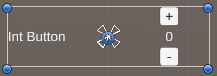
- Int Button Vertical
An int input with 2 buttons to increase and decrease the value, arranged vertically with an additional content between the buttons (content ID value).
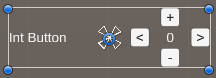
- Int Button Horizontal+Vertical
An int input with 4 buttons to increase and decrease the value, 2 arranged vertically, arranged horizontally with an additional content between the buttons (content ID value).
Create a prefab out of the int input.
Float Input Prefab #
The float input prefab is used for float value inputs, e.g. volume options (when used as float) or custom options using a float variable.
Create an int input using the scene hierarchy’s context menu: Makinom > UI Box > Input (Value) > Float Slider or Float Button
There are the same variants available as for the Int Input.
Create a prefab out of the float input.
Setting up the default UI prefabs #
Navigate to UI > UI System in the editor and change the following settings.
Default UI Prefabs #
- Button Prefab
Select the button prefab you created.
For ORK, it’s recommended to use a Choice Info Button variant, as you often want to display additional content (e.g. item quantity, use costs, etc.).
If no additional content is displayed, it’ll simply not be displayed in the button. - Tab Button Prefab
Select the tab button prefab you created. - Bool Input Prefab
Select the bool input prefab you created. - String Input Prefab
Select the string input prefab you created. - Int Input Prefab
Select the int input prefab you created. - Float Input Prefab
Select the float input prefab you created.
Save the changes using the Save Settings button at the bottom of the editor.
Default Flying Text (optional) #
While not part of the main UI system, flying texts are also displayed by UI and need to be set up.
See this UI tutorial on flying texts for a more in-depth explanation.
You can also use schematics to animate flying texts, see this schematic tutorial for details.
Create a prefab #
Flying texts are created in the UI using prefabs.
Use the scene hierarchy’s context menu: Makinum > UI > Flying Text (Sprite + TextMeshPro)
This’ll create a ready-to-use flying text, make a prefab out of it.
Using the prefab #
Navigate to UI > UI Settings in the editor and change the following settings.
Flying Text Settings #
- UI Prefab
Select the flying text prefab you created.


