
Set up a UI box prefab for the Unity UI module.
UI boxes are used to show dialogues and menus. When using the Unity UI module, the look, placement and size of the UI box is set up as a prefab.
In this tutorial we’ll create a prefab that’ll be used to create UI boxes. Make sure you already have TextMesh Pro set up in your Unity project.
If you don’t want to use the standard Unity background image and TextMesh Pro font, you can download UI assets here:
This package contains:
- 2 background sprites for boxes
- 1 background sprite for buttons
- 1 white sprite (e.g. for value bars)
- 1 font with TextMesh Pro setup
- 2 UI box prefabs
- input prefabs (buttons, toggle, sliders, etc.)
UI Box Prefab #
Setting up a UI box is pretty simple, as you can create ready-to-use setups using the scene hierarchy’s context menu: Makinom > UI Box > UI Box (different variants available)
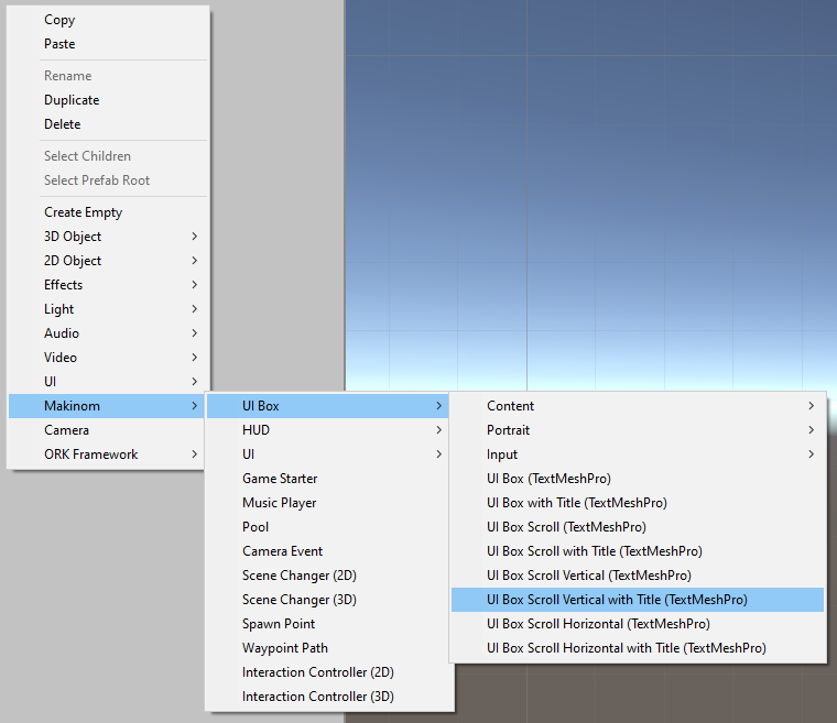
There are different variations available to create (all contain the main text content and use a Vertical Layout Group to arrange the content):
- UI Box
Creates a basic UI box.
E.g. when you just need a UI box to display text without scrolling. - UI Box with Title
Creates a basic UI box with an additional title box. - UI Box Scroll
Creates a UI box with scrolling (both vertical and horizontal are enabled). - UI Box Scroll with Title
Creates a UI box with scrolling (both vertical and horizontal are enabled) and an additional title box. - UI Box Scroll Vertical
Creates a UI box with scrolling (vertical only). - UI Box Scroll Vertical with Title
Creates a UI box with scrolling (vertical only) and an additional title box. - UI Box Scroll Horizontal
Creates a UI box with scrolling (horizontal only). - UI Box Scroll Horizontal with Title
Creates a UI box with scrolling (horizontal only) and an additional title box.
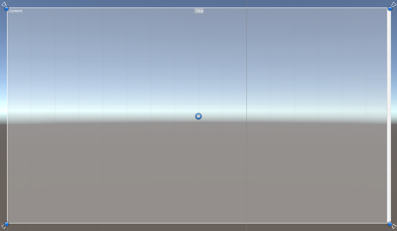
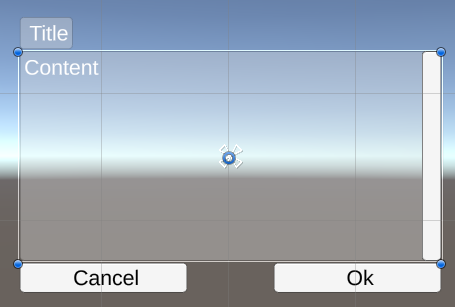
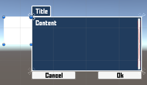
We’ll create a UI Box Scroll Vertical with Title, as that’s the most useful out of all of them. The title box will be hidden when no title is displayed, and the vertical scrollbar is only visible when there is content to scroll.
This will create a UI box setup like this:

And that’s pretty much all you need – you can already make a prefab out of the UI Box game object (i.e. not the including Canvas) and use it.
Position and Size #
When using the UI box in-game, it’ll be placed according to the prefab’s position and size.
So, when creating (or editing) your prefab, move it to the position you want it to be and make it bigger or smaller to match the size you need. Please keep in mind to use a UI Environment scene for editing UI prefabs that matches your project’s Default Screen Size – see the initial setup tutorial for Unity UI module for details.
When dealing with possibly different aspect ratios in your game, make sure to use a correct anchor setup and pivot in the UI box’s Rect Transform component, e.g. anchoring it to the bottom center when the UI box is placed at the bottom center of the screen, using stretch anchor presets, etc.
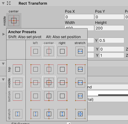
This ensures the UI box will be placed and scaled/stretched with your changing resolution and aspect ratios. This works like for any other UI in Unity (using the Unity UI system), so for more information on that topic, please refer to the Unity documentation.
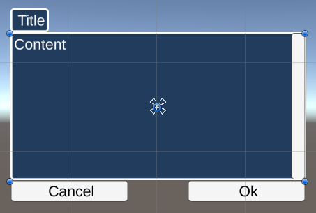
Initially created position, size and anchors:

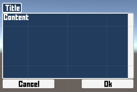
Stretching with height, placed at the left side on screen:

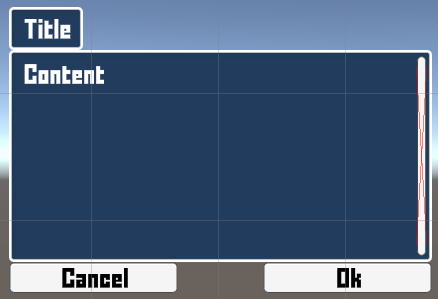
Anchored to the bottom center of the screen:

Or stretched with the whole screen:
You can also change the position, size, anchoring, etc. of the Title content – for this, just adjust this for the UI Box > Title Content child object.
Using the UI Box prefab #
The UI box prefab you created has to be selected by a UI box.
Navigate to UI > UI Boxes in the Makinom editor, select the UI box you want to use the prefab and change the following setting.
Unity UI #
- UI Box Prefab
Select the UI box prefab you want to use.
Don’t forget to save your changes using the Save Settings button at the bottom of the editor.
Reusing the UI Box prefab #
Need another UI box, but at a different position or size?
Copy the prefab #
Just copy the prefab you already created and adjust it to your needs.
Copying a prefab will create another original prefab (or variant of the same parent prefab) that you can adjust without having changes to the original interfere with your copy.
Create prefab variants #
You’ll often use the same UI box, just somewhere else on sceen, so don’t waste your time – make use of Unity’s prefab system, e.g. by creating multiple variants with different placement and size.
If you later want to change the background or used font or font size, you can adjust that in the original prefab and have the others update automatically (unless they override those settings).
Styling (optional) #
However, we’re here to learn, so let’s look into a few more details, styling the box a bit.
Adding Ok and Cancel Buttons #
You can add ok/cancel buttons to your UI box, they’ll e.g. be used to accept or cancel out of dialogues. This is completely optional, UI boxes can also be used without them, in which case they’re purely controlled via input keys.
Bring up the scene hierarchy context menu on the UI Box game object: Makinom > UI Box > Input (Button) > Ok+Cancel Buttons
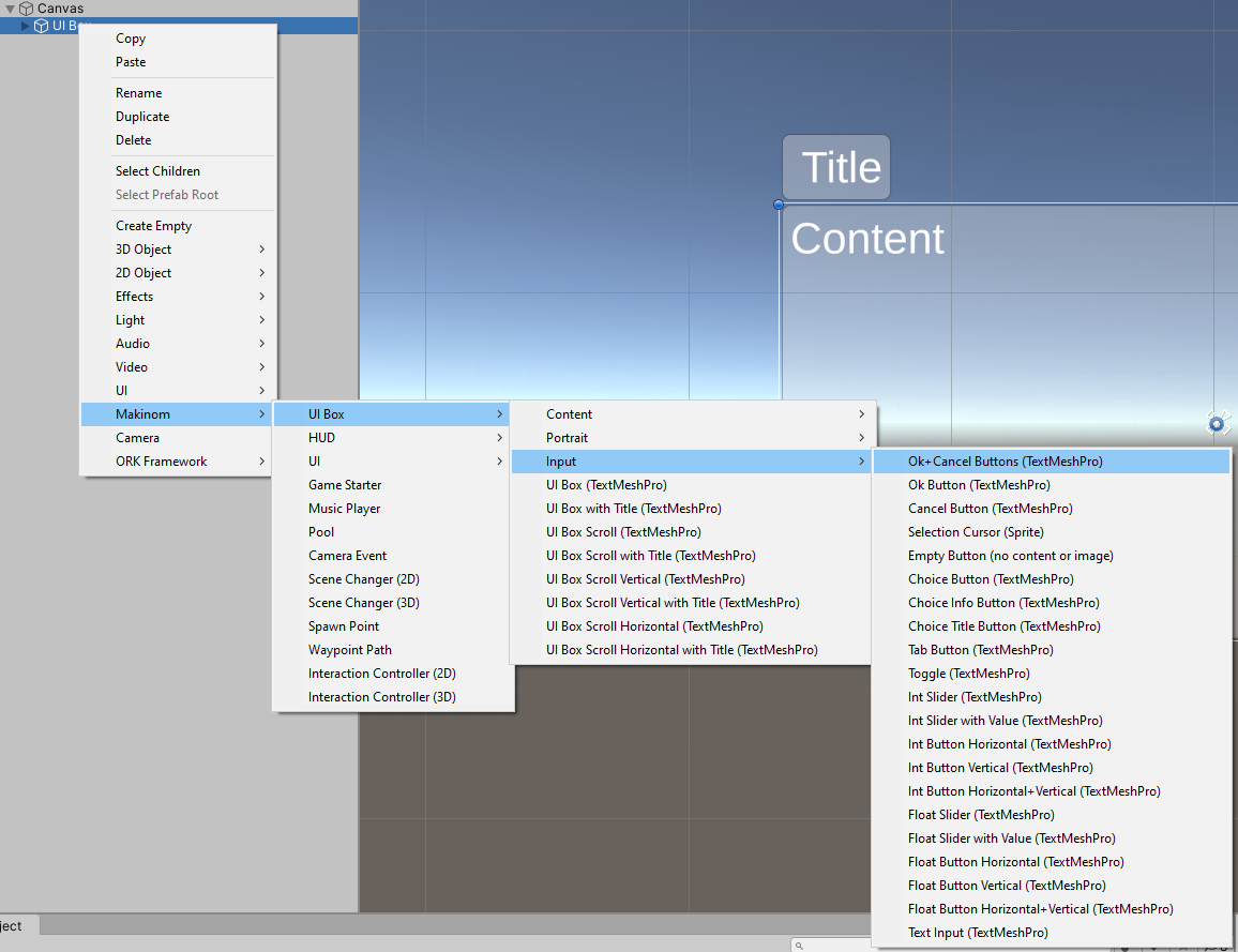
This’ll add those buttons at the bottom of the UI box and set them up in the UI Box component, making them ready to use. In their default setup they’re automatically hidden when the UI box displays multiple inputs (e.g. in a choice dialogue or menu).
You can now further style or place them as you want them to look.
Changing Background Images #
The content and title box use Image components with Unity’s default background image when created via the context menu.
You can simply change the used image to change the look, e.g. use the BoxBlue or BoxBeige image from the provided UI assets (see above). You’ll usually either use a sliced sprite (Polygon sprite mode with set up borders), or an image that matches the size of the box.
The content box background is handled by the Image component directly on the UI Box game object.
The title box background is handled by the Image component on the UI Box > Title Content game object.
Changing Text Formatting #
Text is displayed using TextMeshPro – Text (UI) components, i.e. whatever styling you want to use is set up in these components.
E.g. using the font provided by the TMP setup tutorial:
The main content is handled on the UI Box > Viewport > Content > Text game object (when not using scrolling the location will be a bit different).
The title content is handled on the UI Box > Title Content > Text game object.
The ok button is handled on the UI Box > Ok Button > Text game object.
The cancel button is handled on the UI Box > Ok Button > Text game object.
Tip!
If you often use the same font, set it up as TextMesh Pro’s Default Font Asset in the TMP Settings asset (should be located in Assets/TextMesh Pro/Resources/).
Padding #
Most of the layouting is handled by Layout Group components, e.g. the title uses a Horizontal Layout Group to horizontally arrange an (optional) icon and text, while the main content uses a Vertical Layout Group to arrange the text and any inputs that might be added in-game.
If you want to add padding to displayed content, e.g. the main content (text, inputs, etc.), that’s where you’d handle this.

The main content is handled on the UI Box > Viewport > Content game object (when not using scrolling the location will be a bit different).
The title content is handled on the UI Box > Title Content game object.
The ok button is handled on the UI Box > Ok Button game object.
The cancel button is handled on the UI Box > Ok Button game object.
Scrollbar #
You might also want to adjust the look or placement of the scrollbar.
E.g. make it slimmer and move it a bit inward. You can also change the used images of the different parts of the scrollbar.
This is handled by the Scrollbar component on the UI Box > Scrollbar Vertical game object.
Adding Other Content (optional) #
There are also other optional things you can add to the UI box.
Portraits #
Add portrait content to be able to display a portrait in the UI box, e.g. for a dialogue’s speaker.
Bring up the scene hierarchy context menu on the UI Box game object: Makinom > UI Box > Portrait > Portrait
There are different variations available:
- Portrait (Empty)
An empty portrait, e.g. when using prefabs as portraits for animated portraits. - Portrait (Sprite)
For sprite portraits. - Portrait (Texture)
For texture portraits.
You can also combine all 3 of them in a single portrait, just add an Image (sprite) or Raw Image (texture) component and reference it in the UI Portrait component that manages the portrait.
The first added portrait will be used as the main portrait. When addint more portraits, they’ll be added as additional portraits to the UI Box component’s settings.
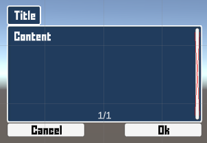
Page Info #
Add page information to show on which page (for multi-paged text) is currently displayed.
Bring up the scene hierarchy context menu on the UI Box game object: Makinom > UI Box > Content > Page Info
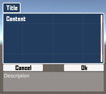
Description Content #
Add a description box to the UI box to automatically display the description content of a selected input.
Bring up the scene hierarchy context menu on the UI Box game object: Makinom > UI Box > Content > Description
Additional Content #
Additional content can be used to display different information in different parts of a UI box, this is available wherever content is displayed, e.g. the main content, title, individual buttons or other inputs. See the UI system overview for more details on additional content.
Bring up the scene hierarchy context menu on the UI Box game object (or wherever the additional content should be placed): Makinom > UI Box > Content > Additional Content
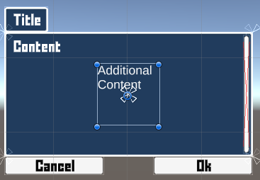
However, unlike all other setups so far, the additional content is not automatically added to the UI Box component setup.
Depending on where you want the additional content to be available, the settings are found at different places. For the main and title content, it’s on the UI Box component, for others (e.g. inputs) it’s usually on their own components.
E.g. to add an additional content to the main content, click on Add Additional Content on the UI Box component’s Content Settings > Main Content settings.
- Content ID
Define the content ID that’ll be used to show content on this additional content component. - Content Component
Select the additional content’s game object/component you added.
To display the additional content, whatever uses the UI box to display information needs to use the same Content ID when defining additional content.
Tabs #
You can add tab areas to the top or bottom of the UI box using the scene hierarchy context menu: Makinom > UI Box > Tab > Add Tabs Top or Add Tabs Bottom
There are variants with and without horizontal scrolling available.
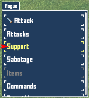
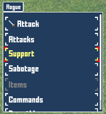
Selection Cursor #
Add a selection cursor that’ll be placed on the currently selected input using the scene hierarchy context menu: Makinom > UI Box > Input (Button) > Selection Cursor
The cursor is placed based on the cursor’s Rect Transform component’s anchor presets and the selected input. The default setup will place the cursor at the middle left edge of the selected input.
Additionally, the cursor’s game object can automatically adjust to the width and/or height of the selected input.
Tip: Animated Cursors
You can use animated selection cursors by having the actual cursor be a child object of the UI Selection Cursor component’s game object.
This allows you to move the cursor icon (or whatever else you use as cursor) without the placement interfering with it. E.g. use it to make the cursor fade a bit to the left and right.
Tip: Encompassing Cursors
You want the cursor to wrap around the whole selected input? Use the following setup:
In the Rect Transform component (to place the cursor at the center of the selected input):
- Anchor Presets
Use middle center anchor presets. - Pos X
Set to 0. - Pos Y
Set to 0.
In the UI Selection Cursor component (to adjust the cursor to the size of the selected input):
- Use Target Width
Enable this setting. - Use Target Height
Enable this setting.
You can further adjust the width/height of the cursor via the Additional Width and Additional Height settings.
Also, if you want to select inputs by clicking on them, you should disable the cursor from receiving raycasts in it’s Image component:
- Raycast Target
Disable this setting.
Otherwise the cursor image will intercept clicks on the selected input.
Using other input prefabs (optional) #
A UI Box component can replace the Default UI Prefabs (defined in UI > UI System in the editor) and use different prefabs to create inputs (buttons, toggles, sliders, etc.).
This is done in the Input Settings of the UI Box component.
For tab buttons, this is done in the Tab Buttons component.
Placed Inputs #
You can also use inputs (and tab buttons) already placed on your UI box prefab instead of creating inputs via prefabs.
For this, use the Add Placed Input button (in the Input Settings) or Add Placed Tab button (in the Tab Buttons settings) to add a placed input/tab. Next, select the input/tab you want to use.
Placed inputs are used in the order they’re added here. If the placed input’s type doesn’t match the displayed input, the placed input isn’t used, using a prefab instead – e.g. a placed button can’t be used for a displayed text field input.
Tip: Open/Close Animations via Schematics #
You can use UI schematics to animate opening and closing a UI box, e.g. fading it in/out or moving it in/out.
See this schematics tutorial to learn how to do this.


