
The UI system is modular and can be completely replaced with custom UI solutions.
See Makinom’s UI system documentation for all details and basics on the modular UI system.
ORK Framework’s UI is build upon Makinom’s UI system, i.e. the UI module set up in Makinom will also be used by ORK. ORK’s UI modules are imported into the Makinom 2 DLL folders:
- Assets/Gaming Is Love/Makinom 2/DLL/
- Assets/Gaming Is Love/Makinom 2/DLL/Editor/
They have to be in the same folder as ORK Framework’s and Makinom’s DLLs to ensure the correct compile order by Unity.
Currently, there’s only one UI module available (and included in a fresh import of ORK Framework): Unity UI, using Unity’s component based UI system.
See this UI tutorial for a detailed look at the initial setup for the Unity UI module.
UI Boxes #
ORK uses UI boxes to display content information and receive user input, e.g. accepting a dialogue, selecting something in a menu, etc.
Beside the same use as in Makinom (e.g. via dialogue nodes in schematics), ORK mainly uses UI boxes in menu screens, battle menus and the Console HUD type (instead of a regular HUD setup).
See Makinom’s UI Boxes documentation for general information on UI boxes. See this UI tutorial for an example UI box setup for the Unity UI module.
Buttons with Additional Content #
ORK often allows showing additional information in buttons, e.g. the quantity of a displayed item or use cost of an ability. Since you usually want this to not show alongside the regular text of the button, this’ll use Additional Content definitions.
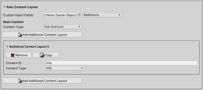
Additional content is identified via it’s Content ID – the content will be displayed by the UI system via a matching content ID setup. ORK’s default setup where such content is displayed will already have the additional content added. There are 2 types of additional content used in default setups:
- title
The title content ID is used by equipment and AI behaviour/ruleset menu screens to show the content information of equipment slots and AI slots alongside currently equipped equipment/AI. - info
The info content ID is used to show a content’s default information, e.g. for items it’s the quantity, for abilities the use costs, etc.
This is used in many UI settings, e.g. battle menus, inventory/ability/etc. menu screens or shops.
Unity UI Setup (on Button) #
Using the Unity UI module, a button uses the UI Button Input component, which has setup for referencing additional UI Content components. You can use the context menu in the scene hierarchy to quickly create buttons with info and title content information.
Create a button with info content ID: Makinom > UI Box > Input (Button) > Choice Info Button (TextMesh Pro)
Create a button with title content ID: Makinom > UI Box > Input (Button) > Choice Title Button (TextMesh Pro)
See Makinom’s Unity UI Module documentation for details on UI setup with the Unity UI.
Buttons with HUD Content #
You can often show additional information in buttons by using HUD content. This is done by either using a HUD as a template or by having a HUD setup directly on the used button (e.g. when using the Unity UI module, on the button’s prefab).
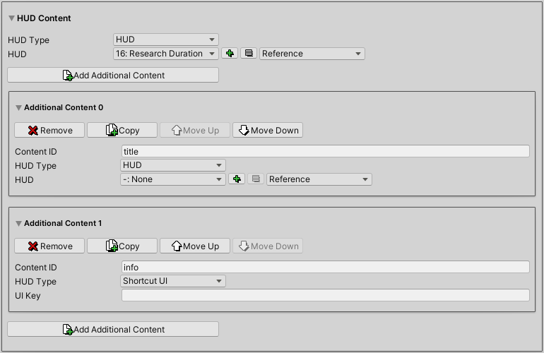
Using a HUD as a template is pretty straight forward – you select the HUD you want to use and it’ll be added to the button when the UI is created.
Using a HUD setup on the button depends on the used UI module. For the in-ORK setup however, you need to still use a HUD like when using a template, but select the -: None HUD instead.
There’s sometimes a 3rd option available, using a Shortcut UI setup of the displayed content. This is only available when something from shortcuts is displayed, e.g. the inventory menu screen. Shortcuts are instances of items, abilities and other (potentially) usable things.
Unity UI Setup (on Button) #
Any HUD component that displays information is getting the content from a HUD Content Provider component (e.g. the HUD component at the root of each HUD is also a HUD Content Provider component).
To use HUD components on a button, you need to add a HUD Content Component to it and reference it in the UI Content component that should fill it with content (i.e. you can also use additional content to display different HUD content). It doesn’t matter where in the button’s hierarchy the component is added, as long as it’s referenced by a UI Content component that’s used by the button to display content information.
HUDs #
HUDs are used to display information to the player, e.g. the player or player group’s status, available interactions, quests, virtual controls, etc.
See Makinom’s HUDs documentation for general information on HUDs.
HUD Types #
ORK adds HUD types for different purposes to Makinom. Depending on the used UI module you’ll be able to mix functionality of different HUD types, e.g. the Unity UI module can mix individual components together as needed.
When using the Unity UI module, the actual HUD content setup is handled via components – you’ll create and design your HUD in the scene view like you’d create any other UI in Unity. The context menu in the scene hierarchy has many useful commands to create HUDs: ORK Framework > HUD > …
Battle Actions #
Displays battle actions registered with the system, e.g. scheduled, casting and active actions.
Each action is displayed in it’s own individual HUD. For an example, check out this Unity UI tutorial.
Combatant #
Displays information about combatants.
Each combatant is displayed in it’s own individual HUD. For an example, check out this Unity UI tutorial.
Combatant Object #
Displays information about combatant at the position of the combatant’s game object.
Each combatant is displayed in it’s own individual HUD.
Console #
Displays the in-game console. The general console setup is handled in UI > Console Settings & Types.
Console type HUDs use a regular UI box to display content.
Latest Turn #
Displays the combatant that has the latest turn until the next combatant’s turn comes up.
The HUD will only be displayed in running battles.
Navigation Bar #
This HUD type is already available in Makinom and displays a navigation bar, e.g. cardinal directions, nearby interactions, etc.
ORK adds the Combatant navigation point type to display nearby combatants in the navigation bar.
Object #
Displays information at the position of a game object.
Quest #
Displays a list of quests, their tasks and requirements. Quest task requirements can also display their quantities using value bars.
Learn more about setting up quest content in a HUD in this documetation.
For an example, check out this Unity UI tutorial.
Timebar #
Displays a timebar with individual HUDs for each combatant, moving along the timebar to represent their current timebar value. The HUD is only visible during battles using the Active Time type battle system.
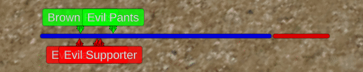
Learn more about setting up a timebar HUD in this documentation.
Turn Order #
Displays the turn order of Turn Based battles (i.e. the order in which combatants perform their actions).
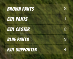
The HUD will only be displayed in running Turn Based battles.
HUDs as Templates #
You’ll often use a HUD as a template, e.g. to add content information to a button or provide combatant information in menus.
When a HUD is only used as a template, make sure to disable Auto Display in the HUD’s settings. You can also ignore any display conditions and other settings of the HUD that doesn’t relate to displayed content. E.g. a Combatant type HUD doesn’t have to define for which combatants (player, enemy, etc.) it’d be dispalyed when used as a template.
Unity UI Setup #
Using the Unity UI module, the HUD’s prefab has to have either a HUD or a HUD Content Provider component at the prefab’s root.
The HUD’s prefab will be spawned by the UI Content component that displays the HUD template, e.g. the main content of a UI box or the content of a button.


