
Create a battle actions HUD using the Unity UI module.
In this tutorial we’ll create a Battle Actions type HUD to display the battle actions that have been registered with the system. I.e. it’ll list all active, casting or scheduled actions that have been selected by combatants in battle, in the order they are used. A battle actions HUD is probably best suited for Classic mode turn based battles, but can be used in any battle system (and the field).
Similar to a Turn Order or Combatant type HUD, each battle action will be displayed by it’s own individual HUD. We’ll arrange them using a UI layout.
Your project’s UI system should already be set to use the Unity UI module. If not, check the initial setup tutorial for the Unity UI module. The Unity UI module will create the HUDs for the individual battle actions using prefabs.
This tutorial is based on the 2D RPG Quickstart and 3D RPG Quickstart tutorial series, but you can use this for any kind of project.
You can download the completed HUD setup here:
This contains the action HUD prefab as well as the used images and font. You still need to set up the UI layout and HUD in the editor (using the action HUD prefab).
HUD Prefab Setup #
We’ll start with setting up the prefab that’ll be used to create each battle action’s HUD.
You can do this in any scene, but it’s best to do it in a separate scene (e.g. the UI Environment scene you set up in the initial UI setup) to not mess with your game’s scenes.
Creating the HUD #
We use the scene hierarchy’s context menu to create our base HUD: Makinom > HUD > HUD (Vertical Layout)
This creates an empty HUD with a vertical layout. We use a Vertical Layout Group to arrange the HUD’s content in a vertical list.
Rect Transform #
We adjust the width of the HUD.
- Width
Set to 200.
Content Size Fitter #
We’ll add a Content Size Fitter to the HUD to make it adjust it’s size to the displayed content.
- Vertical Fit
Select Preferred Size.
Image (Optional) #
We’ll add an Image component to display a background image in the HUD.
- Source Image
Select the Sprite you want to use, e.g. the BoxBeige from the UI assets (see the initial setup tutorial). - Color
Select a color you want to use (optional).
E.g. for the BoxBeige sprite, a white color with full alpha.
Add Action Content #
Now that we’ve got our basic HUD, it’s time to add content to it.
We’ll make it simple by adding all information we want in a single text (and icon) – we’ll display the action’s icon, the name of the user, the name of the action and the name of the target(s).
We’ll add an ORK HUD Status Text Content to display text and icon. See this documentation for details.
Use the scene hierarchy’s context menu on the HUD game object to add the text and icon content: ORK Framework > HUD > Content > Status Text+Icon Content
This adds the content as a child object of the HUD, with icon and text being child objects the content object (in a horizontal layout).
We’ll only need to do two things now – set up our text and add a desired size to the icon.
ORK HUD Status Text Content #
We’ll start with the ORK HUD Status Text Content component added on the HUD > Status Content child object. This component defines the content that’ll be displayed.
- Status Type
Select Action Information.
This content shows information of a battle action, the action has to be provided by the HUD or a content provider used by the component.
We’ll use the HUD prefab in a Battle Actions HUD, so this is done automatically for us. - Use Content Icon
Enable this setting.
This should be the default setup – it’ll use the icon of the displayed content instead of any icon that’s defined in the component.
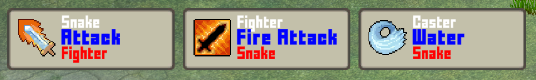
The text will add all the content we want, using text codes to alter the size and color of the individual parts.
- Text (Default Content)
Set the text to: <size=12px><color=#FFFFFFFF><username></color></size>
<size=15px><b><color=#0000FFFF><name></color></b></size>
<size=12px><color=#FF0000FF><targetnames></color></size>
The first line shows the name of the action’s user in white text with font size 12.
The 2nd line shows the name of the action in bold, blue text with font size 15.
The 3rd line shows the names of the targets in red text with font size 12. The <targetnames> text code is used to display the name of one or more targets – how this is done is defined in UI > Text Display Settings in the Combatant Texts > Combatant Name List settings and defaults to separating them by a comma.
Icon #
Next, we’ll set the icon to use a size of 50×50. Select the HUD > Status Content > Image child object.
Add a Layout Element component using the component menu.
- Preferred Width
Enable this setting and set the value to 50. - Preferred Height
Enable this setting and set the value to 50.
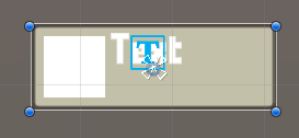
The finished HUD will look like this.
Create Prefab #
You might be wondering about the placement of the HUD. We’ll use a UI Layout to handle this, but you can also use the actual HUD game object’s position if you want. In that case, place the HUD on the canvas where you want it to display.
That’s already everything we need to do. Create a prefab out of the HUD, e.g. save it as Action HUD.
In case you did the setup in one of your game scenes (and not the UI Envirnoment scene), don’t forget to remove the canvas from the scene.
HUD Setup #
With our prefab set up we can finish the setup in the Makinom editor.
We’ll set up the UI layout that’ll arrange the HUDs for multiple actions and the actual HUD.
UI Layout #
Open the Makinom editor and navigate to UI > UI Layouts, we’ll add a new layout.
UI Layout Settings #
- Name
Set to Battle Actions. - Layout Type
Select List.
List Layout Settings #
- Anchor
Select Upper Left. - Padding
Set to X=10, Y=10, Z=0, W=0. - Spacing
Set to 10. - List Fill
Select Horizontal. - Fill Anchor
Select Upper Left.
Move Settings #
- Use Move
Enable this setting. - Time
Set to 0.2. - Interpolation
Select Quadratic > Quadratic In + Out.
Battle Action HUD #
Next, we’ll set up the HUD. Navigate to UI > HUDs, add a new HUD and change the following settings.
HUD Settings #
- Name
Set to Battle Actions. - HUD Type
Select Battle Actions. - Auto Display
Enable this setting.
Battle Actions Settings #
- Show Active Actions
Enable this setting. - Show Casting Actions
Enable this setting. - Show Scheduled Actions
Enable this setting. - Player/Ally/Enemy
Enable these settings.
We’ll show the actions of all combatants involved in battle. - Multi-Box Layout
Select UI Layout. - UI Layout
Select Battle Actions (the UI layout we just created). - Shared Layout
Enable this setting.
It’s usually a good idea to used shared layouts – in case the UI layout is used for multiple things, all content will share the same instance, being arranged together.
Otherwise this HUD will create it’s own instance of the layout, if other UI uses the same layout, it’ll use a different instance and not arrange together.
Display Conditions > Action Checks #
We’ll exclude counter attacks and death actions from being displayed.
Click on Add Action Check.
- Action Type
Select Counter Attack. - Is Valid
Disable this setting.
Copy the previous action check and change the used action type.
- Action Type
Select Death.
Display Conditions > Game State Conditions (Optional) #
I’ll also limit the HUD to be only displayed in battle. Otherwise the HUD would be available at all times, e.g. also when using items or abilities in the field.
Click on Add Game State.
- Condition Type
Select Game State. - Game State
Select In Battle. - Check State
Select Active.
Unity UI #
- UI Layer
Select HUD (or any other layer you want to use). - HUD Prefab
Select the Action HUD prefab we just created.
Schematics (Optional) #
I’m also using the fade in and fade out schematics from the UI animations schematics to animate the HUD.
- Own Schematics
Enable this setting. - Before Open Schematic
Select the UIFadeIn schematic. - Wait
Enable this setting. - Before Close Schematic
Select the UIFadeOut schematic. - Wait
Enable this setting.
Save Changes #
And that’s it!
Don’t forget to save your changes by clicking on Save Settings at the bottom of the editor.
Testing #
Hit play and test your HUD in battle.
Actions are listed after they’ve been selected and are gone after they’re finished.
Great!
Tip! Detailed User/Target Information #
You can add more detailed information on the user and target(s) of an action by getting the user/target via a content provider or listing targets via a list component.
The HUD Action Combatant (Content Provider) component can be used to get the user or (single/first) target of a battle action (again, provided by another content provider like the HUD component at the HUD’s root). Other HUD components using the HUD Action Combatant as their content provider can show combatant information (e.g. status values) like a regular combatant HUD.
Use the HUD Action Target List component to list the targets of an action (not a content provider). This works similar to a status value or quest list, i.e. it’ll use a provided prefab to create content for the individual targets of the action.
Tip! Listing a Combatant’s Actions #
You can list the actions of a combatant (either the combatant being the user or a target of the actions), e.g. in a Combatant type HUD.
The HUD Combatant Action List component will list all found actions, creating them using a provided prefab.


