
In this tutorial we’ll set up a HUD to display the player’s status information during battle.
The HUD will show the status effects added to the player, the combatant’s name and their current HP and MP. Since we’ll add a 2nd player combatant later, the HUD will be displayed using a UI layout and list them vertically in the bottom right corner of the screen.
We’ll set up multiple things for this:
- status value UI
- status effect UI
- HUD prefab
- HUD setup
Let’s get to it!
Status Value UI Prefab #
First, we’ll set up the status value UI for our status values – a way to define how a status value should be displayed in the UI. You can learn more about status value UI in this documentation.
We’ll create a UI that shows the status value’s name on the left side, it’s current value at the right side and a value bar below the text. The value bar uses a sprite and fills it according to the status value’s filled state.
As with all content when using the Unity UI module, we’ll set up a prefab for that. It’s best to do this in the UI Environment Scene, so open it.
We can create a ready-to-use setup using the scene hierarchy’s context menu: ORK Framework > HUD > Status Value > Status Value – Name+Value+Bar (for prefabs)
Rect Transform #
We’ll change the size of the Status Value game object.
- Width
Set to 400. - Height
Set to 40.
Layout Element #
We’ll display our status values in a horizontal list and want them to stick to the size we defined, so we need to make sure by using a Layout Element component.
Add a Layout Element component using the component menu.
- Preferred Width
Enable this setting.
Set the value to 400. - Preferred Height
Enable this setting.
Set the value to 40.
Name #
The Status Value > Name child object contains the setup to display the name on the left side. This is handled by the ORK HUD Status Text Content component, which is the go-to component for all status-related HUD displays.
The actual display of the content is handled by Image and TextMeshPro – Text (UI) components, i.e. similar to the UI boxes and input prefabs.
Value #
The Status Value > Value child object contains the setup to display the value on the right side. It works the same way as the Name.
Value Bar #
We’ll adjust the value bar to only be displayed at the bottom of the status value UI.
Select the Status Value > Value Bar child object.
Rect Transform #
The value bar uses a stretch stretch anchor preset, i.e. it’ll stretch to the width/height of the parent game object.
We’ll add a padding to the top, to have the bar only at the bottom.
- Top
Set to 35.
ORK HUD Value Bar Content #
This component handles what’s displayed by the value bar.
HUD Value Bar (Sprite) #
This component handles actually displaying the value bar via multiple Image components (on child objects).
We need to set the sprite used by those components.
Empty Sprite #
Select the Status Value > Value Bar > Empty Sprite child object.
This is used to display the empty part of the value bar.
- Source Image
Select the White_16x16 sprite.
You can find it in Assets/Tutorial Assets/Images/UI/. - Color
Set to a black color with full alpha (A=1 or A=255, depending on the color picker).
Value Sprite #
Select the Status Value > Value Bar > Value Sprite child object.
This is used to display the filled part of the value bar.
- Source Image
Select the White_16x16 sprite.
You can find it in Assets/Tutorial Assets/Images/UI/. - Color
Set to a white color with full alpha (A=1 or A=255, depending on the color picker).
The Value Sprite‘s image type should be set to Filled, this enables the value display to fill the sprite according to the value that’s displayed.
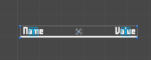
The finished status value UI should look like this:
Create Prefab #
Create a prefab out of the Status Value game object by dragging it on the project view. Rename the prefab to Status Value UI.
Remove the game object from the canvas.
Status Effect UI #
Next, we’ll set up the status effect UI for our status effects – a way to define how a status effect should be displayed in the UI. You can learn more about status effect UI in this documentation.
We’ll create a UI that shows the status effect’s icon and it’s duration at the bottom.
Again, we can use the scene hierarchy’s context menu for a quick setup: ORK Framework > HUD > Status Effect > Status Effect Content+Duration (for prefabs)
Rect Transform #
We’ll change the size of the Status Effect Content game object.
- Width
Set to 40. - Height
Set to 40.
Layout Element #
Like with the status value UI, we want to make sure the size is used when displayed in a layout component list.
Add a Layout Element component using the component menu.
- Preferred Width
Enable this setting.
Set the value to 40. - Preferred Height
Enable this setting.
Set the value to 40.
Name #
The created setup also displays the name of the effect – we don’t want that.
Remove the Status Effect Content > Content > Text child object.
Duration Text #
Select the Status Effect Content > Duration Text child object.
This is set up to display the duration of the status effect at the bottom center of the effect’s UI. That’s fine for us, but we still want to adjust the text size and color.
TextMeshPro – Text (UI) #
We can adjust this in the TMP component (as usual).
- Font Size
Set to 12. - Vertex Color
Select a red color. - Wrapping
Select Disabled.
This prevents a longer text from being wrapped when exceeding the available space.
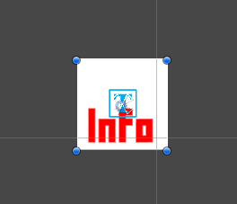
The finished status effect UI should look like this:
Create Prefab #
Create a prefab out of the Status Effect Content game object by dragging it on the project view. Rename the prefab to Status Effect UI.
Remove the game object from the canvas.
Battle HUD Prefab #
Next, we’ll set up our actual HUD prefab.
The HUD should list the combatant’s currently applied status effects, name, HP and MP and allign all of them horrizontally.
Base HUD #
Create the base of the HUD using the scene hierarchy’s context menu: Makinom > HUD > HUD (Horizontal Layout)
Rect Transform #
Since we’ll use a UI layout to list the HUD for multiple (player) combatants, we don’t have to worry about the position of it, but we need to set the size.
- Width
Set to 1325. - Height
Set to 60.
Horizontal Layout Group #
We’ll adjust the padding, spacing and child alignment.
- Padding
Set to Left=10, Right=10, Top=10, Bottom=10. - Spacing
Set to 10. - Child Alignment
Set to Middle Left.
Image #
Add an Image component using the component menu – we’ll use it to add a blue background to the HUD.
- Source Image
Select the BoxBlue sprite.
You can find it in Assets/Tutorial Assets/Images/UI/.
Status Effects #
The first information in the HUD (listed from the left side) will be the status effects.
HUDs can list them using a HUD Status Effect List component. It’ll use the status value UI to create prefabs (as child objects of the list) for individual status effects.
We can add a setup using the scene hierarchy’s context menu: ORK Framework > HUD > Status Effect > Status Effect List (Horizontal Layout)
HUD Status Effect List #
We’ll adjust how the effects are listed – we’ll limit the display to 4 effects at a time.
The status effects are displayed using status effect UI, where you can set up different versions using UI keys. We’ll only have the one version we created earlier (still need to set it up in the editor), so we’ll use an empty UI key to use the default/standard setup we’ll set up.
- Count Limit
Select Defined. - Max Count
Set to 4. - UI Key
Leave empty.
The UI key defines which status effect UI is used.
Horizontal Layout Group #
We’ll change it to fill the layout from the right side.
- Child Alignment
Select Middle Right.
Layout Element #
Add a Layout Element component using the component menu.
We’ll use it to set the size of the status effect list – otherwise it’d be determined by the parent HUD’s layout group.
- Preferred Width
Enable this setting.
Set the value to 175. - Preferred Height
Enable this setting.
Set the value to 40.
Name #
Next, we’ll add the combatant’s name.
Use the scene hierarchy’s context menu on the root HUD game object to add a status text content: ORK Framework > HUD > Content > Status Text Content
This’ll add a text-only content, without any icon/image setup.
ORK HUD Status Text Content #
This component handles the text content that’s displayed – the standard setup already shows the combatant name, but let’s look into it anyway.
- Status Type
Select Combatant Information.
This type is used to display different content about a combatant. - Default Content (Text)
Set to: <name>
TextMeshPro – Text (UI) #
We’ll adjust the alignment of the text to keep it in the (vertical) center.
- Alignment
Select Left and Middle alignment.
Layout Element #
Add a Layout Element component using the component menu.
We’ll use it to set the size of the name – otherwise it’d be determined by the parent HUD’s layout group.
- Preferred Width
Enable this setting.
Set the value to 300. - Preferred Height
Enable this setting.
Set the value to 40.
Status Values #
And finally, we add the status values (HP and MP) – we’ll use a HUD Status Value List component for this, similar to the status effects.
The status value UI will be used to create prefabs of the individual status values as child objects of the list.
Add a horizontal status value list using the scene hierarchy’s context menu on the root HUD game object: ORK Framework > HUD > Status Value > Status Value List (Horizontal Layout)
HUD Status Value List #
We’ll select which status values will be listed – the Consumable status values HP and MP.
The status values are displayed using status value UI, where you can set up different versions using UI keys. We’ll only have the one version we created earlier (still need to set it up in the editor), so we’ll use an empty UI key to use the default/standard setup we’ll set up.
- List Status Values
Select Status Value Type. - Status Value Type
Select Consumable. - UI Key
Leave empty.
The UI key defines which status value UI is used.
Horizontal Layout Group #
We’ll change the spacing to use the same as the root HUD.
- Spacing
Set to 10.
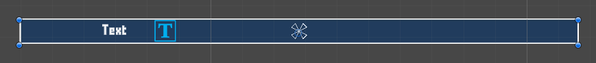
The finished HUD should look like this:
Create Prefab #
Create a prefab out of the HUD game object by dragging it on the project view. Rename the prefab to Player Battle HUD.
Remove the game object from the canvas.
UI Setup #
We still need to set up the status value UI, status effect UI and HUD in the editor.
UI Settings #
We’ll start with the status value/effect UI.
Open the Makinom editor and navigate to UI > UI Settings.
ORK Settings > HUD Settings > Default Status Value UI #
These settings define the default status value UI for all status values. Individual status values can replace them with their custom setup.
- UI Prefab
Select the Status Value UI prefab.
This is prefab is used if an empty UI key is used or no prefab is found for a defined UI key.
ORK Settings > HUD Settings > Default Status Effect UI #
These settings define the default status effect UI for all status effects. Individual status effects can replace them with their custom setup.
- UI Prefab
Select the Status Effect UI prefab.
This is prefab is used if an empty UI key is used or no prefab is found for a defined UI key.
UI Layout #
Next, we’ll set up the UI layout we’ll use to list our HUDs. The layout will list them horizontally in the lower right corner.
Navigate to UI > UI Layouts and change the Default layout.
UI Layout Settings #
- Name
Set to: Player Battle HUD - Layout Type
Select List.
List Layout Settings #
We’ll invert the displayed content, i.e. the first will be at the bottom of the screen, adding them upwards.
This will fit how your player combatants are ordered on screen due to their battle spots.
- Anchor
Select Lower Right. - Padding
Set to X=0, Y=0, Z=10, W=10.
This’ll add a padding to the bottom and right side of the screen. - Spacing
Set to 20.
This is the spacing between UI elements displayed using this layout. - List Fill
Select Vertical. - Invert
Enable this setting.
HUDs General Settings #
Next, we set up the default schematics for animating opening and closing our HUDs.
Navigate to UI > HUDs > General Settings.
Default Schematic #
- Before Open Schematic
Select the UIFadeIn schematic. - Wait
Enable this setting. - Before Close Schematic
Select the UIFadeOut schematic. - Wait
Enable this setting.
Player Battle HUD #
And lastly, we set up the actual HUD.
Navigate to UI > HUDs and select the Default HUD.
HUD Settings #
- Name
Set to: Player Battle - HUD Type
Select Combatant.
I.e. the HUD will be displayed for defined combatants, one HUD for each.
The combatant will be set as the content of the HUD, which is used by the components on our prefabs to display content. - Auto Display
Enable this setting.
This will automatically show the HUD. If you use a HUD only as a template, make sure to disable this setting.
Combatant Settings #
- Player
Enable this setting. - Player Group Scope
Select Battle.
This will show the battle group members of the player group. - Multi-Box Layout
Select UI Layout. - UI Layout
Select Player Battle HUD. - Shared Layout
Enable this setting.
In case different HUDs use the same layout, this option allows them to share the same layout, mixing them together.
Display Conditions > Game State Condition #
We’ll use the game state Show Battle HUD we set up earlier (and which is set by our battle start/end schematics).
The HUD will only be displayed when the game state is active.
Click on Add Game State.
- Condition Type
Select Game State.
We’ll directly check a game state instead of e.g. a template. - Game State
Select Show Battle HUD. - Check State
Select Active.
Unity UI #
- UI Layer
Select HUD.
We set up the layer earlier. - HUD Prefab
Select the Player Battle HUD prefab.
Save Changes #
And that’s it!
Save the changes using the Save Settings button at the bottom of the editor.
Testing #
Open the Forest (or Town) scene and hit play. Run around to start a random battle.
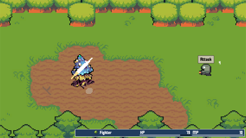
The HUD is displayed during battles – the status updates according to what happens, giving us some insight in the player’s state.
Everything works, great!
Next, we’ll add elemental attacks for the player.


