
In this tutorial we’ll set up HUDs we’ll use as templates.
This tutorial continues the sub-series for setting up menu screens.
HUDs can be used as templates to be added to UI boxes (either directly or on buttons) – we’ll make use of this to display status information of our combatants in different ways.
First, we’ll set up additional Status Value UI setups (see this documentation for details):
- experience with value bar (just a variation of our already created HP/MP UI)
- name and value (no bar)
- name and value (no bar) with preview values to show how equipment changes the status values
Afterwards, we’ll set up 3 HUD templates:
- template similar to the player HUD, but with different layout
- another variant of this, but including experience bar
- listing all Normal type status values (for equipment change previews)
We’ll also set up an empty button prefab we’ll use in our menus to display a HUD template.
Let’s get to it!
Status Value UI Prefabs #
We’ll start with the status value UI prefab setup.
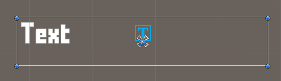
Experience #
This one will be easy – duplicate the Status Value MP prefab, open it for editing and change the following settings.
Image #
Select the Status Value > Value Bar > Value Sprite child object and change the Image component.
- Color
Select a yellow color with full alpha (e.g. A=255 or 1, depending on your color picker).
Exit the prefab editing and rename the prefab, e.g. name it Status Value EXP.
Normal (No Bar) #
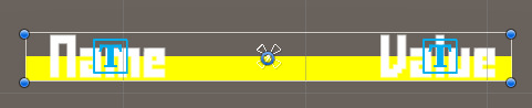
This’ll be used to display the name and value (without maximum value) of a status value, e.g. for listing normal status values.
Duplicate the Status Value HP prefab – i.e. the original, not variant prefab. Open it for editing and change the following settings.
Value Bar #
Remove the Status Value > Value Bar child object.
Value #
Select the Status Value > Value child object, we’ll adjust the text of the ORK HUD Status Text Content component.
- Default Content (Text)
Set to: <value>
Exit the prefab editing and rename the prefab, e.g. name it Status Value.
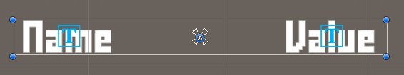
Normal Preview (No Bar) #
This’ll be used to additionally show previews for status value changes, e.g. when selecting equipment.
Duplicate the Status Value prefab we just created, open it for editing and change the following settings.
Name #
Select the Status Value > Name child object, we’ll change settings in the ORK HUD Status Text Content component.
- Value Origin
Select Preview. - Use Preview Blink
Disable this setting. - Default Content (Positive Preview Text)
Set to: <color=#00FF00FF><shortname></color> - Default Content (Negative Preview Text)
Set to: <color=#FF0000FF><shortname></color>
Value #
Select the Status Value > Value child object, we’ll change settings in the ORK HUD Status Text Content component.
- Value Origin
Select Preview. - Use Preview Blink
Disable this setting. - Default Content (Positive Preview Text)
Set to: <color=#00FF00FF>(+<change>) <value></color> - Default Content (Negative Preview Text)
Set to: <color=#FF0000FF>(<change>) <value></color>
Exit the prefab editing and rename the prefab, e.g. name it Status Value Preview.
That’s it for the status value UI prefabs.
Combatant Info HUD Prefab #
Now, we’ll set up our first template HUD, we’ll use it as information in some menu screens, as well as the content for buttons in combatant selections (e.g. also for target selection in battle menus).
The HUD will display the combatant’s icon, name, level, HP, MP and status effects.
Create a new HUD using the scene hierarchy context menu: Makinom > HUD > HUD (Horizontal Layout)
HUD #
We’ll adjust the root HUD game object.
Rect Transform #
- Width
Set to 300.
This is just for making editing a bit easier and things better visible.
The actual width of the HUD will be set whatever is displaying it, e.g. a UI box or input button.
UI Color Changer #
Remove the UI Color Changer component.
Usually, we’ll want this added to be able to change the color of the HUD, but this HUD is used as a template and displayed by UI boxes or inputs on them.
When used on inputs, the UI Color Changer of the HUD would interfere with the input’s color changer, preventing from using the input’s color for selection highlighting.
Content Size Fitter #
Add a Content Size Fitter component and change the following setting.
- Vertical Fit
Select Preferred Size.
Icon #
Use the context menu on the HUD game object to add a content icon: ORK Framework > HUD > Content > Status Icon Content
Layout Element #
Add a Layout Element component to the icon’s game object and change the following settings.
We’ll use the size of our combatant icons as preferred width/height.
- Preferred Width
Enable this setting.
Set the value to 128. - Preferred Height
Enable this setting.
Set the value to 128.
Child Object #
Add an empty child object to the HUD game object and rename it to e.g. Status Information. We’ll use this to list the combatant’s status information vertically beside the icon.
Add a Vertical Layout Group component to the child object and change the following settings.
- Spacing
Set to 5. - Control Child Size
Enable Width and Height. - Child Force Expand
Enable Width.
Disable Height.
Status Text #
Use the context menu on the Status Information child object to add a content text: ORK Framework > HUD > Content > Status Text Content
ORK HUD Status Text Content #
- Default Content (Text)
Set to: <name>, Level <level>
TextMesh Pro – Text (UI) #
Adjust the text to your liking, e.g. I’m using a font size of 20.
Status Value List #
Use the context menu on the Status Information child object to add a status value list: ORK Framework > HUD > Status Value > Status Value List (Vertical Layout)
HUD Status Value List #
- List Status Values
Select Status Value Type. - Status Value Type
Select Consumable. - UI Key
Nothing defined here (empty text).
Status Effect List #
Use the context menu on the Status Information child object to add a status effect list: ORK Framework > HUD > Status Effect > Status Effect List (Grid Layout)
HUD Status Effect List #
We’ll stick with the default setup here.
Grid Layout Group #
- Cell Size
Set to X=50, Y=50. - Spacing
Set to X=5, Y=5.

Create Prefab #
That’s it for this HUD prefab – create a prefab out of it, e.g. name it Combatant Information HUD.
Combatant Info EXP HUD Prefab #
With the HUD still open, we’ll now make a small adjustment and create another prefab.
HUD Status Value List #
Select the HUD > Status Information > Status Value List child object and change the following settings in the HUD Status Value List component.
- List Status Values
Select Defined.
We’ll now define which status values are displayed – this way we can mix different types. Change the already added Status Value 0.
- Status Value
Select Health Points.
Click on Add Status Value.
- Status Value
Select Magic Points.
Click on Add Status Value.
- Status Value
Select Experience.
Create Prefab #
That’s it for this HUD prefab – create a new prefab out of it, e.g. name it Combatant Information EXP HUD.
Status Value Preview HUD #
Now, we’ll create a new HUD that’ll list all Normal type status values to show preview values.
Create a new HUD using the context menu: Makinom > HUD > HUD (Vertical Layout)
HUD #
We’ll adjust the root HUD game object.
Rect Transform #
- Width
Set to 300.
This is just for making editing a bit easier and things better visible.
The actual width of the HUD will be set whatever is displaying it, e.g. a UI box or input button.
UI Color Changer #
Remove the UI Color Changer component.
Vertical Layout Group #
- Spacing
Set to 20.
Content Size Fitter #
Add a Content Size Fitter component and change the following setting.
- Vertical Fit
Select Preferred Size.
Status Text #
Use the context menu on the HUD game object to add a content text: ORK Framework > HUD > Content > Status Text Content
ORK HUD Status Text Content #
- Default Content (Text)
Set to: <name>, Level <level>
TextMesh Pro – Text (UI) #
Adjust the text to your liking, e.g. I’m using a font size of 20.
Status Value List #
Use the context menu on the HUD game object to add a status value list: ORK Framework > HUD > Status Value > Status Value List (Vertical Layout)
HUD Status Value List #
- List Status Values
Select Status Value Type. - Status Value Type
Select Normal. - UI Key
Set to preview.
We’ll use this UI key to set up the preview status value UI.
Vertical Layout Group #
- Spacing
Set to 10.
Create Prefab #
That’s it for this HUD prefab – create a new prefab out of it, e.g. name it Status Value Preview HUD.
Empty Button Prefab #
As our last prefab, we’ll set up the empty button – but we’ll not use the Empty Button variant from the context menu, as we still want the button to have an image, just no content.
Use the scene hierarchy context menu to create a button: Makinom > UI Box > Input (Button) > Choice Button
Remove Child Objects #
Remove the Image and Text Child objects from the button.
Image #
Select the Choice Button game object and change the Image component.
- Source Image
Select Button Simple.
Layout Element #
- Preferred Height
Set to 50.

Create Prefab #
That’s it for this button prefab – create a prefab out of it, e.g. name it Empty Button.
HUD Setup #
Open the Makinom editor and navigate to UI > HUDs, we’ll add 3 new HUDs.
All 3 HUDs will be used as templates, i.e. they’re not displayed on their own, so we can ignore most of their settings.
Combatant Information #
- Name
Set to Combatant Information. - HUD Type
Select Combatant. - Auto Display
Disable this setting.
Unity UI #
- UI Layer
Select HUDs. - HUD Prefab
Select the Combatant Information HUD prefab.
Combatant Information EXP #
Copy the Combatant Information HUD and change the following settings.
- Name
Set to Combatant Information EXP.
Unity UI #
- HUD Prefab
Select the Combatant Information EXP HUD prefab.
Status Value Preview #
Copy the Combatant Information EXP HUD and change the following settings.
- Name
Set to Status Value Preview.
Unity UI #
- HUD Prefab
Select the Status Value Preview HUD prefab.
Status Value UI Setup #
And finally, we’ll use the status value UI prefabs.
Experience #
Navigate to Status > Status Values and select the Experience status value.
UI Settings > Custom Status Value UI #
- Own Status Value UI
Enable this setting. - UI Prefab
Select the Status Value EXP prefab we created.
Other Status Value UI #
Navigate to UI > UI Settings, we’ll set up the default status value UI for all status values here.
ORK UI Settings > HUD Settings > Default Status Value UI #
- UI Prefab
Select the Status Value prefab we created.
Click on Add Key Setup, we’ll also add the preview variant.
- UI Key
Set to preview.
Make sure this matches the UI key we used in the template HUD prefab earlier. - UI Prefab
Select the Status Value Preview prefab we created.
Save Changes #
And that’s it!
Don’t forget to save your changes by clicking on Save Settings at the bottom of the editor.
Next, we’ll set up the overview menu (and some other menu settings).


