
In this tutorial we’ll set up the start menu.
The start menu is used to start a new game, load a saved game, exit the application and more. Learn more about the start menu in this documentation.
If you’ve followed the instructions from the first steps of this tutorial series, you should already have done the initial setup of the Unity UI module, i.e. the default UI prefabs are set up in UI > UI System and you have a UI box prefab in the Default UI box. If not, please follow the initial setup tutorial. Especially setting up the UI Environment scene for editing prefabs is important, or this’ll later mess up the position and size of your UI when changing prefabs later.
Great!
Now we’ll add a different UI box prefab – this time, it’ll not scroll, but automatically adjust it’s height to the displayed content.
UI Box Prefab #
Like in the UI box tutorial, we’ll create a new UI box using the scene hierarchy context menu, but we’ll use a variant that’ll adjust it’s size to the content: Makinom > UI Box > UI Box Fit Size with Title
This UI box variant will have a Content Size Fitter component attached, that fits the the vertical size (height) to the displayed content.
You can do this in any scene, but remember to delete the canvas afterwards when doing it in the World (or any other of the game scenes).
Style the box the way you want, e.g. I’m using the BoxBlue sprite as background (with a white color with full alpha value to make it completely opaque) for the content and title box.
It should now look something like this.

You can use a different style or placement for the UI box if you want.
Create a prefab #
Create a prefab out of the UI box, e.g. save it as UI Box Blue Center Fit.
Don’t forget to remove the Canvas from the scene in case you did this in one of the game scenes.
UI Box Setup #
Now we’ll set up a new UI box that uses our prefab but first, some general settings.
General Settings #
Let’s handle some general settings for UI boxes – navigate to UI > UI Boxes > General Settings.
Default Controls #
Nothing to do here, just keep in mind that this is where you can change the controls for UI boxes, e.g. which input key is used to accept a dialogue or navigate available choices.
It also manages if input selection loops and many other things. Individual UI boxes can also override these settings.
Default Controls > Input Settings #
Oh, wait – there’s one thing we need to do: Enable looping input selections!
- Loop
Enable this setting.
This allows us to go from the first to the last input by pressing up and from last to first input by pressing down.
Default Audio Settings #
Now, this is what we want – we’ll set up our UI’s audio.
- Cursor Move
Select switch37. - Accept
Select switch38. - Cancel
Select switch34. - Fail
Select interface6. - Fail Volume
Set to 0.4.
The audio clip is a bit loud, so we’ll reduce the volume it’ll be played with. - Value Input Change
Select switch37. - Change
Select switch37.
Default Ok/Cancel Content #
Like with the default controls, nothing to do here – just keep in mind that these settings control the content of the ok and cancel buttons that can be displayed by UI boxes.
Default Inactive Colors #
UI boxes can change their color tint when not being focused. E.g. menu screens showing multiple UI boxes, only one of them is focused – so you maybe want to visually show this.
- Set Color
Enable this setting. - Color
Set it to a grey color with full alpha.
0: Center Fit #
Navigate to UI > UI Boxes and select the Default UI box, we’ll use this one, since we didn’t use it anywhere yet.
Base Settings #
- Name
Set to Blue Center Fit.
Since you’ll most likely use UI boxes for different purposes, it’s a good idea to be specific with their naming, e.g. including where they’re placed or how they display their content.
I’m using this name because it’s displayed at the center of the screen, fits to it’s content and … is blue. - UI Layer
Select Layer 1.
The UI layers handle the order of UI content, a new project already comes with 3 layers set up – a layer for flying texts, layer 1 and the screen fader layer.
Using Layer 1 will display this UI box below the screen fader, i.e. it’ll be hidden by fading screens.
Unity UI #
- UI Box Prefab
Select the UI Box Blue Center Fit prefab (or however you named it.
Start Menu #
Navigate to UI > Start Menu, time to set up the actual thing.
Start Menu Settings #
- Start Menu Scene
Set to Start Menu.
This is the scene we want our start menu to show automatically (and return to on game over). - Auto Call
Enable this setting.
The start menu is automatically displayed in this scene.
New Game Settings #
- New Game Scene
Set to World.
This is the scene that’ll be loaded when starting a new game (via the start menu).
We should already have our StartGame schematic set up as the Start Schematic.
Menu Options #
- UI Box
Select Blue Center Fit.
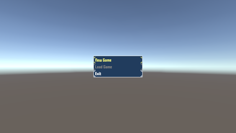
A new project already has 3 options added to the start menu:
- New Game
Starts a new game. - Load Game
Opens the load game menu to load a save game. - Exit
Closes the application.
We’ll add another option to Continue the game from the last save game.
Click on Add Option.
- Option Type
Select Continue. - Hide Inactive
Enable this setting. - Auto Select
Enable this setting. - Text (Menu Button)
Set to Continue.
Click on Move Up to move the Continue option up, until it’s the first option (Option 0) of the start menu.
Alright, don’t forget to save your changes by clicking on Save Settings at the bottom of the editor. Close the Makinom editor.
Scene Setup #
Open the Start Menu scene (found in Assets/Scenes/).
Add an ORK Game Starter to the scene, e.g. using the scene hierarchy context menu: ORK Framework > ORK Game Starter
This time we don’t need to make any setup – the Project asset holding our data is automatically selected and we don’t want to start the game here.
Save the scene and hit play to test it. The menu is controlled using the arrow keys, enter to accept an input.
Great – the menu is displayed with our options (continue is hidden since we don’t have a save game to continue), accepting New Game will load the World scene and our player is spawned.
However, something doesn’t feel right – the Accept key using Enter. Let’s change that.
Accept Input Key #
Navigate to Base/Control > Input Keys, select the Accept input key and change the following settings.
Input ID Setting 0 #
- Positive Key
Select Space.
Don’t forget to save your changes by clicking on Save Settings at the bottom of the editor.
Test again – you now accept inputs using the Space key. Feels much better with the WASD character controls – we’ll also use this input key to interact with the game world.
Speaking of interacting: Next, we’ll set up our first interaction.
(Optional) Animate your UI #
You can use schematics to animate opening or closing your UI boxes and HUDs. See this schematics tutorial to learn how to do this.
Feel free to use them to upgrade the UI of this tutorial – e.g. I’ll use a short fade in/out as the default schematics for all UI boxes and HUDs, and sometimes a small move in/out.


