Create a shortcut HUD using the Unity UI module.
In this tutorial we’ll create a Combatant type HUD to display the player’s shortcut slots. Learn more about shortcut slots in this documentation. or using the Unity UI for displaying shortcuts in this documentation.
Your project’s UI system should already be set to use the Unity UI module. If not, check the initial setup tutorial for the Unity UI module.
You can download the completed HUD setup here:
This contains the shortcut HUD, shortcut slot prefab, default and empty shortcut UI prefabs as well as the used images and font. You still need to use those prefabs for the Shortcut UI and HUD setup in the Makinom editor (see below).
Shortcut UI #
First, we’ll set up the default Shortcut UI for our our shortcuts. The Unity UI module uses a prefab for this – the HUD will use the prefab to create the individual shortcuts.
We’ll create a UI that shows the icon, information (use costs or item quantity) and slot index of the shortcut. Additionally, we’ll use the icon as a value bar to show reuse times.
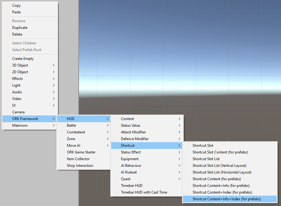
Create a ready-to-use shortcut setup using the scene hierarchy’s context menu: ORK Framework > HUD > Shortcut > Shortcut Content+Info+Index (for prefabs)
There are different variants available to create a shortcut setup with other content setup, e.g. only showing the name/icon.
The game object that’s created for us has the following structure:
Content > Image handles the icon, spread out to be used as a background for the shortcut.
Content > Text handles the name, we’ll remove that one since we only show the icon (but you can keep it if you want to show the name).
Info Text handles the information, e.g. use cost or item quantity.
Index Text handles the slot’s index.
Rect Transform #
We’ll control the size of our shortcut on the Shortcut Content game object. I’ll use a size of 80×80.
- Width
Set to 80. - Height
Set to 80.
Remove the name #
Delete the Shortcut Content > Content > Text child object, as we don’t display the shortcut’s name.
Icon #
Select the Shortcut Content > Content > Image child object, this is where the shortcut’s icon will be displayed.
Since there’s currently no sprite selected, it’ll show as a white square, not really helpful, as it also blocks the white text from being seen. Let’s select a dummy icon for now.
Image #
- Source Image
Select a sprite, best one of an ability or item that could be displayed by the shortcut.
Now that we’ve selected a sprite, we can also set up the image to be used in our value bar showing the reuse time.
- Image Type
Select Filled. - Fill Method
Select Radial 360.
This’ll fill the sprite as a circle.
You can further adjust (and test) the filling with the other settings.
Value Bar #
We want to use the icon as a value bar to show the reuse time.
First, we’ll add an empty game object to the Shortcut Content > Content child object, which will manage the bar. We’ll use an empty game object for this, as the bar’s game object can be disabled if the bar isn’t used, hiding all content, e.g. by a shortcut without a reuse time or when the time isn’t running.
Add a HUD Value Bar (Sprite) component to the empty game object and change the following settings.
- Value Image
Select the Image component on the Shortcut Content > Content > Image child object. - Change Fill Amount
Enable this setting.
Next, add an ORK HUD Value Bar Content component to the empty game object and change the following settings.
- Value Type
Select Reuse Time. - Invert Time
Enable this setting.
The reuse time is counting down to 0, i.e. it’d empty the icon if we wouldn’t invert it.
With the time inverted, our icon will be filled from 0 to full.
The value bar content automatically select’s the root’s HUD content provider and the sprite value bar we just added.
Info Text #
Select the Shortcut Content > Info Text child object, it handles displaying the shortcut’s information, e.g. the use costs of an ability or quantity of an item.
The ORK HUD Status Text Content component handles the content that’ll be displayed. It already is set up as we need it, using the Shortcut type and the <info> text code to display the information of the shortcut. You can use other types in case you need specialized text codes for abilities (Ability type) or items (Item type) and set up their own shortcut UI prefabs.
The TextMeshPro – Text (UI) component handles how the text is displayed. If you want to change the font, font size, color, etc., this is where you can do it. I’ll adjust the following settings.
- Font Size
Set to a smaller size, e.g. I’m using 16. - Vertex Color
Change the text’s color to a color you like – e.g. I’m using a red color. - Alignment
Set to Center and Top.
This’ll place the text at the top of the icon (where the other text is, I’ll adjust that one shortly). - Wrapping
Select Disabled.
Index Text #
Select the Shortcut Content > Index Text child object, it handles displaying the shortcut’s slot index when it’s displayed as part of a shortcut slot.
The ORK HUD Status Text Content component handles the content that’ll be displayed. It already is set up as we need it, using the Shortcut Slot type and the <slotindex> text code to display the information of the shortcut.
The TextMeshPro – Text (UI) component handles how the text is displayed. If you want to change the font, font size, color, etc., this is where you can do it. I’ll adjust the following settings.
- Font Size
Set to a smaller size, e.g. I’m using 14. - Vertex Color
Change the text’s color to a color you like – e.g. I’m using a red color. - Alignment
Set to Center and Bottom. - Wrapping
Select Disabled.
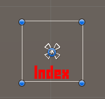
The finished game object (with the dummy icon) will look something like this:
Don’t forget to remove the dummy icon in the Shortcut Content > Content > Image component.
Create Prefab #
Create a prefab out of our Shortcut Content game object (without the Canvas). E.g. name the prefab Shortcut Default.
You can now remove the game object from the scene.
Empty Shortcut UI #
We’ll also set up a shortcut for an empty shortcut slot, i.e. just displaying slot’s index.
For this, we’ll just duplicate our prefab and remove the things we don’t need. Duplicate the prefab, rename it to Shortcut Empty and open it for editing.
Remove the Content child object (i.e. the icon and bar included).
Remove the Info Text child object.
And our empty shortcut is finished.
Save the changes to the prefab and exit the prefab editing.
We’ll handle setting up the shortcut UI in the editor later.
Shortcut Slot Prefab #
Next, we’ll set up a prefab handling a shortcut slot – this’ll show the shortcut UI prefab we set up.
Create a ready-to-use shortcut slot setup using the scene hierarchy’s context menu: ORK Framework > HUD > Shortcut > Shortcut Slot Content (for prefabs)
Rect Transform #
Like before, we’ll control the size of our shortcut slot on the Shortcut Slot Content game object. I’ll use a size of 80×80.
- Width
Set to 80. - Height
Set to 80.
HUD Shortcut Slot Content #
The HUD Shortcut Slot Content handles the shortcut slot – which shortcut UI will be used and how the slot can be used, assigned and how it’s highlighted.
- Empty UI Key
Leave this empty.
We’ll use the default empty shortcut UI – you can define a key here in case you want to use a different shortcut UI.
When using a key, an empty shortcut UI for the defined key has to be set up in the editor. - Assigned UI Key
Leave this empty.
Like the Empty UI Key this allows us to use different shortcut UI for assigned slots.
Slot Input Settings #
These settings handle how the shortcut slot can be used or assigned. We’ll mainly use the shortcuts as display in this tutorial, but we’ll enable using the shortcuts by clicking on them.
- Click Use
Select Use. - Click Count
Set to 1.
Shortcuts will be used by 1 click on them. - Use Click Use
Enable this setting.
State Changes #
You can show the different states of a shortcut by either using a color or enabling/disabling a game object (e.g. using a different background image on the slot). Each state also has a setup for normal and highlighted state – highlighted is when the cursor is above the shortcut slot.
We’ll set up color changes.
Empty State
This state is used by empty slots.
- Use Color (Normal State)
Enable this setting. - Color (Normal State)
Select a white color with full alpha (i.e. A=255 or 1, depending on your color picker). - Use Color (Highlighted State)
Enable this setting. - Color (Highlighted State)
Select a yellow color with full alpha.
Active State
This state is used when a shortcut is active, e.g. while using an ability or selecting a target for an item, etc.
- Use Color (Normal State)
Enable this setting. - Color (Normal State)
Select a green color with full alpha. - Use Color (Highlighted State)
Enable this setting. - Color (Highlighted State)
Select a yellow color with full alpha.
Useable State
This state is used when the shortcut can be used.
- Use Color (Normal State)
Enable this setting. - Color (Normal State)
Select a white color with full alpha. - Use Color (Highlighted State)
Enable this setting. - Color (Highlighted State)
Select a yellow color with full alpha.
Inactive State
This state is used when the shortcut can’t be used.
- Use Color (Normal State)
Enable this setting. - Color (Normal State)
Select a red color with full alpha. - Use Color (Highlighted State)
Enable this setting. - Color (Highlighted State)
Select a yellow color with full alpha.
In case you also use passive abilities that can be toggled on/off, you can use the Passive Ability states to highlight them.
Image #
Add an Image component to the game object using the component menu.
We’ll use it to show a background image for the slot.
- Source Image
Select the background you want to use, e.g. I’m using the BoxBlue sprite from the initial UI setup.
UI Color Changer #
Add an UI Color Changer component to the game object using the component menu.
The color changer is used to change the highlight colors – it can also change the color of the displayed shortcut, but we’ll disable this and only change teh background.
- In Children
Disable this setting.
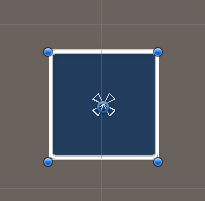
The finished game object will look like this:
Create Prefab #
Create a prefab out of our Shortcut Slot Content game object (without the Canvas). E.g. name the prefab Shortcut Slot.
You can now remove the game object from the scene.
HUD Prefab Setup #
As our last prefab, we’ll set up the actual HUD.
Create a HUD with horizontal layout using the scene hierarchy’s context menu: Makinom > HUD > HUD (Horizontal Layout)
Rect Transform #
I’ll show my HUD at the bottom center of the screen, and it’ll show 9 slots, use a padding and spacing of 10 – so in total, it’ll have a size of 820×100.
Select a bottom center anchor preset.
- Pivot
Set to X=0.5, Y=0. - Pos X
Set to 0. - Pos Y
Set to 0. - Width
Set to 820. - Height
Set to 100.
Horizontal Layout Group #
We’ll adjust the horizontal layout a bit, using our padding/spacing of 10 and also prevent it from changing the shortcut slot’s size.
- Padding
Set all to 10. - Spacing
Set to 10. - Control Child Size
Disable Width and Height.
Image #
Add an Image component to the game object using the component menu.
We’ll use it to show a background image for the HUD.
- Source Image
Select the background you want to use, e.g. I’m using the BoxBeige sprite from the initial UI setup.
HUD Shortcut Slot List #
Add a HUD Shortcut Slot List component to the game object using the component menu.
This’ll list our shortcut slots using the shortcut slot prefab we set up.
- Prefab
Select the Shortcut Slot prefab. - List Type
Select Range.
We’ll display a range of slots, from a start index to an end index. - Group Shortcut
Disable this setting.
We’ll display a combatant’s individual shortcut slots. - Shortcut List Index
Set to -1.
This’ll display the currently active shortcut list and allows us to switch shortcut lists (if we use multiple). - Slot Start Index
This largely depends on how you use your slots, e.g. if you start with index 0 or 1, etc.
I’ll start with index 1, so I set this to 1. - Slot End Index
Similarly, this depends on the start index – we want to display 9 slots, so I’m using the end index 9.
I’m display slots 1-9, so 9 slots in total.
The finished game object looks like this:
Create Prefab #
And that’s it for the HUD prefab – create a prefab out of our HUD game object (without the Canvas). E.g. name the prefab Shortcut HUD.
You can now remove the canvas from the scene.
Shortcut UI Setup #
Now, we’ll set up the Shortcut UI for the empty and default shortcuts.
Open the Makinom editor, navigate to UI > Shortcut Settings.
Default UI Settings #
These settings handle the default shortcut UI for all shortcuts, as well as optional default shortcuts for individual shortcut types (e.g. items or abilities).
Default Empty UI #
These settings are used for empty shortcut slots. We’ll set up the empty shortcut UI using the Shortcut Empty prefab we set up.
- UI Prefab
Select the Shortcut Empty prefab.
Alternatively, you can also define a Key Shortcut UI instead of setting the default UI. In this case, make sure to later also use the same UI key in the HUD Shortcut Slot Content component setup (Empty UI Key setting).
Default Shortcut UI #
These settings are used for all shortcuts. We’ll set up the shortcut UI using the Shortcut Default prefab we set up.
- UI Prefab
Select the Shortcut Default prefab.
Alternatively, you can also define a Key Shortcut UI instead of setting the default UI. In this case, make sure to later also use the same UI key in the HUD Shortcut Slot Content component setup (Assigned UI Key setting).
HUD Setup #
Next, we’ll set up the HUD. Navigate to UI > HUDs, add a new HUD and change the following settings.
HUD Settings #
- Name
Set to Shortcuts. - HUD Type
Select Combatant. - Auto Display
Enable this setting.
This will automatically show the HUD. If you use a HUD only as a template, make sure to disable this setting.
Combatant Settings #
We’ll only display the shortcuts for the actual player combatant, not for each group member.
- Only Leaders
Enable this setting. - Player
Enable this setting.
Display Conditions #
You can use these settings to only show the HUD based on conditions. E.g. only during battles, etc.
We’ll ignore this for now.
Unity UI #
- UI Layer
Select HUDs (or any other UI layer you want the HUD to display on).
UI layers are used to organize your UI, learn more in the Makinom documentation. - HUD Prefab
Select the HUD prefab you just created.
Schematics #
You can optionally use schematics to animate opening and closing the HUD, e.g. fading it in/out. You can also set up default schematics for all HUDs.
See this tutorial for details.
Save Settings #
That’s it for the setup.
Don’t forget to save the changes you did in the Makinom editor via the Save Settings button at the bottom.
Testing #
Hit play and test your HUD! Naturally, you need a combatant with shortcuts set up as your player.
Shortcuts that can’t be used are displayed in a red color-tinted box (yellow tint is where the cursor currently is over).
Useable shortcuts are kept in the regular color – green tint when a shortcut is active (e.g. during target selection or using the action).
Tip: Assigning Shortcuts #
You can set up default shortcut assignments and automatically add shortcuts to slots in UI > Shortcut Settings, as well as have individual combatants override them these settings.
Default Shortcut Assignments #
Define a fix shortcut to a defined shortcut slot, e.g. to assign the base attack to the 1st shortcut slot of the HUD:
Click on Add Shortcut.
- Shortcut List Index
Set to 0.
This is the standard shortcut list that’s selected at the start of a game. - Shortcut Slot Index
Set to 1.
This is the 1st slot in the HUD, if you also used 1 as the start index there. - Shortcut Type
Select Attack.
Default Auto Add Slots #
Automatically fill empty slots with shortcuts from defined types, e.g. active abilities or useable items – optionally limited by ability/item type, etc.
E.g. to automatically fill slots 2-6 with active abilities when they’re learned:
- Shortcut List Index
Set to 0. - Slot Start Index
Set to 2. - Slot End Index
Set to 6. - Active Abilities
Enable this setting.
Disable the rest of the Used Shortcuts settings.
Or, to automatically fill slots 7-9 with useable items of the Potion item type:
- Shortcut List Index
Set to 0. - Slot Start Index
Set to 7. - Slot End Index
Set to 9. - Useable Items
Enable this setting.
Disable the rest of the Used Shortcuts settings. - Limit Item Type
Enable this setting.
Click on Add Item Type.
- Item Type
Select Potions.
Tip: Control Maps #
You can use control maps to bind actions to input keys – e.g. a shortcut slot.
Control maps are set up in Base/Control > Control Maps. You can learn more about them in this documentation.
E.g. to use the 1st slot of the HUD via an input key:
Click on Add Control Key.
- Input Key
Select the input key you want to use (e.g. F1). - Type
Select Action. - Action Type
Select Shortcut. - Shortcut List Index
Set to 0. - Shortcut Slot Index
Set to 1.
You can further set up to use group/indivdiual targets or auto targeting, etc.


