
In this tutorial we’ll continue the UI setup and create prefabs for UI boxes.
UI boxes are used by ORK to dispaly menus, dialogues and other notifications (but not for HUDs, except a Console HUD). They are, in short, a container to display content in.
We will set up all UI boxes we need for this tutorial series in one go – and since most of them will look the same, we mainly need to adjust positions and sizes.
Learn more about UI boxes in this Makinom documentation.
UI Box Prefabs #
Setting up a UI box is pretty simple, you can create ready-to-use setups using the scene hierarchy’s context menu: Makinom > UI Box > UI Box (different variants available)
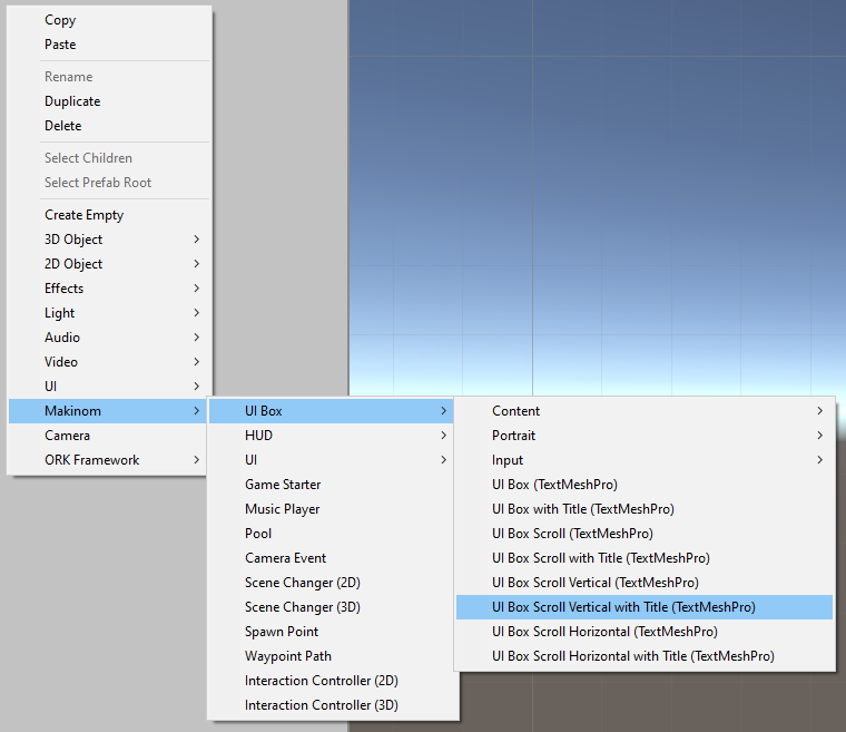
For more information, check out this tutorial focusing on UI box prefab setup.
We’ll create our UI prefabs in the UI Environment Scene we set up – but remember to also remove the created game objects from the Canvas afterwards to not have it part of our prefab scene.
Blue Center #
Our first UI box will be displayed in the center of the screen and use a blue box image (as will most of our UI boxes).
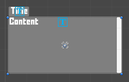
Create a UI box with vertical scrolling and a title box using scene hierarchy’s context menu: Makinom > UI Box > UI Box Scroll Vertical with Title
This’ll create a UI box that looks like this:
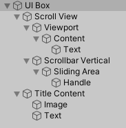
And has a structure like this:
We’ll now adjust the UI box to our needs.
Image #
First, we change the background image of the UI Box game object and UI Box > Title Content child object.
This is done in the Image component attached to the game objects – the setup for both is the same.
- Source Image
Select the BoxBlue sprite.
You can find it in Assets/Tutorial Assets/Images/UI/. - Color
Select a white color with full alpha (e.g. A=1 or A=255, depending on your color picker).
Rect Transform #
Select the UI Box game object again – we’ll now adjust the size of the UI box in the Rect Transform component.
- Width
Set to 400. - Height
Set to 400.
Scrollbar (Optional) #
The scrollbar is currently a bit too big, let’s size it down a little.
Select the UI Box > Scroll View > Scrollbar Vertical child object and adjust the Rect Transform component.
- Pos X
Set to -5. - Top
Set to 5. - Width
Set to 10. - Bottom
Set to 5.
Content Padding (Optional) #
The content of the UI box and title box is currently a bit close to the edges of their box. Let’s adjust that.
Select the UI Box > Scroll View > Viewport > Content child object, we’ll change the Vertical Layout Group component.
- Padding
Set to Left=10, Right=10, Top=10, Bottom=10. - Spacing
Set to 10.
And once more for the title box, select the UI Box > Title Content child object, this time we’ll change the Horizontal Layout Group component.
- Padding
Set to Left=10, Right=10, Top=10, Bottom=10. - Spacing
Set to 10.
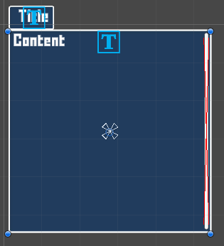
And with that, the UI box should now look like this:
Create Prefab #
Create a prefab out of the UI Box game object by dragging it into the project view, e.g. name it UI Box Blue Center.
Don’t forget to remove the UI Box from the Canvas game object when creating in your UI Environment Scene.
Tip!
Keep your project’s assets organized and put your UI box prefabs in a separate folder somewhere – e.g. I put my prefabs into Assets/Tutorial Assets/_Created/UI Box/.
Battle Menu #
For most of the remaining UI boxes (except the last two), we’ll only adjust the position and size.
Create a copy of the prefab you just created and rename the new prefab to UI Box Battle Menu. Open the new prefab for editing, e.g. by double clicking on it.
Rect Transform #
All we need to do is change the settings of the Rect Transform component on the root UI Box game object.
Change the settings in the following order.
Select the bottom left anchor preset.
- Pivot
Set to X=0, Y=0. - Pos X
Set to 0. - Pos Y
Set to 0. - Width
Set to 400. - Height
Set to 300.
Save the changes you’ve made to the prefab.
Menu Small #
Create a copy of the UI Box Blue Center prefab and rename the new prefab to UI Box Menu Small. Open the new prefab for editing.
Rect Transform #
Again, we change the settings of the Rect Transform component on the root UI Box game object.
We only change the position, the size (400×400) and anchor preset (middle center) stay as they are.
- Pos X
Set to -600. - Pos Y
Set to 200.
Save the changes you’ve made to the prefab.
Menu Info #
Create a copy of the UI Box Blue Center prefab and rename the new prefab to UI Box Menu Info. Open the new prefab for editing.
Rect Transform #
Like before, we’ll only change the position.
- Pos X
Set to 600. - Pos Y
Set to -200.
Save the changes you’ve made to the prefab.
Menu Big #
Create a copy of the UI Box Blue Center prefab and rename the new prefab to UI Box Menu Big. Open the new prefab for editing.
Rect Transform #
This time we only change the size to make it bigger, while keeping it in the center of the screen.
- Width
Set to 800. - Height
Set to 800.
Save the changes you’ve made to the prefab.
Dialogue #
The dialogue will be a bit different, as we’ll also change the used background image (beige box) and change the font color.
We still base it on our first UI box, create a copy of the UI Box Blue Center prefab and rename the new prefab to UI Box Dialogue. Open the new prefab for editing.
Rect Transform #
We’ll start with changing the position and size of the Rect Transform component on the root UI Box game object.
Change the settings in the following order.
Select the bottom center anchor preset.
- Pivot
Set to X=0.5, Y=0. - Pos X
Set to 0. - Pos Y
Set to 100. - Width
Set to 600. - Height
Set to 200.
Image #
As with our first UI box, we change the Image component on the root UI Box game object and UI Box > Title Content child object.
The setup for both is the same.
- Source Image
Select the BoxBeige sprite.
You can find it in Assets/Tutorial Assets/Images/UI/.
TextMeshPro – Text (UI) #
And we’ll change the font color of the content and title.
This is done on the TextMeshPro – Text (UI) components on the UI Box > Scroll View > Viewport > Content > Text child object (for the main content) and the UI Box > Title Content > Text child object (for the title content).
- Vertex Color
Select a black color with full alpha (e.g. A=1 or A=255, depending on your color picker).
Save the changes you’ve made to the prefab.
Action Info #
For our final UI box, we’ll create a new one from scratch. This time, the UI box should adjust to the content it displays – we don’t use scrolling or a title.
Close the prefab editing and create a UI box using scene hierarchy’s context menu (in the UI Environment Scene): Makinom > UI Box > UI Box Fit Size
We’ll use this UI box to display the name of the action a combatant will use during battle. It’s position will be based on the combatant’s on-screen position, and the size adjust to the displayed content.
Image #
The UI box will also be beige, change the Image component on the root UI Box game object.
- Source Image
Select the BoxBeige sprite. - Color
Select a white color with full alpha (e.g. A=1 or A=255, depending on your color picker).
Vertical Layout Group #
We’ll adjust the padding.
- Padding
Set to Left=20, Right=20, Top=20, Bottom=15.
Content Size Fitter #
This component handles adjusting the size to the displayed content. We’ll adjust both horizontal and vertical.
- Horizontal Fit
Select Preferred Size. - Vertical Fit
Select Preferred Size.
TextMeshPro – Text (UI) #
As before, we change the text color to a black color. This is done on the TextMeshPro – Text (UI) components on the UI Box > Text child object.
- Vertex Color
Select a black color with full alpha (e.g. A=1 or A=255, depending on your color picker).
Create Prefab #
Create a prefab out of the UI Box game object by dragging it into the project view, e.g. name it UI Box Action Info.
Don’t forget to remove the UI Box from the Canvas game object when creating in your UI Environment Scene.
UI Boxes General Settings #
With our UI box prefabs finished, we can now set up our UI boxes in the editor.
First, we’ll set up some general settings for all UI boxes, e.g. UI audio clips and how input is handled. Individual UI boxes can also override these settings, if needed (but we don’t need it for this tutorial series).
Open the Makinom editor and navigate to UI > UI Boxes > General Settings.
Default Controls #
These settings handle which input keys are used to control the UI (e.g. accepting or canceling, selecting a button, etc.). We can already keep most of the settings, but will set our input selections to loop, e.g. going down from the last selected input returns to the first input.
Input Settings #
- Loop
Enable this setting.
Default Audio Settings #
You can find all used audio clips in Assets/Tutorial Assets/NinjaAdventure/Sounds/Menu/.
- Cursor Move
Select the switch37 audio clip. - Accept
Select the switch38 audio clip. - Cancel
Select the switch34 audio clip. - Fail
Select the interface6 audio clip. - Fail Volume
Set to 0.4.
The audio clip is a bit loud, so we’ll reduce the volume it’ll be played with.
We don’t need the rest of the audio settings for our tutorial, but you can set them up if you want.
- Value Input Change
Select the switch37 audio clip. - Change
Select the switch37 audio clip. - Tab Change
Select the switch37 audio clip. - Page Change
Select the switch37 audio clip.
Default Inactive Colors #
Inactive colors are used to tint unfocused UI boxes, e.g. making them darker or semi-transparent. Only one UI box has the active focus and can be controlled at a time, these settings help making clear which one is controlled to the player.
- Set Color
Enable this setting.
I’ll stick to the default Color (a gray color with full alpha value), but you can change it to your liking.
Default Schematics #
We’ll use the schematics we’ve set up to fade in and fade out our UI boxes.
- Before Open Schematic
Select the UIFadeIn schematic. - Wait
Enable this setting.
This’ll wait for the schematic to finish before considering the UI box open (e.g. allowing controls). - Before Close Schematic
Select the UIFadeOut schematic. - Wait
Enable this setting.
This’ll wait for the schematic to finish before considering the UI box closed (e.g. finish closing a menu screen or continuing a schematic after a dialogue closed).
UI Boxes #
Finally, we’ll set up UI boxes and use our prefabs.
Navigate to UI > UI Boxes and select the Default UI box. We’ll change it and also add the rest of the UI boxes we’ve set up.
0: Blue Center #
- Name
Set to: Blue Center - UI Layer
Select Layer 1.
Unity UI #
Since we’re using the Unity UI module, we’ll use the prefab we created.
- UI Box Prefab
Select the UI Box Blue Center prefab.
1: Battle Menu #
The rest of the UI boxes are just copies with changed name and prefab.
Copy the Blue Center UI Box and change the following settings.
- Name
Set to: Battle Menu - UI Box Prefab
Select the UI Box Battle Menu prefab.
2: Menu Small #
Copy the Battle Menu UI Box and change the following settings.
- Name
Set to: Menu Small - UI Box Prefab
Select the UI Box Menu Small prefab.
3: Menu Info #
Copy the Menu Small UI Box and change the following settings.
- Name
Set to: Menu Info - UI Box Prefab
Select the UI Box Menu Info prefab.
4: Menu Big #
Copy the Menu Info UI Box and change the following settings.
- Name
Set to: Menu Big - UI Box Prefab
Select the UI Box Menu Big prefab.
5: Dialogue #
Copy the Menu Big UI Box and change the following settings.
- Name
Set to: Dialogue - UI Box Prefab
Select the UI Box Dialogue prefab.
6: Action Info #
Copy the Dialogue UI Box and change the following settings.
- Name
Set to: Action Info - UI Box Prefab
Select the UI Box Action Info prefab.
Save Changes #
And that’s it for now.
Save the changes using the Save Settings button at the bottom of the editor.
Next, we’ll set up flying texts (e.g. used for damage numbers).


