
In this tutorial we’ll change the battle end’s loot dialogue to a more advanced setup.
This tutorial continues the sub-series for setting up battles.
We previously set up a Simple loot dialogue at the start of our battle setup. Now, we’ll change this and use a more complex loot dialogue, the Sequence loot dialogue.
In short, the Sequence loot dialogue will display different battle gains one after another, e.g. first showing all items and currencies gained, followed by each gained equipment one at a time, followed by listing all combatant gains and level ups. This loot dialogue allows you to define which content is displayed when and if it’ll be displayed all together or one at a time.
We’ll use a Tooltip type HUD as a template to show content information of the loot – this allows us to more freely define how the content is displayed. This is naturally optional, as you can also just define the content in the loot dialogue itself. The same can be done for combatant gains and level up notifications.
We need to set up:
- UI prefabs (UI box, HUD)
- UI box and HUDs using the prefabs
- UI layout for displaying multiple battle gains side by side
- loot dialogue
Let’s get to it!
UI Box Prefab Setup #
We’ll start with setting up a new UI box – it’ll have a width of 400 and adjust it’s height to the displayed content. And let’s make it beige.
Prefab Setup #
Create a new content fitting UI box using the scene hierarchy context menu: Makinom > UI Box > UI Box Fit Size with Title
Rect Transform #
The positioning (center of the screen) and width (400) should already be correct, here are the settings to check:
Use the middle center anchor presets.
- Pivot
Set to X=0.5, Y=0.5. - Pos X
Set to 0. - Pos Y
Set to 0. - Width
Set to 400.
Image #
Change the image to use the BoxBeige sprite on both the UI Box game object and the UI Box > Title Content child object.
- Source Image
Select BoxBeige. - Color
Select a white color with full alpha (A=1 or 255, depending on the used color picker).
Content Size Fitter #
The content size fitter handles adjusting the size to the displayed content. It should already be set up to adjust the vertical size to fit the content.
- Horizontal Fit
Select Unconstrained. - Vertical Fit
Select Preferred Size.
TextMeshPro – Text #
We’ll change the text color on the UI Box > Text and UI Box > Title Content > Text child objects.
- Vertex Color
Select a black color with full alpha (A=1 or 255, depending on the used color picker).
The completed UI box should look something like this:
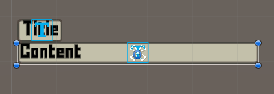
Create a prefab #
Create a prefab out of the UI box, e.g. save it as UI Box Beige Center Fit.
Remove the UI box from the canvas before we continue with the next setup.
HUD Prefab Setup #
Next, we’ll set up the HUD prefab for displaying a looted item, currency, equipment, etc.
We’ll keep it simple, but you can go as complex as you want as HUDs allow to set up content in whatever way you want. We’ll show the icon, name and quantity of the looted item.
All loot is just a variant of shortcuts, e.g. an item shortcut, currency shortcut, etc., so we’ll make use of Shortcut HUD elements (e.g. see the shortcut HUD setup tutorial for other ways).
HUD #
Create a new HUD with a vertical layout using the scene hierarchy context menu: Makinom > HUD > HUD (Vertical Layout)
Rect Transform #
The positioning can be ignored, due to just using the HUD as a template and displaying it within other content (e.g. the UI box we just set up).
We’ll set the width to 300, the height will be adjusted to the displayed content.
- Width
Set to 300.
Vertical Layout Group #
We’ll adjust the layout of the HUD, having content centered.
- Padding
Set all to 0. - Child Alignment
Select Middle Center.
Content Size Fitter #
Add a Content Size Fitter component and set it to adjust the vertical size.
- Vertical Fit
Select Preferred Size.
Icon #
Add an icon content to the HUD game object using the scene hierarchy context menu: ORK Framework > HUD > Content > Status Icon Content
Optionally change the newly created game object’s name to Icon.
ORK HUD Status Text Content #
We just need to make sure to use the correct status type and show the content’s icon.
- Status Type
Select Shortcut. - Use Content Icon
Enable this setting.
Layout Element #
Add a Layout Element component, we’ll use it to set the size of the icon within the HUD’s layout.
- Preferred Width
Enable this setting.
Set the width to 150. - Preferred Height
Enable this setting.
Set the width to 150.
Name #
Add a text content to the HUD game object using the scene hierarchy context menu: ORK Framework > HUD > Content > Status Text Content
Optionally change the newly created game object’s name to Name.
ORK HUD Status Text Content #
We’ll display the displayed shortcut’s name.
- Status Type
Select Shortcut. - Default Content (Text)
Set to: <name>
TextMeshPro – Text #
Adjust the font, font size and color to your liking, I’ll use these settings:
- Font Size
Set to 40. - Vertex Color
Select a yellow color. - Alignment
Select Center.
Quantity #
Add another text content to the HUD game object using the scene hierarchy context menu: ORK Framework > HUD > Content > Status Text Content
Optionally change the newly created game object’s name to Quantity.
ORK HUD Status Text Content #
We’ll display the displayed shortcut’s quantity.
- Status Type
Select Shortcut. - Default Content (Text)
Set to: <quantity>
TextMeshPro – Text #
Adjust the font, font size and color to your liking, I’ll use these settings:
- Font Size
Set to 30. - Vertex Color
Select a red color. - Alignment
Select Center and Middle. - Wrapping
Select Disabled.
This’ll make the text exceed the game object’s bounds in case it’s larger instead of getting wrapped into the next line.
Layout Element #
Add a Layout Element component, we’ll use it to keep the quantity out of the HUD’s layout.
- Ignore Layout
Enable this setting.
Rect Transform #
Now, with the quantity not being handled by the HUD’s layout component, we can adjust the positioning and size.
We’ll show it in the upper right corner of the HUD.
Use the top right anchor presets.
- Pivot
Set to X=1, Y=1. - Pos X
Set to 0. - Pos Y
Set to 0. - Width
Set to 100. - Height
Set to 100.
The finished HUD should look something like this:
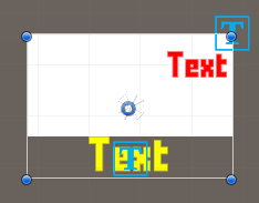
Create a prefab #
Create a prefab out of the HUD, e.g. save it as HUD Template Loot.
Don’t forget to remove the Canvas from the scene in case you did this in one of the game scenes.
UI Setup #
With the UI prefabs set up, we’ll continue with setting up the UI in the editor.
UI Box #
Open the Makinom editor, navigate to UI > UI Boxes and add a new UI box.
Base Settings #
- Name
Set to: Beige Center Fit - UI Layer
Select Layer 1.
Unity UI #
- UI Box Prefab
Select the UI Box Beige Center Fit prefab we just created.
Schematics #
Use custom schematics if you want – the previous default setup will otherwise have the UI box fade in and out.
HUD #
Navigate to UI > HUDs and add a new HUD.
HUD Settings #
- Name
Set to: Loot Template - HUD Type
Select Tooltip.
We’ll use the tooltip type, since we’ll display different kinds of content using this HUD. - Auto Display
Disable this setting.
We’ll use this HUD as a template and don’t display it on it’s own.
We can ignore the Tooltip Settings and Display Conditions due to this HUD being a template.
Unity UI #
- UI Layer
Select HUDs.
This isn’t really needed, due to the HUD never being displayed on it’s own, so it’ll be displayed within other content (which is placed on it’s own UI layer). - HUD Prefab
Select the HUD Template Loot prefab we just created.
UI Layout #
Navigate to UI > UI Layouts and add a new UI layout.
We’ll create a grid layout, displayed at the center of the screen and having 3 elements per row.
UI Layout Settings #
- Name
Set to: Center Grid 3 - Layout Type
Select Grid.
Grid Layout Settings #
- Anchor
Select Middle Center. - Spacing
Set to X=20, Y=20. - Filling
Select Horizontal.
The grid will be filled horizontally, i.e. per row. - Fill Count
Set to 3.
This limits the row to 3 elements before starting a new row.
That’s it with the UI setup – next we’ll finally be able to set up the actual loot dialogue.
Loot Dialogue #
Navigate to Battles > Battle End.
We’ve already set up the Loot Dialogue 0 previously, we’ll now change it to use a different loot dialogue type.
- Loot Dialogue Type
Select Sequence.
The Battle Outcome settings define for which outcome of a battle the loot dialogue will be used. The default setup uses them for all, we’ll keep it that way.
Loot Dialogue Settings #
- Block Focus
Enable this setting. - Show Outcome Notification
Disable this setting.
You can optionally show a UI box with some content alongside the displayed loot and battle gains, we’ll not use it this time. - Show Notification
Disable this setting.
We’ll not show usual notifications when adding an item to the inventory for the looted items.
Next, we’ll add the notifications in the order they’re displayed.
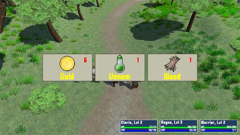
Notification 0 #
Click on Add Notification to add the first battle gains notification.
We’ll start with showing currency and items, maximum 6 at a time.
- Information Type
Select Loot.
We’ll start with displaying loot. - Display Type
Select Defined. - Display Count
Set to 6. - UI Layout
Select Center Grid 3.
Loot Settings #
We can define which loot will be displayed by this notification.
- Add Currency/Items/AI Behaviours/AI Rulesets/Crafting Recipes/Combatants
Enable these settings. - Add Equipment
Disable this setting.
Dialogue Settings #
These settings define how the loot is displayed – we’ll use the UI box and HUD template we set up.
- UI Box
Select Beige Center Fit. - Count to Quantity
Enable this setting.
We’ll count up the quantity of the loot over time. - Interpolation
Select Linear. - Time
Set to 1. - Add HUD (Loot Content)
Enable this setting. - HUD
Select Loot Template.
Notification 1 #
Copy Notification 0, we’ll just adjust it to display equipment one at a time instead of the other content.
- Display Type
Select One.
Loot Settings #
- Add Currency/Items/AI Behaviours/AI Rulesets/Crafting Recipes/Combatants
Disable these settings. - Add Equipment
Enable this setting.
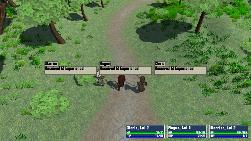
Notification 2 #
Click on Add Notification to add another notification.
We’ll now display the combatant gains, 3 at a time.
- Information Type
Select Combatant. - Display Type
Select Defined. - Display Count
Set to 3. - UI Layout
Select Center Grid 3.
Dialogue Settings #
- UI Box
Select Beige Center Fit. - Show Title
Enable this setting. - Text (Title Content)
Set to: <name>
We’ll adjust the Total Gains Content a bit.
- Text (Total Gains Content)
Set to: <experience>
<normal>
We can keep the rest of the settings as they are.
Notification 3 #
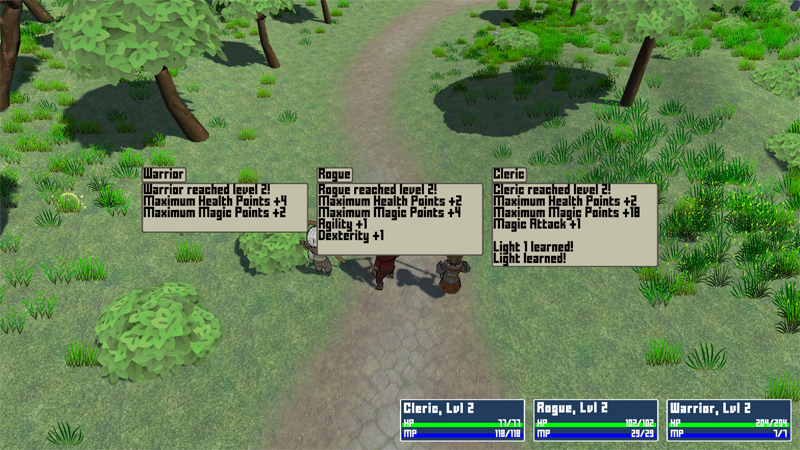
Copy Notification 2, we’ll finally show the level ups.
- Information Type
Select Level Up.
Dialogue Settings #
- UI Box
Select Beige Center Fit. - Show Title
Enable this setting. - Text (Title Content)
Set to: <name>
The actual level up content is defined below the loot dialogue settings in the Level Up Texts – we can keep them as they are, though. You can check them out and adjust them to your liking if you want.
Save Changes #
And that’s it for our loot dialogue setup!
Don’t forget to save your changes by clicking on Save Settings at the bottom of the editor.
Testing #
Hit play, fight someting and enjoy your shiny new battle gains!
In case you want to test some different loot, you can add Additional Loot to individual Battle components in your scene!


