

In this tutorial we’ll set up a Quest type HUD.
The quest HUD will display the player’s active quests.
This tutorial is based on the ORK 4 Unity Quickstart 3D tutorials using the quest mini-series for quest content, but can be used in any project.
Your project’s UI system should already be set to Unity UI. If not, check the initial setup tutorial for Unity UI.
We’ll create our quest HUD using prefabs – we’ll have to set up 4 prefabs for this:
- Quest HUD
The actual HUD, which lists the quests. - Quest
The individual quest, which lists the quest’s tasks. - Quest Task
The individual quest task, which lists the task’s requirements. - Quest Task Requirement
The individual quest task requirement (e.g. kill X enemies, collect Y items, etc.)
We’ll create the prefabs in reverse order, i.e. starting with the quest task requirement and ending with the actual quest HUD’s prefab. This is due to using the prefabs in the previous prefab, e.g. the requirement prefabs are used by the task prefabs to list the requirements.
This might sound more complicated than it actually is, since we’ll create ready to use setups (using the ORK toolbar or scene hierarchy context menu), which we just have to adjust to our needs and style.
Quest Task Requirement Prefab #
First, we’ll create the prefab for the quest task requirements. A requirement is something that’s needed to complete a quest task, e.g. killing X number of a defined enemy or collecting Y number of a defined item, etc.
We create a ready to use setup using the scene hierarchy’s context menu (ORK Framework > HUD > Quest > Prefab: Quest Task Requirement) or ORK toolbar (search for: Quest Task Requirement Prefab).
The size and placement of the object doesn’t matter. The prefab we’ll create out of it will be placed in the HUD using a Vertical Layout Group, which controls these parameters.
HUD Text Content #
This component manages the text content and which types of requirements are displayed. We’ll keep the default setup, only adjusting the text to show the requirement’s name, count and max count.
- Text
Set to: <name> <count>/<countmax>
Image Size (Optional) #
In case you’re using large icons, you might want to adjust the size when displayed in the quest HUD.
For this, add a Layout Element component to the Image child object using the component menu.
- Preferred Width
Enable
Set the value to the width you want, e.g. 30. - Preferred Height
Enable
Set the value to the height you want, e.g. 30.
Text Styling #
The TextMeshPro – Text (UI) component on the Text child object is responsible for displaying the text.
This is where you can change the font, font size, font color, etc.
I’m using font size 16.
Adding a value bar (Optional) #
We’ll can also add a value bar to display the requirement’s count.
Select the Quest Task Requirement object and either use the context menu (ORK Framework > HUD > Content > HUD: Value Bar (Sprite)) or ORK toolbar (search for: Value Bar Sprite).
This adds a value bar as a child object of the Quest Task Requirement object.
Rect Transform #
Adjust the size and position of the object via it’s Rect Transform.
How you place it is up to you – I’ll use the bottom stretch anchor presets and adjust the bar to display below the text as a small, thin line.
Also, move the Value Bar object upwards in the hierarchy to be the first child object of the Quest Task Requirement object. This way the value bar doesn’t obstruct the text.
HUD Value Bar Content #
This component manages the value the value bar displays.
- Value Type
Select; Quest Task Requirement
Bar Image #
The value bar uses a sprite and fills it according to the requirement’s count (and max count).
Change the Image components on the Empty Sprite and Value Sprite objects (child objects of Value Bar).
- Source Image
Select: White_16x16
Also, change the color of the value sprite (or empty sprite) to your liking.
Tooltips (Optional) #
You can optionally display a Tooltip type HUD with the quest task requirement’s content (if you’ve set up a Tooltip HUD).
To add tooltips to a part of your HUD, simply add a HUD Tooltip component to it. In this case, add the component to the root Quest Task Requirement object.
Create prefab #
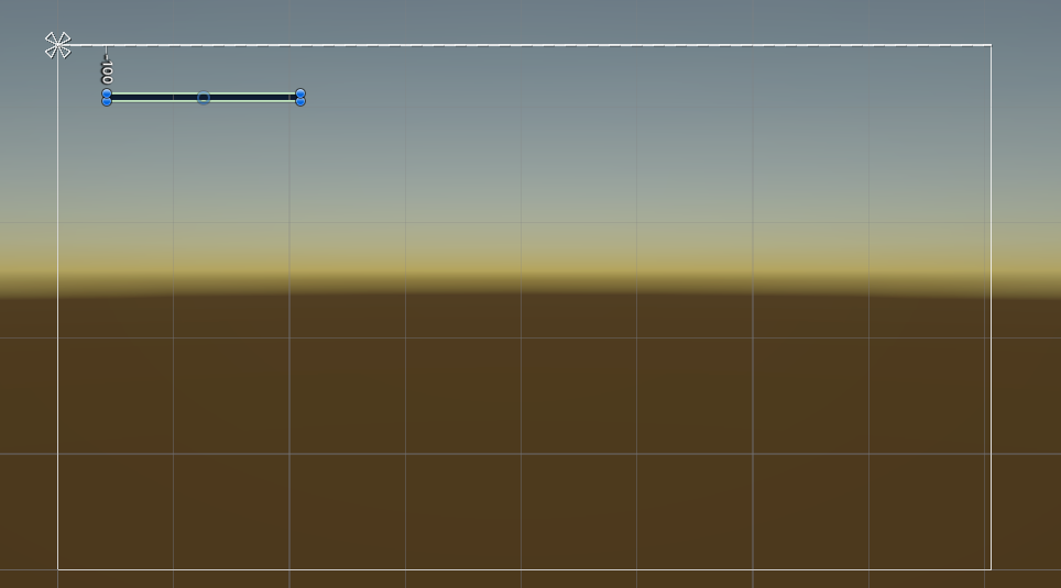
My end result looks like this.

Create a prefab out of the Quest Task Requirement object (i.e. not the including Canvas).
You can remove the object from the scene after creating the prefab.
Quest Task Prefab #
Next, we’ll set up the prefab for the quest tasks.
Once again, create a ready to use setup using the scene hierarchy’s context menu (ORK Framework > HUD > Quest > Prefab: Quest Task with Requirement List) or ORK toolbar (search for: Quest Task Requirement List).
HUD List Content #
This component is attached to the Quest Task object and adds the requirements of the task (using the prefab we created). The vertical layout arranges the requirements below the name.
- Prefab
Select: Quest Task Requirement
HUD Text Content #
This component is added on the Name child object and manages the text content of the quest task.
- Show Active
Enable - Text
Set to: <name>
Text Styling #
Like before, the TextMeshPro – Text (UI) component on the Name > Text child object is responsible for displaying the text.
This is where you can change the font, font size, font color, etc.
I’m using font size 18.
Tooltips (Optional) #
Add a HUD Tooltip component to the Quest Task object in case you want to display a Tooltip type HUD for the quest task’s content.
Create prefab #
Create a prefab out of the Quest Task object (i.e. not the including Canvas).
You can remove the object from the scene after creating the prefab.
Quest Prefab #
Now we’ll set up the prefab for the quests.
Create a ready to use setup using the scene hierarchy’s context menu (ORK Framework > HUD > Quest > Quest with Task List (for prefabs)) or ORK toolbar (search for: Quest with Task List).
HUD List Content #
This component is attached to the Quest object and adds the tasks of the quest (using the prefab). The vertical layout arranges the tasks below the name.
We’ll use the prefab we just created (for the tasks) and enable the active tasks.
- Prefab
Select: Quest Task - Add Inactive
Disable this setting. - Add Active
Enable this setting. - Add Finished
Disable this setting. - Add Failed
Disable this setting.
HUD Text Content #
This component on the Name child object manages the text content of the quest. We’ll just display the name of the quest, the default setup should already use the <name> text code.
- Show Active
Enable - Text
Set to: <name>
Text Styling #
Like before, the TextMeshPro – Text (UI) component on the Name > Text child object is responsible for displaying the text.
This is where you can change the font, font size, font color, etc.
I’m using font size 20.
Tooltips (Optional) #
Add a HUD Tooltip component to the Quest object in case you want to display a Tooltip type HUD for the quest task’s content.
Create prefab #
Create a prefab out of the Quest object (i.e. not the including Canvas).
You can remove the object from the scene after creating the prefab.
Quest HUD Prefab #
The last prefab is for the actual quest HUD.
Naturally, we’ll create a ready to use setup using the scene hierarchy’s context menu (ORK Framework > HUD > Quest > Quest List HUD (Vertical Layout, fit size)) or ORK toolbar (search for: Quest List HUD).
As the text suggests, this will create a HUD with a Vertical Layout Group and a Content Size Fitter to adjust the object’s size to the displayed content. This is the only way to make sure the HUD will envelope the whole content, since you don’t know how many quests, quest tasks and requirements will be displayed.
HUD List Content #
This component is attached to the Quest List HUD object and adds the quests (using the prefab). The vertical layout arranges the quests.
We’ll use the prefab we just created (for the quests) and enable the active quests.
- Prefab
Select: Quest - Add Inactive
Disable - Add Active
Enable - Add Finished
Disable - Add Failed
Disable
Image (Optional) #
Add an Image component to display a background image in the HUD.
- Source Image
Select: BoxBlue
Or any other spirte you’d like to use. - Color
Select a color you want to use (optional).
I’ll stick with a white color with full alpha.
Rect Transform #
The default width of the setup is a bit small, so we’ll adjust the width.
- Width
Set to 400.
You can also place the HUD on the canvas where you want it to show up. I’d recommend to use anchor presets according to the placement. E.g. if you place the HUD at the top left corner, use a top left anchor preset.
And that’s my final result.
Create prefab #
Create a prefab out of the Quest List HUD object (i.e. not the including Canvas).
You can now remove the canvas (and HUD) from the scene.
HUD Setup #
As a last step, we’ll set up the HUD in the ORK editor.
Open the ORK editor, navigate to UI > HUDs, add a new HUD and change the following settings.
HUD Settings #
- Name
Set to: Quests - HUD Type
Select: Quest - Auto Display
Enable
This will automatically show the HUD. If you use a HUD only as a template, make sure to disable this setting.
Quest Settings #
- UI Layout
Select None.
This will not use a layout, using the prefab’s position instead.
Display Conditions #
You can use these settings to only show the HUD based on conditions. E.g. only in the field (out of battles) or when there are quests or certain quest types.
- Has Quests
Enable - Has Active
Enable
Unity UI #
- UI Layer
Select: HUD (or any other UI layer you want the HUD to display on). - HUD Prefab
Select: Quest List HUD.
Save Settings #
Don’t forget to save the changes you did in the editor using the Save Settings button at the bottom.
Testing #
Hit play and test your HUD! Naturally, you need an active quest for this to work.

If you’re not satisfied with the look, open up the prefabs for the HUD, quest, quest task or quest task requirement and adjust them to your liking.
E.g. looking at my HUD, I’ll probably have to adjust a few things.

There – I’ve changed the following things:
- Quest Prefab
Changed the quest name’s font color - Quest Task Prefab
Increased Left padding to 15 in the Vertical Layout Group component. - Quest Task Requirement Prefab
Set the Left value to 25 in the Rect Transform component of the Name and Value Bar child objects.
And that’s it!