

ORK 4 RPG Framework Logo
  • ORK 4 GUIDE
    • Documentation
    • Tutorials
    • Extensions
    • API
  • ORK 3 GUIDE
    • Documentation
    • Tutorials
    • API
  • Support
  • Forum
  • Get ORK

ORK 4 Documentation

  • Getting Started
    • Welcome
    • First Steps (Unity)
  • Features
    • The Status System
    • Schematics
    • Schematic Nodes
    • Dialogue Importer
    • Variables
    • Selected Data
  • Components
    • Battle Components
    • Combatant Components
    • Control Components
    • Cursor Prefab Components
    • Game Starters
    • Interactable Components
    • Move AI Components
    • Scene Setup Components
  • Editor
    • The ORK 4 Editor
    • Sections & Sub-Sections
    • Node Editor
    • Schematic Editor
    • Asset Sources
    • Unity Overlay Toolbar
  • Section: System
    • System Settings
    • Languages
    • Organizer Types
    • Game States & Conditions
    • General Condition Templates
    • Object Pools
    • Prefab Savers
    • Scene Connections
  • Section: Controls
    • Game Controls
    • Interaction Settings
    • Player Controls
    • Camera Controls
    • Input Keys
    • Control Maps
    • Camera Positions
    • Battle Camera
  • Section: Gameplay
    • Game Settings
    • Formulas
    • Difficulties
    • Shortcut Slots & Settings
    • Custom Settings & Global Custom Settings
    • Global Machines
    • Machine Templates
  • Section: Status
    • Status Values
    • Status Effects
    • Attack Modifiers
    • Defence Modifiers
    • Abilities & Ability Developments
    • Status Developments
    • Research Trees
    • Damage Types
    • Status Bonuses & Templates
    • Status Condition Templates
  • Section: Inventory
    • Inventory Settings
    • Inventory Containers
    • Currencies
    • Items
    • AI Rulesets
    • Crafting Recipes
    • Equipment Slots & Slot Set Templates
    • Equipment & Available Equipment Templates
    • Shops
    • Loot
  • Section: Combatants
    • Combatants
    • Combatant Groups
    • Class Slots
    • Classes
    • Factions & Faction Benefits
    • Animations
    • Move AIs
    • Formations
    • Action Combos
  • Section: Battles
    • Battle Systems
    • Turn Based Battles
    • Active Time Battles
    • Real Time Battles
    • Phase Battles
    • Battle Spots
    • Battle AIs
    • Battle Actions Settings
    • Special Commands Settings
    • Target Settings
    • Target Selection Templates
    • Battle Range Templates
    • Battle Grid Settings
    • Battle Grid Highlights
    • Battle Grid Cell Types
    • Battle Grid Formations
  • Section: Content
    • Content Types
    • Music
    • Sound Templates
    • Areas
    • Teleports
    • Quests & Quest Tasks
    • Logs & Log Texts
    • Object Contents
  • Section: UI
    • UI Settings
    • UI Layers
    • UI Layouts
    • UI Boxes
    • HUDs
    • Notifications
    • Cursor Settings
  • Section: Menus
    • Start Menu
    • Save Game Settings
    • Option Categories
    • Menu Screens
    • Menu Requirements
    • Battle Menus
    • Loot Dialogues
    • Item Collection
    • Combatant Selections
    • Quantity Selections
    • Shop Layouts
  • Section: Texts
    • Text Settings
    • Formatting Settings
    • Flying Texts
    • Use Cost Display
    • Status Preview Display
    • Bonus Display
    • Status Change Display
    • Console Settings & Console Types
    • Text Codes
  • Sections: Editor
    • Editor Settings
    • Backups
    • Variables
    • Plugins
  • Scripting
    • Access Handler
    • Custom Nodes
    • Custom Save Data
    • Custom Component Save Data

ORK 4 Tutorials

  • ORK 4 Unity Quickstart Tutorials (3D)
    • ORK 4 Unity Quickstart 3D
    • 01 Initial ORK Setup
    • 02 Player Setup
    • 03 Music & Scenes
    • 04 UI System Setup
    • 05 UI Boxes
    • 06 Flying Texts
    • 07 Status Values
    • 08 Status Effects
    • 09 First Abilities
    • 10 Fighter Setup
    • 11 First Enemies & Battle AI
    • 12 Battle System Setup
    • 13 Animating Battle Start and End
    • 14 Random Battles
    • 15 Animating Actions
    • 16 Player Battle HUD
    • 17 Elemental Attacks
    • 18 Animating More Actions
    • 19 Inventory & Loot
    • 20 Equipment
    • 21 Loot, Start Equipment & Viewers
    • 22 Magic Abilities
    • 23 Caster Setup
    • 24 More Enemies
    • 25 Start Menu & Save Games
    • 26 Menu Screens
    • 27 Interactions
    • 28 Item Collectors
    • Quickstart Extended
  • Battle Tutorials
    • Active Time Battles
    • Phase Battles
    • Real TT 01 Real Time Battles & Tab Targeting
    • Real TT 02 Control Map, Use Ranges & Battle Area
    • Real TT 03 Camera Control, Battle AI & Reuse Time
    • Real TT 04 Damage Detection, Action Animation & Player HUD
    • Real TT 05 Switch Player & Final Adjustments
    • Hit & Miss
    • Critical Hits
    • Cast Time
    • Reuse Time
    • Grid 01: Battle Grid Setup
    • Grid 02: Highlights
    • Grid 03: Cell Types
    • Grid 04: Move Command
    • Grid 05: Scene Grid Setup
    • Grid 06: Battle Ready
    • Grid 07 Use & Affect Ranges
    • Grid 08: Better Camera Control
  • Gameplay Tutorials
    • Multiple Interaction Controllers
    • Player Group Spawn & Follow
    • Spawn Hunting Enemies
    • Gamepad Controls (Unity Input System)
    • Combined Inputs
    • Control Map for Keyboard (Shortcuts)
    • Control Map for Gamepad (Shortcuts)
    • Quests 01: Menu Screen
    • Quests 02: Hunting
    • Quests 03: Collect Potion Materials
    • Quests 04: Collect Equipment Materials
    • Quests 05: Quest Mark HUDs
    • Crafting 01: Menu Screen
    • Crafting 02: Materials & Recipes
    • Crafting 03: Getting Materials
    • Crafting 04: Proficiency & Critical Outcome
    • Shop
    • Inventory Containers
  • Schematics Tutorials
    • UI Animation Schematics
    • Flying Text Animation Schematics
    • HUD Conditional Schematics
  • UI Tutorials
    • Unity UI: Initial Setup
    • Unity UI: Status Value UI Setup
    • Unity UI: Status Effect UI Setup
    • Unity UI: Shortcut UI Setup
    • Unity UI: Dragging Notification
    • Unity UI: Interaction HUD
    • Unity UI: Shortcut HUD
    • Unity UI: Turn Order HUD
    • Unity UI: Cast Time HUD
    • Unity UI: Quest HUD
    • Unity UI: Tooltip HUD
    • Unity UI: Move Range HUD
    • Menus 01 UI Box Setup
    • Menus 02 Template HUDs
    • Menus 03 Menu Setup
    • Menus 04 Main Menu
    • Menus 05 Inventory
    • Menus 06 Equipment
    • Menus 07 Ability
    • Menus 08 Group
    • Menus 09 Quest
    • Menus 10 Crafting
  • Module 01: Status System
    • Introduction to Modular Tutorials
    • M01.1: Status Values
      • Introduction to Status Values
      • Health
      • Mana
      • Barrier
      • Base Experience
      • Class Experience
      • Spendable Experience
      • Normal Stats
    • M01.2: Modifiers
      • Introduction to Modifiers
      • Element
      • Attack Type
      • Size
      • Race
    • M01.3: Status Effects
      • Introduction to Status Effects
      • Buffs
      • Debuffs
      • Poison
      • Regeneration
      • Blind
      • Stun
      • Sleep
      • Silence
      • Enchants
      • Charm
      • Doom
      • Reflect
  • Module 02: Actions
    • Introduction to Actions
    • M02.1: Formulas
      • Introduction to Formulas
      • Physical Damage Formula
      • Magical Damage Formula
      • Hit Chance
      • Critical Chance
    • M02.2: Abilities
      • Introduction to Abilities
      • Base Attack
      • Elemental Magic Spells
      • Steal Ability
      • Drain
      • Healing Spell
      • Cure
      • Buff Abilities
      • Debuff Abilities

ORK 4 Extensions

  • Plugins
    • Save Game Compression Plugin
  • Schematic Nodes
    • Footstepper Nodes (Unity)
  • Scripts
    • A* Pathfinding Movement Component (Unity)
    • PolyNav 2D Movement Component (Unity)
    • Cinemachine Camera Control Type (Unity)
    • Rewired Input Key (Unity)
    • Unity Legacy Input Key (Unity)
    • Core GameKit Wrapper (Unity)
    • Pool Boss Wrapper (Unity)
View Categories
  • Guide
  • ORK 4
  • ORK 4 Documentation
  • Section: UI

UI Boxes

0:00 / 4:19
  • View as Markdown Open this page as plain Markdown (opens in a new tab)
  • Open in ChatGPT Ask questions about this page (opens in a new tab)
  • Open in Claude Ask questions about this page (opens in a new tab)
  • Open in Google AI Studio Ask questions about this page (Google account required) (opens in a new tab)

UI boxes are used to display dialogues and menus.

UI boxes are found in UI > UI Boxes.

General Settings #

The general settings define default settings that are used by all UI boxes. Each individual UI box can optionally override the default settings.

Base Settings #

Define cursor and accept timeouts, scroll speed and other base settings.

Focus Settings #

Manage how the focus between UI boxes is changed. Only the currently focused UI box is controlable.

Focus can automatically be received when the cursor is over a UI box, or by using left, middle or right click.

Cursor Over Settings #

UI boxes displaying inputs (e.g. buttons or value inputs) can optionally change the selected input by moving the cursor over an input.

Controls #

Define the default controls used by all UI boxes. The controls use input keys and click inputs.

Input Settings #

Define how inputs (e.g. buttons or value inputs) will be selected.

E.g. the selection can be looped, unfocused UI boxes can also change selection or if inactive inputs are hidden, etc.

Tab Settings #

Similar to the input settings, tab buttons can also loop, receive unfocused selection or hide inactive tabs.

Input Filter Settings #

Define controls for input filters.

Unity UI: Input filters can be added to UI boxes using input filter components.

Audio Settings #

Define the default audio settings for UI boxes.

Changing input selection, accepting, canceling and other UI interactions can play audio assets on a defined audio channel.

Ok/Cancel Content #

Define the default content for ok and cancel buttons used by all UI boxes.

UI boxes can optionally show ok and cancel buttons to accept or cancel.

Tab Button Content #

Define the default content for previous and next tab buttons.

UI boxes displaying tabs can add buttons to change to the previous or next tab.

Inactive Colors #

Define the default inactive color tints for UI boxes.

An inactive (i.e. unfocused) UI box can optionally be tinted in a color, e.g. making them slightly darker and faded out. This can be used to visually highlight which UI box has the focus and is controlled.

Typewriter #

Define the default typewriter settings for UI boxes.

UI boxes can optionally use a typewriter effect, typing text and texts of input buttons letter by letter instead of displaying them all at once.

Schematics #

Define the default schematics for UI boxes.

UI boxes can use schematics to animate opening or closing them, e.g. to fade them in/out and move or scale them. See examples in this tutorial.

Additionally, you can use schematics when gaining or losing focus, or when an input has been selected or accepted.

The schematics have the UI box available as local selected data via the data key ui. The Starting Object can be an optional schematic context of the UI box, e.g. the speaker of a dialogue or combatant/user of a menu screen.
If the currently selected input has a schematic context (e.g. the item a button displays in an inventory menu) it’ll be avaialble as local selected data via the data key action.

UI Boxes #

UI boxes are used by dialogues (e.g. Show Dialogue node in a schematic) and menus (e.g. menu screens, start menu or battle menus) to display content like texts, inputs (buttons, value inputs) and portraits.

UI boxes and inputs can also use HUD elements to create more complex designs or add virtual controls. The HUD elements can either be added directly to the UI box/input setup or use HUDs as templates.

Here’s an example of multiple UI boxes being used in a menu screen. The box in the center uses HUD elements on inputs to add portraits and status information of combatants.
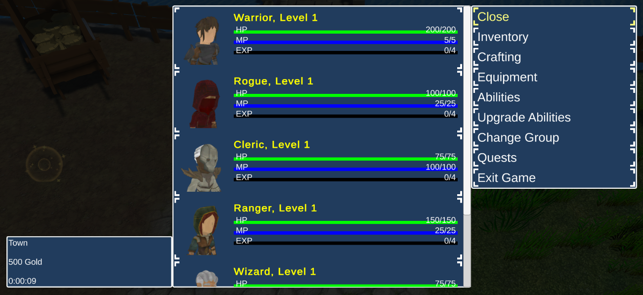
UI boxes are displayed on a defined UI layer – if no layer is selected it’ll be displayed on the default UI layer (before all other UI layers). The used UI layer influences the order in which UI content is displayed, e.g. placing one UI box over another.

UI System Types #

Defining the actual position, size and style of a UI box depends on the used UI system type (see UI settings documentation for details).

Unity UI #

Using Unity UI in Unity uses prefabs with a UI Box component.

You can create a ready to use setup via the scene view’s context menu: ORK Framework > UI Box has different layout variants available.

Override Default Settings #

UI boxes can optionally override the default settings defined in the general settings.

You can override the separate settings individually, e.g. have a UI box only override the default controls or audio settings.

Table of Contents
  • General Settings
    • Base Settings
      • Focus Settings
      • Cursor Over Settings
    • Controls
      • Input Settings
      • Tab Settings
      • Input Filter Settings
    • Audio Settings
    • Ok/Cancel Content
    • Tab Button Content
    • Inactive Colors
    • Typewriter
    • Schematics
  • UI Boxes
    • UI System Types
      • Unity UI
    • Override Default Settings
Sitemap
  • Showcase
  • ORK 4 Guide
    • Documentation
    • Tutorials
    • Extensions
    • API
  • ORK 3 Guide
    • Documentation
    • Tutorials
    • API
  • ORK 2 Hub
    • Tutorials
    • Plugins
    • API
  • Support
  • Forum
  • Get ORK
  • Contact
  • Blog
  • Makinom
  • gamingislove.com
Categories
  • News (75)
  • ORK 2 (137)
    • Tutorial (137)
      • Game tutorial (50)
      • Gameplay (32)
      • How-to (55)
  • Release (158)
Search

© 2015 Gaming is Love e.U.

Disclosure: This site may contain affiliate links, which means I may receive a commission if you click a link and purchase something that I have recommended. While clicking these links won’t cost you any money, they will help me fund my development projects while recommending great assets!