

ORK 4 RPG Framework Logo
  • ORK 4 GUIDE
    • Documentation
    • Tutorials
    • Extensions
    • API
  • ORK 3 GUIDE
    • Documentation
    • Tutorials
    • API
  • Support
  • Forum
  • Get ORK

ORK 4 Documentation

  • Getting Started
    • Welcome
    • First Steps (Unity)
  • Features
    • The Status System
    • Schematics
    • Schematic Nodes
    • Dialogue Importer
    • Variables
    • Selected Data
  • Components
    • Battle Components
    • Combatant Components
    • Control Components
    • Cursor Prefab Components
    • Game Starters
    • Interactable Components
    • Move AI Components
    • Scene Setup Components
  • Editor
    • The ORK 4 Editor
    • Sections & Sub-Sections
    • Node Editor
    • Schematic Editor
    • Asset Sources
    • Unity Overlay Toolbar
  • Section: System
    • System Settings
    • Languages
    • Organizer Types
    • Game States & Conditions
    • General Condition Templates
    • Object Pools
    • Prefab Savers
    • Scene Connections
  • Section: Controls
    • Game Controls
    • Interaction Settings
    • Player Controls
    • Camera Controls
    • Input Keys
    • Control Maps
    • Camera Positions
    • Battle Camera
  • Section: Gameplay
    • Game Settings
    • Formulas
    • Difficulties
    • Shortcut Slots & Settings
    • Custom Settings & Global Custom Settings
    • Global Machines
    • Machine Templates
  • Section: Status
    • Status Values
    • Status Effects
    • Attack Modifiers
    • Defence Modifiers
    • Abilities & Ability Developments
    • Status Developments
    • Research Trees
    • Damage Types
    • Status Bonuses & Templates
    • Status Condition Templates
  • Section: Inventory
    • Inventory Settings
    • Inventory Containers
    • Currencies
    • Items
    • AI Rulesets
    • Crafting Recipes
    • Equipment Slots & Slot Set Templates
    • Equipment & Available Equipment Templates
    • Shops
    • Loot
  • Section: Combatants
    • Combatants
    • Combatant Groups
    • Class Slots
    • Classes
    • Factions & Faction Benefits
    • Animations
    • Move AIs
    • Formations
    • Action Combos
  • Section: Battles
    • Battle Systems
    • Turn Based Battles
    • Active Time Battles
    • Real Time Battles
    • Phase Battles
    • Battle Spots
    • Battle AIs
    • Battle Actions Settings
    • Special Commands Settings
    • Target Settings
    • Target Selection Templates
    • Battle Range Templates
    • Battle Grid Settings
    • Battle Grid Highlights
    • Battle Grid Cell Types
    • Battle Grid Formations
  • Section: Content
    • Content Types
    • Music
    • Sound Templates
    • Areas
    • Teleports
    • Quests & Quest Tasks
    • Logs & Log Texts
    • Object Contents
  • Section: UI
    • UI Settings
    • UI Layers
    • UI Layouts
    • UI Boxes
    • HUDs
    • Notifications
    • Cursor Settings
  • Section: Menus
    • Start Menu
    • Save Game Settings
    • Option Categories
    • Menu Screens
    • Menu Requirements
    • Battle Menus
    • Loot Dialogues
    • Item Collection
    • Combatant Selections
    • Quantity Selections
    • Shop Layouts
  • Section: Texts
    • Text Settings
    • Formatting Settings
    • Flying Texts
    • Use Cost Display
    • Status Preview Display
    • Bonus Display
    • Status Change Display
    • Console Settings & Console Types
    • Text Codes
  • Sections: Editor
    • Editor Settings
    • Backups
    • Variables
    • Plugins
  • Scripting
    • Access Handler
    • Custom Nodes
    • Custom Save Data
    • Custom Component Save Data

ORK 4 Tutorials

  • ORK 4 Unity Quickstart Tutorials (3D)
    • ORK 4 Unity Quickstart 3D
    • 01 Initial ORK Setup
    • 02 Player Setup
    • 03 Music & Scenes
    • 04 UI System Setup
    • 05 UI Boxes
    • 06 Flying Texts
    • 07 Status Values
    • 08 Status Effects
    • 09 First Abilities
    • 10 Fighter Setup
    • 11 First Enemies & Battle AI
    • 12 Battle System Setup
    • 13 Animating Battle Start and End
    • 14 Random Battles
    • 15 Animating Actions
    • 16 Player Battle HUD
    • 17 Elemental Attacks
    • 18 Animating More Actions
    • 19 Inventory & Loot
    • 20 Equipment
    • 21 Loot, Start Equipment & Viewers
    • 22 Magic Abilities
    • 23 Caster Setup
    • 24 More Enemies
    • 25 Start Menu & Save Games
    • 26 Menu Screens
    • 27 Interactions
    • 28 Item Collectors
    • Quickstart Extended
  • Battle Tutorials
    • Active Time Battles
    • Phase Battles
    • Real TT 01 Real Time Battles & Tab Targeting
    • Real TT 02 Control Map, Use Ranges & Battle Area
    • Real TT 03 Camera Control, Battle AI & Reuse Time
    • Real TT 04 Damage Detection, Action Animation & Player HUD
    • Real TT 05 Switch Player & Final Adjustments
    • Hit & Miss
    • Critical Hits
    • Cast Time
    • Reuse Time
    • Grid 01: Battle Grid Setup
    • Grid 02: Highlights
    • Grid 03: Cell Types
    • Grid 04: Move Command
    • Grid 05: Scene Grid Setup
    • Grid 06: Battle Ready
    • Grid 07 Use & Affect Ranges
    • Grid 08: Better Camera Control
  • Gameplay Tutorials
    • Multiple Interaction Controllers
    • Player Group Spawn & Follow
    • Spawn Hunting Enemies
    • Gamepad Controls (Unity Input System)
    • Combined Inputs
    • Control Map for Keyboard (Shortcuts)
    • Control Map for Gamepad (Shortcuts)
    • Quests 01: Menu Screen
    • Quests 02: Hunting
    • Quests 03: Collect Potion Materials
    • Quests 04: Collect Equipment Materials
    • Quests 05: Quest Mark HUDs
    • Crafting 01: Menu Screen
    • Crafting 02: Materials & Recipes
    • Crafting 03: Getting Materials
    • Crafting 04: Proficiency & Critical Outcome
    • Shop
    • Inventory Containers
  • Schematics Tutorials
    • UI Animation Schematics
    • Flying Text Animation Schematics
    • HUD Conditional Schematics
  • UI Tutorials
    • Unity UI: Initial Setup
    • Unity UI: Status Value UI Setup
    • Unity UI: Status Effect UI Setup
    • Unity UI: Shortcut UI Setup
    • Unity UI: Dragging Notification
    • Unity UI: Interaction HUD
    • Unity UI: Shortcut HUD
    • Unity UI: Turn Order HUD
    • Unity UI: Cast Time HUD
    • Unity UI: Quest HUD
    • Unity UI: Tooltip HUD
    • Unity UI: Move Range HUD
    • Menus 01 UI Box Setup
    • Menus 02 Template HUDs
    • Menus 03 Menu Setup
    • Menus 04 Main Menu
    • Menus 05 Inventory
    • Menus 06 Equipment
    • Menus 07 Ability
    • Menus 08 Group
    • Menus 09 Quest
    • Menus 10 Crafting
  • Module 01: Status System
    • Introduction to Modular Tutorials
    • M01.1: Status Values
      • Introduction to Status Values
      • Health
      • Mana
      • Barrier
      • Base Experience
      • Class Experience
      • Spendable Experience
      • Normal Stats
    • M01.2: Modifiers
      • Introduction to Modifiers
      • Element
      • Attack Type
      • Size
      • Race
    • M01.3: Status Effects
      • Introduction to Status Effects
      • Buffs
      • Debuffs
      • Poison
      • Regeneration
      • Blind
      • Stun
      • Sleep
      • Silence
      • Enchants
      • Charm
      • Doom
      • Reflect
  • Module 02: Actions
    • Introduction to Actions
    • M02.1: Formulas
      • Introduction to Formulas
      • Physical Damage Formula
      • Magical Damage Formula
      • Hit Chance
      • Critical Chance
    • M02.2: Abilities
      • Introduction to Abilities
      • Base Attack
      • Elemental Magic Spells
      • Steal Ability
      • Drain
      • Healing Spell
      • Cure
      • Buff Abilities
      • Debuff Abilities

ORK 4 Extensions

  • Plugins
    • Save Game Compression Plugin
  • Schematic Nodes
    • Footstepper Nodes (Unity)
  • Scripts
    • A* Pathfinding Movement Component (Unity)
    • PolyNav 2D Movement Component (Unity)
    • Cinemachine Camera Control Type (Unity)
    • Rewired Input Key (Unity)
    • Unity Legacy Input Key (Unity)
    • Core GameKit Wrapper (Unity)
    • Pool Boss Wrapper (Unity)
View Categories
  • Guide
  • ORK 4
  • ORK 4 Documentation
  • Section: UI

UI Layouts

0:00 / 5:07
  • View as Markdown Open this page as plain Markdown (opens in a new tab)
  • Open in ChatGPT Ask questions about this page (opens in a new tab)
  • Open in Claude Ask questions about this page (opens in a new tab)
  • Open in Google AI Studio Ask questions about this page (Google account required) (opens in a new tab)

UI layouts are used to arrange multiple UI content (i.e. UI boxes and HUDs).

UI layouts are found in UI > UI Layouts.

The position of a UI box or HUD will be ignored when using them in a UI layout. Instead, they are positioned according to the used layout’s settings and other UI content in the same layout. UI layouts are e.g. available in HUDs to arrange multiple HUD instances depending on each other, or by battle menus showing sub-menus using a UI layout.

Basics #

Some basics are shared across all available layout types.

Anchor and Padding #

The layout’s Anchor and Padding settings define where on screen the layout will be placed.

The Anchor (white text on the image below) defines where on the available space the layout will be placed – the corresponding layout’s corner will be placed on the anchor, e.g. using Upper Left will place the layout’s upper left corner on that position.

The Padding (red letters on the image below) defines the space between the edges of the screen and the layout’s placement.

Shared Layouts #

When selecting a UI layout, you can optionally use a Shared Layout, i.e. a global layout, that can be accessed from different UI parts, adding different UI content to a single layout. E.g. arranging different HUDs together instead of only the multiple instances of a single HUD.

When not using a shared layout, each UI using a layout will create their own instance of the layout – all existing separate from each other. E.g. different HUDs being added to separate layouts (of the selected layout), arranging them apart from each other.

Layout Types #

There are multiple types of built-in layouts available and you can easily add new layouts to the system by deriving from the UIBaseLayoutSettings class for the layout’s settings and the UIBaseLayout class for the layout’s implementation. See the built-in layout classes for an example, as they’re using the same system.

Offset #

The Offset layout type places UI content by adding an offset to the previous UI content’s position. You can define which corner of the previous UI content the next should be placed relative to (e.g. the Upper Left corner).
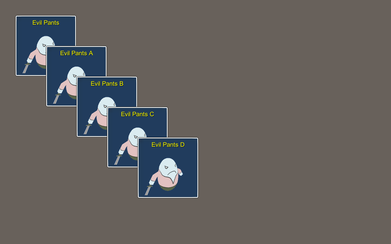
List #

The List layout type places UI content in a Horizontal or Vertical list with a defined spacing between them.

Here’s an example of a Horizontal list.

Here’s an example of a Vertical list.

Row #

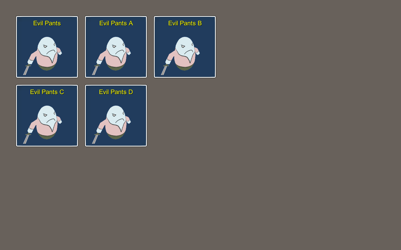
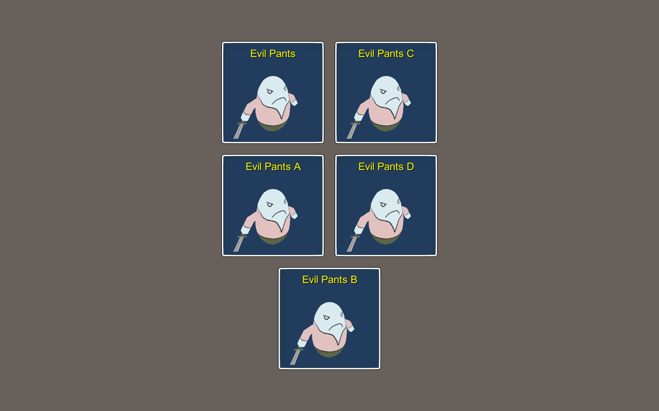
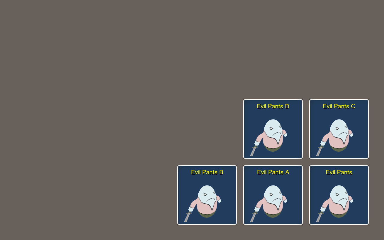
The Row layout type places UI content in rows – similar to a horizontal list – but defines the maximum number of content per row (or the number of rows to be filled). Using Horizontal filling, each row is filled until a defined number is reached. Using Vertical filling, rows will be filled until a defind number of rows is reached.

Here’s an example for a horizontally filled row with 3 per row, aligning rows on the left side and placed on the Upper Left.
Here’s an example for a vertically filled with 3 rows, aligning rows in the center and placed in the Middle Center.
Here’s an example for a horizontally filled row with 3 per row, aligning rows on the right side and placed on the Lower Right and using reversed horizontal and vertical order (i.e. filling from bottom right to upper left).
Column #

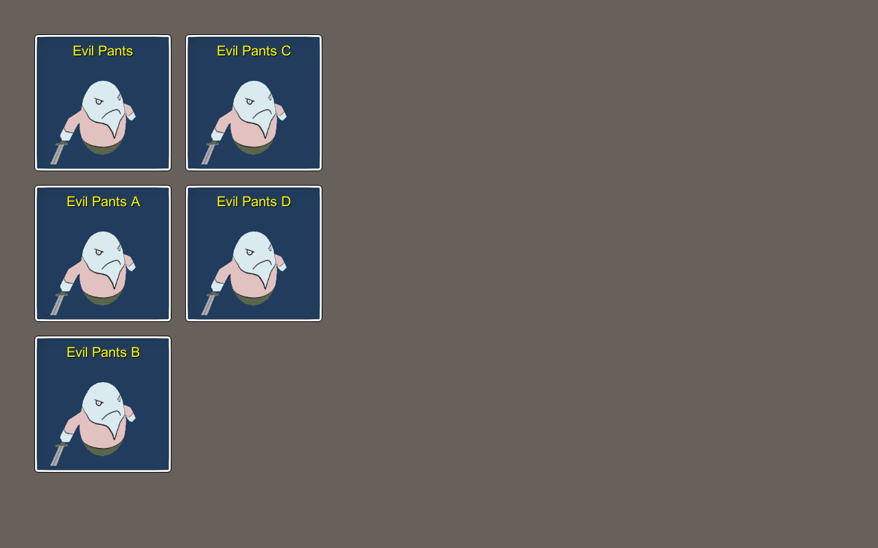
The Column layout type places UI content in columns – similar to a vertical list – but defines the maximum number of content per column (or the number of columns to be filled). Using Vertical filling, each column is filled until a defined number is reached. Using Horizontal filling, columns will be filled until a defind number of columns is reached.

Here’s an example for a vertically filled column with 3 per column, aligning columns on the top and placed on the Upper Left.
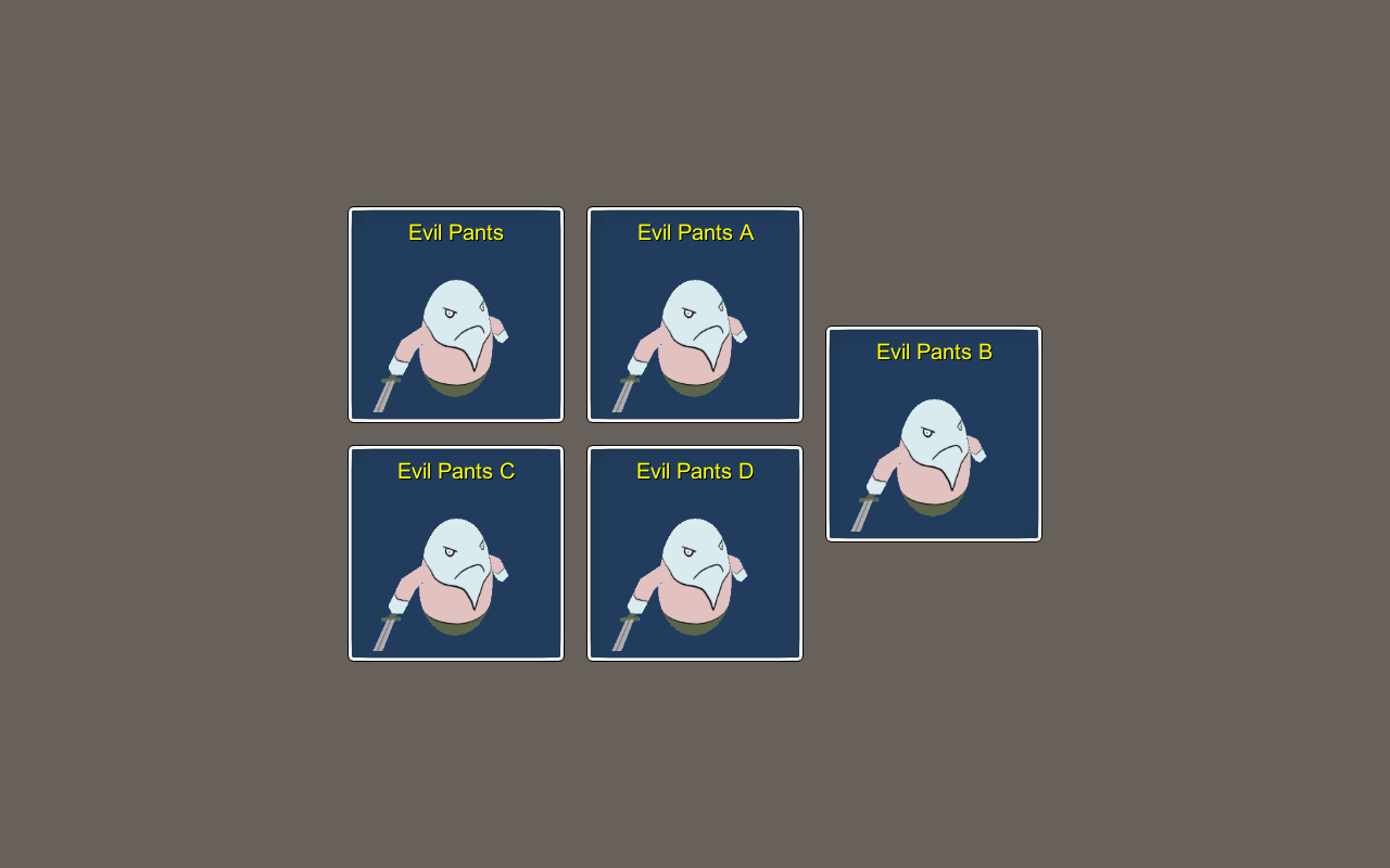
Here’s an example for a horizontally filled column with 3 columns, aligning columns in the middle and placed in the Middle Center.
Here’s an example for a vertically filled column with 3 per column, aligning columns on the bottom and placed on the Lower Right and using reversed horizontal and vertical order (i.e. filling from bottom right to upper left).

Grid #

The Grid layout type places UI content in a grid – similar to row or column – but places the content in ‘cells’, which are depending on all UI content added to the layout. Using Horizontal filling, the grid is filled row-wise until a defined number is reached. Using Vertical filling, the grid is filled column-wise until a defined number is reached.

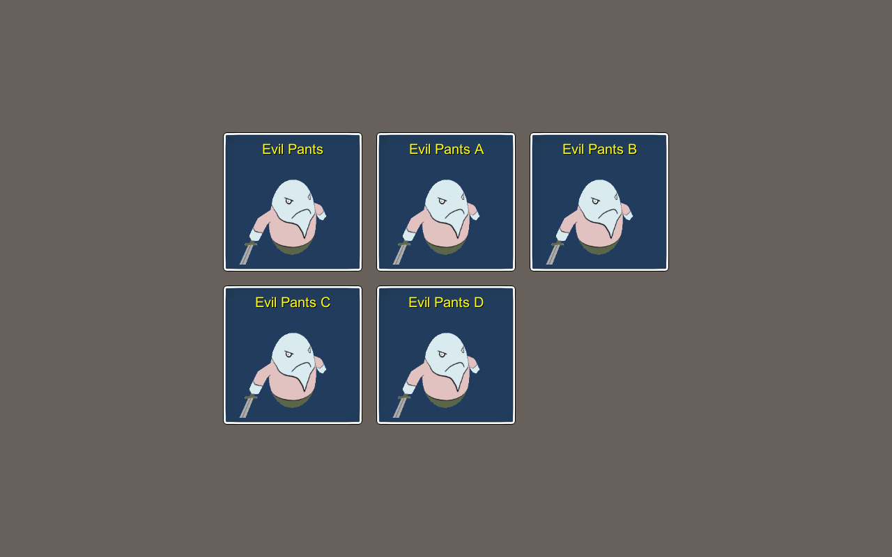
Here’s an example for a horizontally filled grid with 3 per row, placed in the Middle Center.
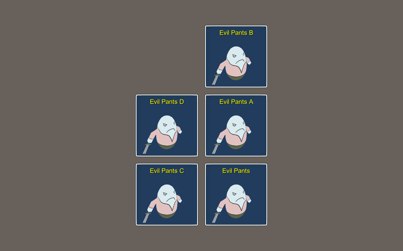
Here’s an example for a vertically filled grid with 3 per column, placed in the Middle Center and using reversed horizontal and vertical order (i.e. filling from bottom right to upper left).
Circle #

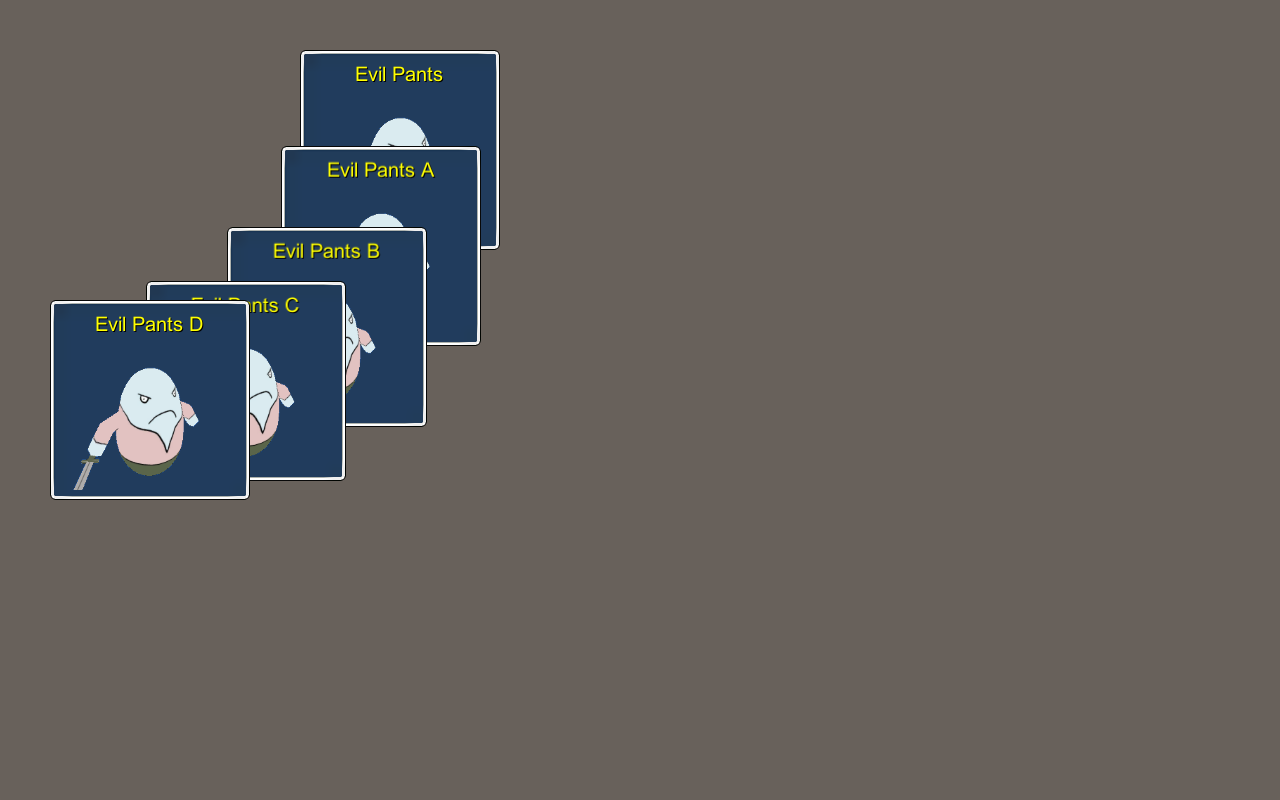
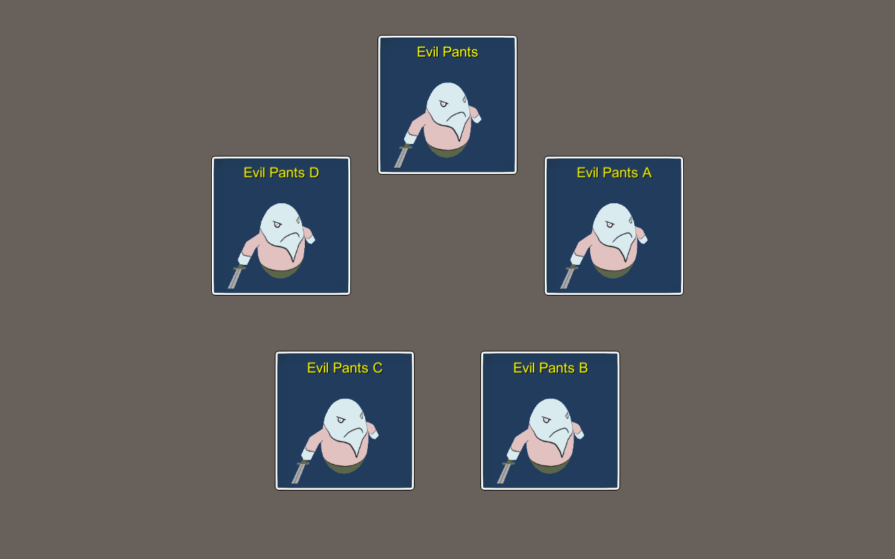
The Circle layout type places UI content in a circle. The circle will be placed at the used anchor – you can define the radius of the circle and the degree the circle uses (e.g. 360 degree for a full circle). The added content can either be distributed evenly on the available degree or placed at fixed offsets (e.g. every 15 degrees).

Here’s an example for a 90 degree circle, placed in the Upper Left.
Here’s an example for a full circle (360 degree), placed in the Middle Center.
Here’s an example for a 180 degree circle, placed in the Lower Center.
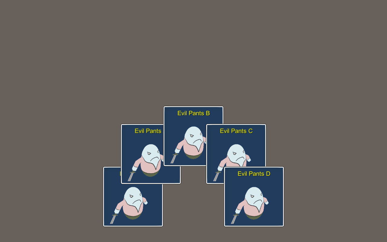
Table of Contents
  • Basics
    • Anchor and Padding
    • Shared Layouts
  • Layout Types
    • Offset
    • List
    • Row
    • Column
    • Grid
    • Circle
Sitemap
  • Showcase
  • ORK 4 Guide
    • Documentation
    • Tutorials
    • Extensions
    • API
  • ORK 3 Guide
    • Documentation
    • Tutorials
    • API
  • ORK 2 Hub
    • Tutorials
    • Plugins
    • API
  • Support
  • Forum
  • Get ORK
  • Contact
  • Blog
  • Makinom
  • gamingislove.com
Categories
  • News (75)
  • ORK 2 (137)
    • Tutorial (137)
      • Game tutorial (50)
      • Gameplay (32)
      • How-to (55)
  • Release (158)
Search

© 2015 Gaming is Love e.U.

Disclosure: This site may contain affiliate links, which means I may receive a commission if you click a link and purchase something that I have recommended. While clicking these links won’t cost you any money, they will help me fund my development projects while recommending great assets!