
We can use HUDs to display all kinds of information – in our case, the player’s status (HP and MP).
In this tutorial we’ll focus on creating a simple HUD – a more detailed introduction to HUDs will be added later.
A new GUI Box
First of all we need a new GUI box to display our HUD. We want to display the HUD in the lower right corner of the screen – so open the ORK Framework editor and navigate to Menus > GUI Boxes.
Copy the Battle Menu GUI box and change the following settings.
- Name
Set to Player HUD.
Content Box Settings
- Bounds
Set to X=1280, Y=800, W=200, H=50. - Anchor
Select Lower Right.
Open Box Behaviour > Move Settings
- Start Position
Set to X=1680, Y=800.
Close Box Behaviour > Move Settings
- End Position
Set to X=1680, Y=800.
That’s it for the GUI box.
Creating the HUD
Navigate to Menus > HUDs and change the settings of the Default HUD (the first HUD in the list).
HUD Settings
- Name
Set to Player HUD. - GUI Box
Select Player HUD. - HUD Type
Select Combatant.
This type allows us to display information about a combatant, e.g. status values.
Combatant Settings
- Combatant Type
Select Group.
This will display a list of all members – each member will be displayed in it’s own GUI box (with an offset).
Individual would display the GUI box at each member’s game object position. - Combatant Offset
Set to X=0, Y=-5. - Relative Offset
Enable this setting. - Relative To
Select Upper Right.
The HUDs for different combatants will now be relative to the upper right of the previous combatant’s HUD, with an offset of -5 vertically. - Displayed Groups
Enable Player and disable the rest.
Display Conditions
- In Control
Select Ignore. - In Battle
Select Yes. - Target Selection, Performing Action, Grid Battles
Select Ignore. - Turn Based, Active Time, Real Time, Phase
Enable these settings.
Set all other Game States to No.
HUD Elements
A HUD consists of one ore multiple HUD elements. In our case (Combatant type HUD), it consists of multiple Status Elements. The drawing order is from first to last – i.e. the element with index 1 will be placed above index 0.
Status Element 0
First we want to display the combatant’s name.
Click on Add Status Element to add the first element – change the following settings.
- Type
Select Information.
This type let’s us display information about the combatant (e.g. name, class, etc.). - Text
Set to %n.
This will display the combatant’s name. - Text Color
Select Yellow. - Font Size
Set to 15.
The Element Bounds define the size of the HUD element and where it’ll will be positioned within the GUI box. HUD elements can also be anchored to their previous element.
- Position
Set to X=0, Y=0. - Anchor
Select Upper Left. - Relative To
Select Upper Left. - Use Last Element
Disable this setting. - Width
Set to 100. - Is Percent (Width)
Enable this setting. - Adjust Width
Enable this setting. - Height
Set to 40. - Is Percent (Height)
Disable this setting. - Adjust Height
Enable this setting.
Status Element 1
Now we want to display the Consumable type status values as bars. We will define the default look of those bars later in the status value settings.
Click on Add Status Element to add another element.
- Type
Select Status Value.
This will display information on one or multiple status values. - Value Origin
Select Current.
The value origin defines where the displayed status value’s value comes from – you can use this to display how status values would change when changing equipment.
Current will only display the status value’s real value. - List Status Values
Select Status Value Type.
This will list multiple status values of a defined status value type. - Status Value Type
Select Consumable. - Offset
Set to X=0, Y=20.
This is the offset added to each status value. - Use Bar
Enable this setting.
We’ll anchor this HUD element to the previous element. In case the previous element changes in size, this element’s position will be updated accordingly.
- Position
Set to X=0, Y=15. - Anchor
Select Upper Left. - Relative To
Select Lower Left. - Use Last Element
Enable this setting. - Width
Set to 100. - Is Percent (Width)
Enable this setting. - Adjust Width
Enable this setting. - Height
Set to 5. - Is Percent (Height)
Disable this setting. - Adjust Height
Enable this setting.
Status Element 2
Additionally, we want to display the name of the status value – to make things easier, let’s copy the previous element. Change the following settings.
- Use Bar
Disable this setting. - Text
Set to %n. - Font Size
Set to 18. - Position
Set to X=0, Y=-20. - Relative To
Select Upper Left. - Height
Set to 100.
Status Element 3
Finally, we also want to display the values as text – copy status element 2 and change the following settings.
- Text
Set to %. - Text Alignment
Select Right. - Position
Set to X=0, Y=0.
And that’s it for our HUD.
The default bars
While we could define the colors/images used for our status value bars in the HUD as well, it’s better to do this in the status value settings – this way they’ll look everywhere the same.
For now we’ll only set this up for HP and MP – navigate to Status > Status Values and change the following settings.
Status Value 1: HP
Default Value Bar
We can change the look of the bars depending on how much they’re filled – we want the bar to be red when below 25 %, yellow when below 50 % and green for the rest (50-100%).
The first added bar will always represent 100 % – the following are in descending order (e.g. 100, 50, 25). Change the already added value bar settings.
- Percent
Set to 100.
Since this is the first value bar, you can’t change this setting anyway. - Color (Bar Image)
Select Green. - Use Empty Bar
Enable this setting.
We also want to display the empty part of the bar. - Color (Empty Bar Image)
Select Default Shadow.
This is a black color.
Now, click on Add Images to add another value bar setting.
- Percent
Set to 50. - Color (Bar Image)
Select Yellow. - Use Empty Bar
Enable this setting. - Color (Empty Bar Image)
Select Default Shadow.
Click on Add Images to add the last value bar setting.
- Percent
Set to 25. - Color (Bar Image)
Select Red. - Use Empty Bar
Enable this setting. - Color (Empty Bar Image)
Select Default Shadow.
That’s it for HP.
Status Value 3: MP
Default Value Bar
The MP should always display the same value bar – we don’t need to react on it’s filling.
- Percent
Set to 100. - Color (Bar Image)
Select Blue. - Use Empty Bar
Enable this setting. - Color (Empty Bar Image)
Select Default Shadow.
That’s it – click on Save Settings and close the ORK Framework editor.
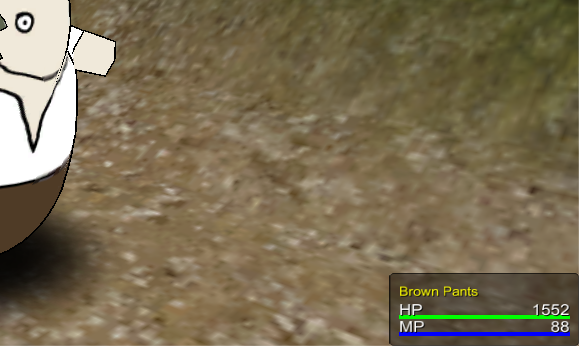
Test it
Open the main menu scene (0 Main Menu) and hit Play. Walk outside of the town and into the battle – you’ll now see the player HUD displaying at the lower right side of the screen.
Wow – now our battle is fully animated! At least for now … there’s always something to play around with.
This concludes our animating the battle marathon.
And that’s it for now – the next lesson will continue with combatant groups and turn based battles.
Want to do more?
You’re still not satisfied with your animated battle? Here’re some things you can do:
- Create more camera positions.
- Add camera position changes to ability and item battle events.
- Create/use more particle effects.