
We all know them – menus to manage our items, abilities and other things. In ORK Framework they’re created using Menu Screens.
A menu screen consists of one or more parts (e.g. a list of items, a description box, etc.) – multiple menu screens can be bound together using an overview menu screen to create a complex menu system.
We’ll create the following menus:
- Overview
Displaying a list of our other menus, some status information of the player group and game information (e.g. time, area, money). - Inventory
Displaying all our items. - Equipment
Displaying the equipment parts and allows changing the equipment. - Ability
Displaying the abilities of the player. - Status
Displaying detailed status of a member of the player group.
In this tutorial we’ll add some new GUI Boxes and other settings, and the first two of our menu screens.
New GUI boxes
Open the ORK Framework editor and navigate to Menus > GUI Boxes. We’ll need three new ones.
Copy Top Info and change the following settings.
- Name
Set to Menu Small. - Height Adjustment
Select Scroll.
Content Box Settings
- Bounds
Set to X=0, Y=50, W=400, H=325. - Text Alignment
Select Left.
Open Box Behaviour > Fade Settings
- Use Fade
Enable this setting.
Close Box Behaviour > Fade Settings
- Use Fade
Enable this setting.
That’s it for this GUI box.
Copy Menu Small and change the following settings.
- Name
Set to Menu Big.
Content Box Settings
- Bounds
Set to X=400, Y=50, W=880, H=750.
That’s it for this GUI box.
Copy Menu Small and change the following settings.
- Name
Set to Menu Info.
Content Box Settings
- Bounds
Set to X=0, Y=375, W=400, H=325.
That’s it for the GUI boxes.
Adding a call requirement
Calling a menu screen via input keys (i.e. opening it by pressing an assigned key) can be bound to certain requirements. We only want the menu to be accessible while the player is in control (i.e. outside of events, battles, etc.). Navigate to Game > Requirements and add a new requirement to the list (don’t change the already existing one). Change the following settings.
- Name
Set to Menu Call. - In Control, Menu Screen
Select Ignore. - Shop, In Event, Changing Scene, Game Paused, In Battle
Select No.
That’s it for the requirement.
EXP bar settings
Since we’re going to display the experience (EXP) status value of our player, we need to set up the settings for it’s value bar display. Navigate to Status > Status Values and select EXP. Change the following settings in the Default Value Bar.
- Color
Select Yellow. - Use Empty Bar
Enable this setting. - Color (Empty Bar)
Select Default Shadow.
That’s it for the bar settings.
The inactive colors
When displaying menus consisting of multiple controlable parts (e.g. the inventory menu will display a box for the item types and another for the item list), we need to tint the inactive parts in a different color to let the user know which box he is actually controlling. That’s done using the Inactive Color settings. The default settings are made in Menus > Menu Settings.
- Set Background Color
Enable this setting. - Background Color
Set to R=0.5, G=0.5, B=0.5, A=1. - Set Content Color
Enable this setting. - Content Color
Set to R=0.5, G=0.5, B=0.5, A=1.
That’s it for the inactive colors.
Tip: You can override the default inactive colors in each GUI box individually.
The overview menu will display a list of buttons to change other menus, game information (time, area, money) and the status of the player group. Navigate to Menus > Menu Screens and change the following settings in the default menu.
- Name
Set to Overview. - Block Controls
Enable this setting.
This menu screen will disable the player control while it’s opened. - Single Screen
Enable this setting.
This menu screen will be displayed alone – no other menu screen can be displayed while it’s opened.
When not using Single Screen, you can open multiple menu screens at the same time. - 2nd Call Closes
Enable this setting.
Calling this menu screen a while it’s already opened (e.g. by pressing an assigned key) will close the menu screen. - Use Call Key
Enable this setting.
We want to call this menu screen by pressing an input key. - Input Key
Select Menu. - Use Requirement
Enable this setting.
We want to only allow opening this menu via input key when a requirement is valid. - Requirement
Select Menu Call.
Now it’s time to add some parts to the menu screen. Click on Add Menu Part and than on Button List.
A button list part will display, well, a list of buttons – each button can be set to do different things, like calling another menu screen. Change the following settings.
- GUI Box
Select Menu Small.
That’s it for the button list part for now – we’ll add the buttons later, after we’ve added the other menu screens.
Part 1: Description
Click on Add Menu Part and than on Description to add a description part. This part is used to display the description of selected choices – change the following settings.
- GUI Box
Select Top Info. - Always Visible
Enable this setting.
The description box will be displayed even if no description is available.
Part 2: Information
Click on Add Menu Part and than on Information. The information part can use HUD elements to display game information – change the following settings.
- GUI Box
Select Menu Info.
You can either use an already existing HUD as a template, or add HUD elements directly to this part. We’ll add them directly.
- Auto Update
Enable this setting.
The displayed information will be updated over time. - Update Interval (s)
Set to 1.
The update will happen once per second.
Element 0
Now, click on Add Information Element to add a HUD element.
- Text
Set to
Time:
Area:
#currency.name0#: - Text Alignment
Select Left. - Position
Set to X=0, Y=0. - Anchor
Select Upper Left. - Relative To
Select Upper Left. - Use Last Element
Disable this setting. - Width
Set to 100. - Is Percent (Width)
Enable this setting. - Adjust Width
Enable this setting. - Height
Set to 100. - Is Percent (Height)
Enable this setting. - Adjust Height
Enable this setting.
Element 1
Copy the HUD element and change the following settings.
- Text
Set to
#time
#area.current
#currency.inventory0# - Text Alignment
Select Right.
That’s it for the information part.
Part 3: Combatant
Finally, we’ll add the status information for the player group – click on Add Menu Part and than on Combatant. This part also uses HUD elements to display information.
- GUI Box
Select Menu Big. - Combatant Scope
Select Battle.
The scope defines the combatants that will be displayed.
Now it’s time to add the HUD elements – we want to display the combatant’s name, level, HP/MP, EXP and status effects.
Element 0
Click on Add Status Element and change the following settings.
- Type
Select Information. - Text
Set to %n, Lvl %. - Text Alignment
Select Left. - Text Color
Select Yellow. - Position
Set to X=0, Y=0. - Anchor
Select Upper Left. - Relative To
Select Upper Left. - Use Last Element
Disable this setting. - Width
Set to 400. - Is Percent (Width)
Disable this setting. - Adjust Width
Enable this setting. - Height
Set to 50. - Is Percent (Height)
Disable this setting. - Adjust Height
Enable this setting.
Element 1
Now it’s time for HP and MP. Click on Add Status Element and change the following settings.
- Type
Select Status Value. - List Status Values
Select Status Value Type. - Status Value Type
Select Consumable. - Offset
Set to X=0, Y=30. - Use Bar
Enable this setting. - Position
Set to X=0, Y=50. - Anchor
Select Upper Left. - Relative To
Select Upper Left. - Use Last Element
Disable this setting. - Width
Set to 400. - Is Percent (Width)
Disable this setting. - Adjust Width
Enable this setting. - Height
Set to 5. - Is Percent (Height)
Disable this setting. - Adjust Height
Enable this setting.
Element 2
Copy the last element and change the following settings.
- Use Bar
Disable this setting. - Text
Set to %n. - Text Alignment
Select Left. - Position
Set to X=0, Y=30. - Height
Set to 60.
Element 3
Copy the last element and change the following settings.
- Text
Set to % / %n. - Text Alignment
Select Right.
Element 4
Now the EXP. Click on Add Status Element and change the following settings.
- Type
Select Status Value. - Status Value
Select EXP. - Use Bar
Enable this setting. - Position
Set to X=0, Y=110. - Anchor
Select Upper Left. - Relative To
Select Upper Left. - Use Last Element
Disable this setting. - Width
Set to 400. - Is Percent (Width)
Disable this setting. - Adjust Width
Enable this setting. - Height
Set to 5. - Is Percent (Height)
Disable this setting. - Adjust Height
Enable this setting.
Element 5
Copy the last element and change the following settings.
- Use Bar
Disable this setting. - Text
Set to %n. - Text Alignment
Select Left. - Position
Set to X=0, Y=90. - Height
Set to 30.
Element 6
Copy the last element and change the following settings.
- Text
Set to % / %n. - Text Alignment
Select Right.
Element 7
Finally, the status effects. Click on Add Status Element and change the following settings.
- Type
Select Status Effect. - Rows
Set to 4. - Columns
Set to 1. - Spacing
Set to X=0, Y=0. - Set Cell Size
Enable this setting. - Cell Size
Set to X=400, Y=30.
Click on Add Content Text to add a text that will be displayed for each status effect.
- Text
Set to %n. - Position
Set to X=460, Y=0. - Anchor
Select Upper Left. - Relative To
Select Upper Left. - Use Last Element
Disable this setting. - Width
Set to 400. - Is Percent (Width)
Disable this setting. - Adjust Width
Enable this setting. - Height
Set to 120. - Is Percent (Height)
Disable this setting. - Adjust Height
Enable this setting.
And that’s it for this menu screen for now. We’ll return to it later when it’s time to add the other menu screens as buttons.
The inventory menu will list all the items in the player’s inventory. We’ll also separate them by type. Add a new menu screen and change the following settings.
- Name
Set to Inventory. - Block Controls
Enable this setting. - Single Screen
Enable this setting. - 2nd Call Closes
Enable this setting.
Part 0: Inventory
Now, click on Add Menu Part and than on Inventory to add an inventory part. This part handles everything related to displaying items – change the following settings.
- Default Action
Select Use.
The default action allows what’ll happen when an item is selected. - All Item Types
Enable this setting.
Type Box Settings
- Type Display
Select GUI Box.
The item types will be displayed in their own GUI box. - Show Empty Types
Disable this setting.
If we don’t have an item of a type, we don’t need to display it. - Box Display
Select Multi.
The box display setting defines how the item type and item list will be displayed – the Multi setting will display them at the same time using different GUI boxes. - Type Box
Select Menu Small.
Item Box Settings
- Item Box
Select Menu Big. - Add Money
Disable this setting.
We don’t want to add the money as an item. - Add Items
Enable this setting. - Add Weapons, Add Armors
Disable this settings.
We’ll display the equipment in the equipment menu, no need to display them here as well.
Part 1: Description
Click on Add Menu Part and than on Description to add a description part. Change the following settings.
- GUI Box
Select Top Info. - Always Visible
Enable this setting.
And that’s it for this menu screen.
Now, let’s add our first menu to the overview menu. In the Button List part, click on Add Menu Item and change the following settings.
- Type
Select Menu Screen. - Menu Screen
Select Inventory. - Name
Set to Inventory. - Description
Set to Show all the stuff..
And that’s it – click on Save Settings and close the ORK Framework editor.
Open the main menu scene (0 Main Menu) and hit play.
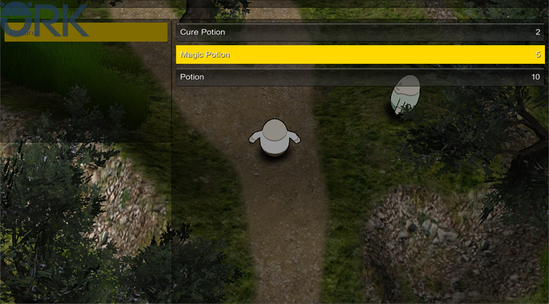
If you now press the Menu key (Escape), the menu will open and you’ll be able to select the inventory menu.
And that’s it for now – the next lesson will continue with menu screens.