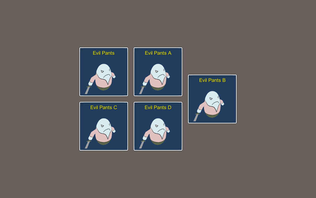
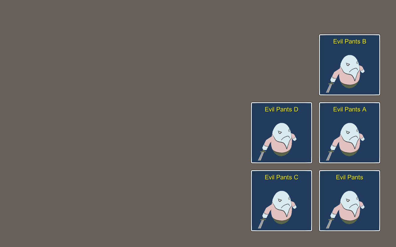
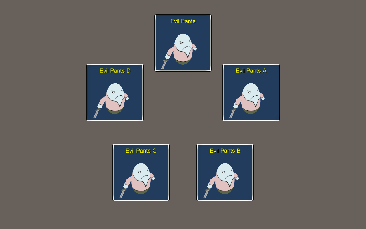
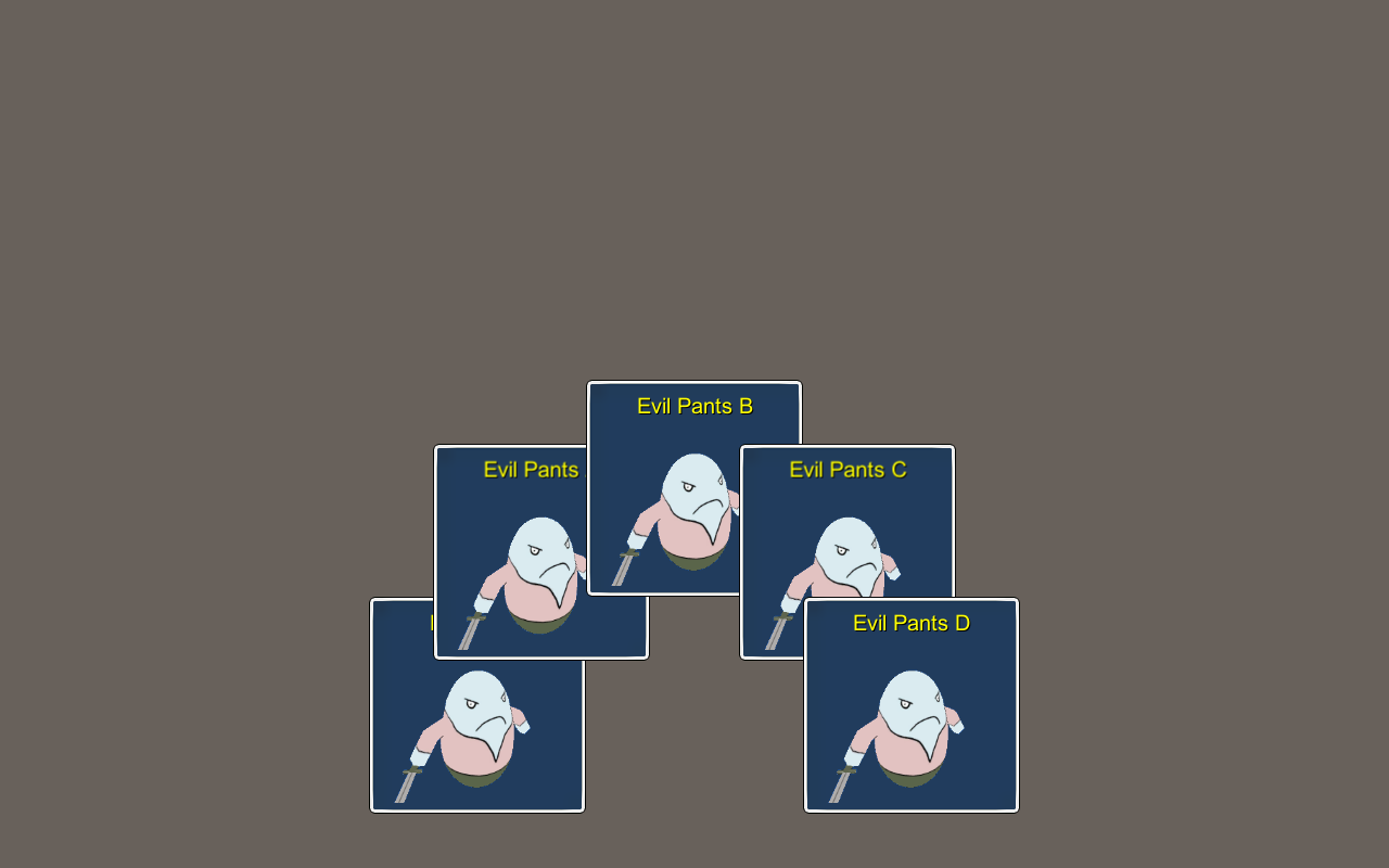
GUI layouts can be used to arrange multiple GUI boxes.
The position (X and Y of the content box bounds) and anchor of a GUI box will be ignored when using a GUI layout, positioning the GUI box according to the used layout’s position and other GUI boxes in the same layout instead. GUI layouts are available to be used in HUDs and certain battle loot dialogues to arrange multiple GUI boxes. E.g. a Combatant type HUD displaying information about the player group members can use GUI layouts for advanced layout positioning.
Basics
GUI layouts are set up in Menus > GUI Layouts. Some basics are shared across all available layout types.
Anchor and Padding
The layout’s Anchor and Padding settings define where on screen the layout will be placed.
The Anchor (white text on the image below) defines where on the available space the layout will be placed – the corresponding layout’s corner will be placed on the anchor, e.g. using Upper Left will place the layout’s upper left corner on that position.
The Padding (red letters on the image below) defines the space between the edges of the screen and the layout’s placement.
When selecting a GUI layout (e.g. in a HUD), you can optionally use a Shared Layout, i.e. a global layout, that can be accessed from different UI parts, adding different GUI boxes to a single layout. E.g. a Combatant type HUD and a Turn Order type HUD adding their GUI boxes to the same layout, arranging them together.
When not using a shared layout, each UI using a layout will create their own instance of the layout – all existing separate from each other. E.g. a Combatant type HUD and a Turn Order type HUD adding their GUI boxes to separate layouts (of the selected layout), arranging them apart from each other.
Layout Types
There are multiple types of built-in layouts available and you can easily add new layouts to the system by extending from the GUIBaseLayoutSettings class for the layout’s settings and the GUIBaseLayout class for the layout’s implementation. See the built-in layout classes for an example, as they’re using the same system.
Offset
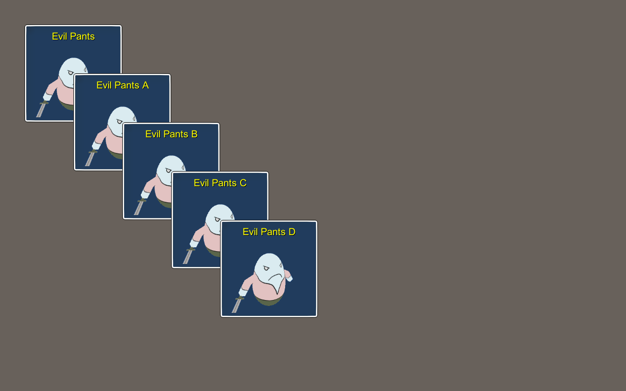
The Offset layout type places GUI boxes by adding an offset to the previous boxes position. You can define which corner of the previous GUI box the next box should be placed relative to (e.g. the Upper Left corner).
List
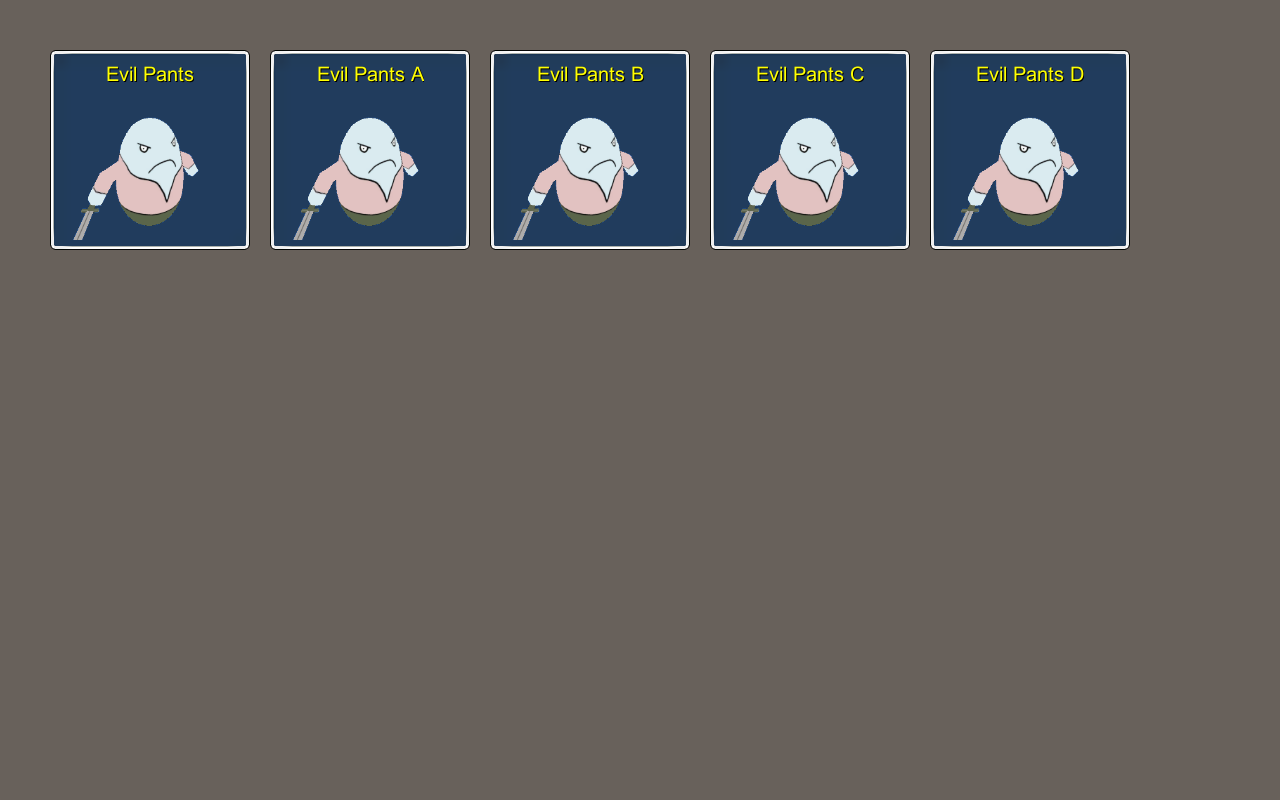
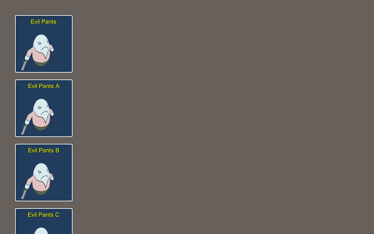
The List layout type places GUI boxes in a Horizontal or Vertical list with a defined spacing between them.
Here’s an example of a Horizontal list.
Here’s an example of a Vertical list.
Row
The Row layout type places GUI boxes in rows – similar to a horizontal list – but defines the maximum number of GUI boxes per row (or the number of rows to be filled). Using Horizontal filling, each row is filled until a defined number of boxes is reached. Using Vertical filling, rows will be filled until a defind number of rows is reached.
Here’s an example for a horizontally filled row with 3 boxes per row, aligning rows on the left side and placed on the Upper Left.
Here’s an example for a vertically filled row with 3 rows, aligning rows in the center and placed in the Middle Center.
Here’s an example for a horizontally filled row with 3 boxes per row, aligning rows on the right side and placed on the Lower Right and using reversed horizontal and vertical order (i.e. filling from bottom right to upper left).
Column
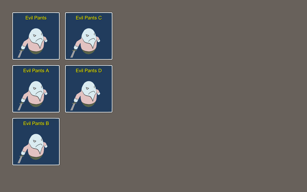
The Column layout type places GUI boxes in columns – similar to a vertical list – but defines the maximum number of GUI boxes per column (or the number of columns to be filled). Using Vertical filling, each column is filled until a defined number of boxes is reached. Using Horizontal filling, columns will be filled until a defind number of columns is reached.
Here’s an example for a vertically filled column with 3 boxes per column, aligning columns on the top and placed on the Upper Left.
Here’s an example for a horizontally filled column with 3 columns, aligning columns in the middle and placed in the Middle Center.
Here’s an example for a vertically filled column with 3 boxes per column, aligning columns on the bottom and placed on the Lower Right and using reversed horizontal and vertical order (i.e. filling from bottom right to upper left).
Grid
The Grid layout type places GUI boxes in a grid – similar to row or column – but places the boxes in ‘cells’, which are depending on all boxes added to the layout. Using Horizontal filling, the grid is filled row-wise until a defined number of boxes is reached. Using Vertical filling, the grid is filled column-wise until a defined number of boxes is reached.
Here’s an example for a horizontally filled grid with 3 boxes per row, placed in the Middle Center.
Here’s an example for a vertically filled grid with 3 boxes per column, placed in the Middle Center and using reversed horizontal and vertical order (i.e. filling from bottom right to upper left).
Circle
The Circle layout type places GUI boxes in a circle. The circle will be placed at the used anchor – you can define the radius of the circle and the degree the circle uses (e.g. 360 degree for a full circle). The added content can either be distributed evenly on the available degree or placed at fixed offsets (e.g. every 15 degrees).
Here’s an example for a 90 degree circle, placed in the Upper Left.
Here’s an example for a full circle (360 degree), placed in the Middle Center.
Here’s an example for a 180 degree circle, placed in the Lower Center.
