
Adding a multi-paged status menu and some other menu settings.
Open the ORK Framework editor and navigate to Menus > Menu Screens.
We already added a Combatant part to our overview menu with some simple status information. Now, we want to create a whole menu screen, consisting of multiple pages displaying more detailed status information (i.e. all Normal type status values, attack attributes and defence attributes). Add a new menu screen and change the following settings.
- Name
Set to Status. - Block Controls
Enable this setting. - Single Screen
Enable this setting. - 2nd Call Closes
Enable this setting.
Part 0: Combatant
Click on Add Menu Part and than on Combatant.
- GUI Box
Select Menu Big. - Combatant Scope
Select Current. - Accept Next Page
Enable this setting.
Pressing the Accept input key will display the next page.
Now, we already have the first page added, so let’s change the following settings.
Page 0
This page will display the status values and status effects of the combatant.
Click on Add Status Element to add a HUD element. We’ll use this one to display the name and level of the combatant.
- Type
Select Information. - Text
Set to %n, Lvl %. - Text Alignment
Select Left. - Text Color
Select Yellow. - Position
Set to X=0, Y=0. - Width
Set to 400. - Is Percent (Width)
Disable this setting. - Height
Set to 50. - Is Percent (Height)
Disable this setting.
Again, click on Add Status Element. Time for our status values.
- Type
Select Status Value. - List Status Values
Select Status Value Type. - Status Value Type
Select Normal. - Offset
Set to X=0, Y=30. - Text
Set to %n. - Text Alignment
Select Left. - Position
Set to X=0, Y=50. - Width
Set to 400. - Is Percent (Width)
Disable this setting. - Height
Set to 400. - Is Percent (Height)
Disable this setting.
Copy the last element and change the following settings.
- Text
Set to %. - Text Alignment
Select Right.
Finally, the status effects. Click on Add Status Element and change the following settings.
- Type
Select Status Effect. - Rows
Set to 10. - Columns
Set to 1. - Spacing
Set to X=0, Y=0. - Set Cell Size
Enable this setting. - Cell Size
Set to X=400, Y=30.
Click on Add Content Text to add a text that will be displayed for each status effect.
- Text
Set to %n. - Position
Set to X=460, Y=50. - Width
Set to 400. - Is Percent (Width)
Disable this setting. - Height
Set to 400. - Is Percent (Height)
Disable this setting.
That’s it for this page.
Page 1
This page will display the attack and defence attribute values.
Click on Add Status Element to add a HUD element. Again, we’ll use this one to display the name and level of the combatant.
- Type
Select Information. - Text
Set to %n, Lvl %. - Text Alignment
Select Left. - Text Color
Select Yellow. - Position
Set to X=0, Y=0. - Width
Set to 400. - Is Percent (Width)
Disable this setting. - Height
Set to 50. - Is Percent (Height)
Disable this setting.
Click on Add Status Element. Time for the Element attack attributes.
- Type
Select Attack Attribute. - Attribute Group
Select Element. - List All
Enable this setting. - Offset
Set to X=0, Y=30. - Text
Set to %n. - Text Alignment
Select Left. - Position
Set to X=0, Y=50. - Width
Set to 400. - Is Percent (Width)
Disable this setting. - Height
Set to 150. - Is Percent (Height)
Disable this setting.
Copy the last element and change the following settings.
- Text
Set to %. - Text Alignment
Select Right.
Now it’s time for the Attack Type attack attribute. Click on Add Status Element.
- Type
Select Attack Attribute. - Attribute Group
Select Attack Type. - List All
Enable this setting. - Offset
Set to X=0, Y=30. - Text
Set to %n. - Text Alignment
Select Left. - Position
Set to X=0, Y=200. - Width
Set to 400. - Is Percent (Width)
Disable this setting. - Height
Set to 150. - Is Percent (Height)
Disable this setting.
Copy the last element and change the following settings.
- Text
Set to %. - Text Alignment
Select Right.
Click on Add Status Element. Time for the Race defence attributes.
- Type
Select Defence Attribute. - Attribute Group
Select Race. - List All
Enable this setting. - Offset
Set to X=0, Y=30. - Text
Set to %n. - Text Alignment
Select Left. - Position
Set to X=460, Y=50. - Width
Set to 400. - Is Percent (Width)
Disable this setting. - Height
Set to 180. - Is Percent (Height)
Disable this setting.
Copy the last element and change the following settings.
- Text
Set to %. - Text Alignment
Select Right.
Click on Add Status Element. Time for the Size defence attributes.
- Type
Select Defence Attribute. - Attribute Group
Select Size. - List All
Enable this setting. - Offset
Set to X=0, Y=30. - Text
Set to %n. - Text Alignment
Select Left. - Position
Set to X=460, Y=230. - Width
Set to 400. - Is Percent (Width)
Disable this setting. - Height
Set to 120. - Is Percent (Height)
Disable this setting.
Copy the last element and change the following settings.
- Text
Set to %. - Text Alignment
Select Right.
That’s it for this page, and for this menu screen.
Now, all we need to do is to add the last menu screen to the overview menu.
Select the Overview screen and change the following settings in the Button List part. Click on Add Menu Item to add a new button to the menu.
- Type
Select Menu Screen. - Menu Screen
Select Status. - Select Combatant
Enable this setting. - Name
Set to Status. - Description
Set to: Show detailed status information.
And finally, we’ll add a button to return to the main menu. Click on Add Menu Item again.
- Type
Select Exit Game. - Name
Set to Exit. - Description
Set to: Exit the game to the main menu.
And that’s it for the menu screens.
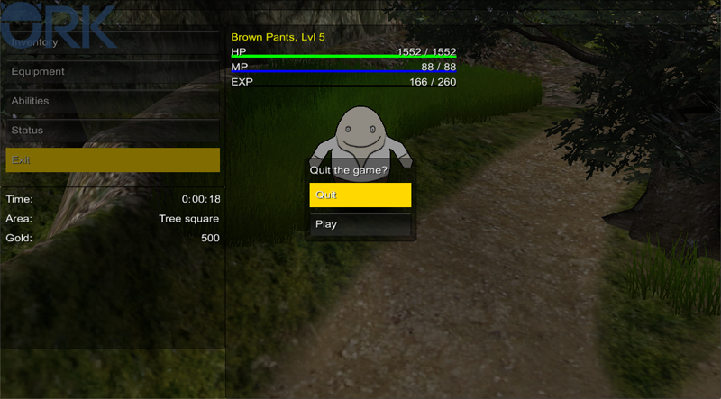
The exit question
When selecting the Exit Game item in our overview menu, the game will display a question dialogue asking if we really want to quit the game – so let’s set it up!
Navigate to Menus > Main Menu and change the following settings.
Exit Question
- GUI Box
Select Main Menu. - Question Text
Set to Quit the Game?. - Use Choice
Enable this setting.
The question dialogue will be displayed as a choice dialogue.
Else, the Ok and Cancel buttons of the GUI box will be used. - Yes Button Text
Set to Quit. - No Button Text
Set to Play.
That’s it for the exit question.
There are some general settings that affect all menu screens, let’s take a look at them.
First, navigate to Menus > Text Display Settings.
Use Cost Display
Most of the time, Abilities have use costs (like our Small Heal costs 2 MP). How those costs are displayed in menus is defined by the Use Cost Display settings.
You can set up a separation string (by default an empty space) and the texts for negative, positive and set changes.
Default Combatant Choice Layout
Combatant Selections are used whenever you make a combatant choice in a menu screen (e.g. when using an item, or when using the Select Combatant option in the overview menu). The default layout to display a combatant is made here, but can be overridden in a combatant selection. For our small game, we don’t need different combatant selections – so let’s tune the default layout a bit.
- Content Type
Select None.
We’ll use HUD elements to display the information instead. - Add HUD Elements
Enable this setting. - Use HUD
Enable this setting.
We’ll use a HUD as a template. - HUD
Select Player HUD.
Navigate to Menus > Menu Settings.
You might have noticed the background image settings in the menu screens. While you can set up a background image for each menu screen individually, it’s more convenient to use a general background for all menus (menu screens can still override them). The Default Backgrounds are displayed with a menu screen, but they’ll fade in and out with the screen – this can lead to flickering. To prevent this, you can use General Backgrounds – they’re displayed as soon as a menu screen is displayed and will stay visible until the last menu screen is closed.
We wont add backgrounds to our menus though – moving on …
The default menu buttons (like Back, Cancel or Unequip) are defined here.
Default Combatant Selections
As mentioned earlier, the combatant selections are used to display combatant choices in menu screens. You can set up different default combatant selections (e.g. to select the menu user or target of an item or ability). Some of the combatant selections can be overridden by other parts of ORK Framework (like the item target selection can be overridden by items).
The actual combatant selections are set up in Menus > Combatant Selections.
Default Quantity Selections
Quantity Selections are used to select quantities of items, equipment and other things. There are various default quantity selections (like for dropping or buying items).
The actual quantity selections are set up in Menus > Quantity Selections.
And that’s it – click on Save Settings and close the ORK Framework editor.
Open the main menu scene (0 Main Menu) and hit play. In the menu, you can now display the detailed status information and change the page by using the Accept key (enter).
And you can quit the game and return to the main menu!
This concludes the menu screen tutorials.
And that’s it for now – the next lesson will cover our first quest.